")


 – Scale (Geoffrey West)")
 – Jóga")


 – Banded Iron Formations a raná mineralogická diverzifikace")
 – vznik kontinentů a TTG hornin – šedá Země")
 – Vznik oceánů a hydrosféry – modrá Země")
 – Hadejská epocha – černá Země")


As you saw yesterday and over the weekend, sometimes gadget things just don’t make sense. And one of those things has been the tsunami of data I collected on a single run this weekend, using a wide variety of products designed to measure running efficiency and form.
Of course, some of these products aren’t new. For example, Garmin’s Running Dynamics has been around since 2013 with the FR620 initially using the HRM-RUN, as has RunScribe since 2013. Others have popped up onto the scene in the last year or so, with more even in the last few months. Yet what’s new is really having the ability to start evaluating what is theoretically the same data from different companies. It’s one thing to have two different companies and compare data (i.e. Garmin vs RunScribe), but it’s another to really dig even further and compare a lot more at once…like…six of them concurrently. All of which ultimately get to the question of: Which one is correct? Or…are any of them correct?
For reference, here are the devices I was using:
1) RunScribe running pods (dual left/right pod setup)
2) Stryd running pod power meter
3) Kinematix Tune insole based running metrics (dual left/right setup)
4) SHFT running metrics/power meter (dual pod setup)
5) Milestone footpod with advanced running metrics
6) Garmin HRM-TRI Running Dynamics (HR strap)
Note that there are other advanced running metrics devices on the market that I didn’t use/have for this run. They include: Wahoo TICKR, RunTeq Zoi, FeetMe, Lumo, and more I’m likely forgetting or have never heard of. I also touched on a few others at ISPO a couple of weeks ago like DigitSole.
Most times in reviews/posts I collect vast sums of data and rarely post on something until I have those piles of both mainstream and edge cases to evaluate. But in this case, I’m going to simplify things a bit more and just look at this single run. After all – most consumers aren’t looking at half a dozen devices to decide which one is correct. They’re expecting that the data they use is both accurate and precise, as well as repeatable and actionable.
‘Riddle Me This’ Background:
During one of the IT projects I worked at back over a decade ago now, I spent many long nights in a corporate apartment with two co-workers. Both these colleagues can now be counted among my best friends (including my groomsmen). Much pizza and Mountain Dew was consumed. At the time our job was partly to understand why things were the way they were. It often started with one of us staying aloud: Riddle me this – Do you actually know how ‘X’ works? In theory, you did. At the surface, the questions were always simple sounding. Of course you knew how DHCP leases (and renewal) worked. Of course you knew how Active Directory rejection and escalation of incorrect passwords worked. Or, of course you knew how some other staple of IT computing worked.
But that wasn’t actually the question. The question was did you really know how it worked. Could you tear it apart packet by packet and explain precisely what was going on? Could you explain the exact moment something was triggered and the various domino effects from it? For example – does the computer request a new DHCP lease if it reboots mid-lease duration? And if it does, did that extend the lease time if it was prior to the half-life of the lease? What did the client do if the server removed the address from the lease pool? No doubt these concepts all sound foreign if you’re not in IT. And that’s OK.
The point of the question was in effect a dare: Could you produce the mother of all in-depth e-mails and explanation on what sounded trivial, but in reality was not. Could you leave that knowing that you now know all there is to know about some inconsequential little topic that virtually everyone takes for granted?
All of which is a long-winded precursor to my ‘Riddle me this’ in this post. A riddle that perhaps it might be up to you to solve.
What’s being measured:

Before we get too far along, let’s me define what we’re going to focus on today. These devices all measure various running efficiency and form metrics. The theory behind them is that you can focus on one specific element (or a group of elements) and modify your running form. By modifying your running form you may run more efficiently, which means that you can expend less energy to go the same pace (or spend the same energy and go faster). Ultimately this is mostly all about either going faster, or spending less energy. There are however elements around injury reduction too though, which some companies focus on more than others.
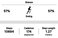
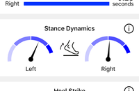
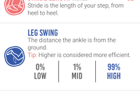
Each company generally measures between 6 and 12 different metrics. Some of those metrics are the same across devices. For example, cadence is cadence (whether displayed as single leg or double/total), and pace is pace. Those two are the foundation of running metrics, and companies shouldn’t be getting those wrong. Then you move into areas like Ground Contact Time or Vertical Oscillation – all of which should, in theory, be the same across devices if supported. Finally, you move further into more detailed areas like footstrike type or g-forces, which can get very nuanced depending on how you measure it or where you measure it.
To start, here’s what each of the units I was using is capable of recording. Note that I’m specifically covering items which are exposed in their apps. If a user can’t access it – it doesn’t count. Meaning, just because they may have that data somewhere behind the scenes, if it’s not exposed to an end user it doesn’t matter to me. I’m also not covering in this table some of the coaching elements that you see in some apps like SHFT.
Running Efficiency Devices
| Functionality | Garmin HRM-TRI/RUN | RunScribe | Stryd | Milestone | Kinematix Tune | SHFT Run |
|---|---|---|---|---|---|---|
| Price | $89 (+ watch) | $162 (dual) | $199 | $24 | 199EUR | 199EUR |
| Placement | Chest Strap | Footpod | Footpod | Footpod | Insoles | Footpod & Chestpod |
| Support dual pods? | No | Yes | No | No | Yes | Yes (Chest/Foot) |
| Is phone required during run? | No | No | No | No | Yes | Yes |
| Battery type | CR2032 Coin cell | Rechargeable | Rechargeable | CR2032 Coin cell | Rechargeable | Rechargeable |
| Metrics: Cadence | Yes | Yes | Yes | Yes | Yes | Yes |
| Metrics: Pace | Yes | Yes | Yes | Yes | Yes | Yes |
| Metrics: Total Steps | No | Yes | No | Yes | Yes | No |
| Metrics: Running Power | No | No | Yes | No | No | Yes |
| Metrics: Vertical Oscillation | Yes | No | Yes | No | No | Yes |
| Metrics: Ground Contact Time | Yes | Yes | Yes | Yes | Yes | Yes |
| Metrics: Ground Contact Time Balance | Yes | Yes | No | No | Yes | No |
| Metrics: Stride Length | Yes | Yes | No | Yes | Yes | Yes |
| Metrics: G-Forces | No | Yes | No | No | No | Yes |
| Metrics: Footstrike location | No | Yes | No | Yes | Yes | No |
| Metrics: Pronation/Supination | No | Yes | No | No | No | No |
| Metrics: General efficiency score | No | Yes | No | Yes | No | Yes |
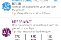
| Metrics: Other notable data captured | Vertical Ratio | Footstrike type, pronation velocity, braking forces, flight ratio | Leg spring stiffness, Form Power | Leg swing, rate of impact | Heel time, Heel Strike, Gait Cycle Time | Brake effect, time in air, landing angle |
| Data: Can export data | Yes | Yes | Yes | Summary/totals only | No | Only GPS/cadence |
Phew…holy data moly!
Of course – all of this ignores whether or not there’s any actual use for much of this data in terms of making you a better/faster/safer runner. It’s incredibly easy for companies to point to studies that prove that you should run one way or another because it somehow might be faster/better one way or another. But more on that in a moment, first let’s look at the numbers.
A Runny Pile of Data:
So with half a dozen running metric devices charged up, and four GPS watches, I set out on my roughly hour long run. The run was almost entirely without stoppage, and on mostly flat terrain. There were a few minor inclines up/down ramps to the river, and the ground was primarily pavement, with a portion compact dirt and finally an even smaller portion cobblestones. In general when I run I don’t stand for lights and such, but rather simply run up/down the street until I can safely cross. You can see the route here, as well as the pacing.

Now the first piece of the puzzle is getting a way to compare the data. Sure, I could show you screenshots from each piece, but that’s hard to actually compare like data side by side. Still, I’m going to do it anyway. Here’s a gallery of the different pieces from all of the apps. For the phone-only apps, I’m including a few screenshots of each:

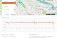
In general, I found that SHFT had the clearest and easiest to understand metrics panel, combining both GPS and pod data in a simple manner. While RunScribe’s data is close behind (albeit sans-GPS). Here are the direct links to each workout, if available:
Garmin Connect
Stryd Power Center
RunScribe Dashboard
SHFT Portal
Kinematix Tune (no shareable link option)
Milestone Pod (no shareable link option)
Ok, with that prettiness out of the way, I decided to try and compare just one single metric: Ground Contact Time. Aside from cadence, it was the lone metric that all the devices had. So next I had to figure out how to export that data.
Oh.
Wait.
That’s not actually possible. Here’s whether each platform supports some sort of CSV/TXT data file for that advanced data portion of the file:
A) Garmin Connect: Sorta, you’d have to manually parse the .FIT file for Running Dynamics data.
B) RunScribe: Sorta. It’s complicated.
C) SHFT: Exports only GPS track and cadence data, not running metrics.
D) Stryd: Sorta, you have to parse the .FIT file – same as Garmin
E) Kinematix: No export available (on phone only)
F) Milestone Pod: No per-run export available (only summary/total data)
So then…well…crap. Nobody above provides a simple ‘Export CSV’ option for this data. Now I realize the irony of this, because I routinely talk about the fact that in fitness data, publishing CSV/TXT files isn’t useful. Instead you want .FIT or .TCX files for integration purposes – which is exactly what these companies did. Unfortunately, in this case, all those advanced metrics aren’t easily consumed into any 3rd party application as-is. They would require additional coding. So while it seems year after year of pounding I won the war on getting companies to adopt standards, I appear to have lost this specific battle on making this advanced data comparable.
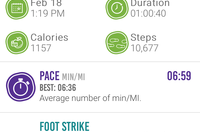
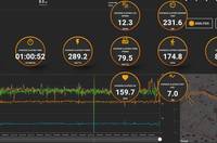
Nonetheless, let’s back up and compare that average data per run, and see how it differs between the units. I went ahead and manually pulled together the most common metrics for each device into the ‘top-line’ stats.

(Side note: I have no idea why the Milestone pod is so far off on distance, up until this run I’ve seen it no more than 1-2% of GPS distance. Also, for Kinematix and SHFT they use the phone’s GPS for distance.)
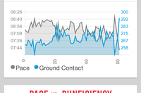
Now some platforms make it easier than others to compare the data more visually. For example, with Garmin Connect, I was capturing both the Garmin Running Dynamics (HRM-TRI) data side by side with the Stryd data on the same exact Fenix watch (using Connect IQ). And these days Garmin Connect plots that nicely on the same charts. Even better is that I can drag across the entire timeline and see like data points. So here’s the vertical oscillation at one totally random point:

So above we see that with the HRM-TRI it shows 10.4cm, whereas the Stryd shows 7.50cm. Let’s pick another random point:

Here you see it 9.2cm for Garmin, and 7.00cm for Stryd. Roughly a 2-3cm difference across the board when I drag to most places on the plot (you can drag around here too).
Let’s pick Ground Contact Time now:

You’ll see above it differs by about 22ms. So then I purposefully picked the biggest ‘spike’ I could find on the chart, to see if it would spike on both. And sure enough, it did:

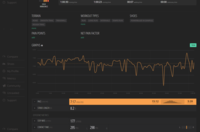
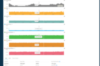
Well that’s positive – at least it’s spiking in the same place. So let’s look at the zoomed in chart on RunScribe and see if I can find the exact same point (48:56) and if there’s a spike there:

Sorta? It’s a bit trickier with RunScribe because there is no start button on the device, so it’s automatically based on a trigger of me starting to run. So in the above case, at exactly 58:56, it starts to climb, but it doesn’t really spike for another 15 seconds. Prior to that, it spikes significantly, but that was some 30 seconds earlier. So it’s possible, but it’s hard to know for certain because there’s no time alignment possible here without a start button.
Let’s look at SHFT then (zoomed in). For that, I start the app on the phone, and then stash it. So we’re looking at a couple of seconds difference likely with lag.

We do see a spike there in that region – but not unlike any of the other umpteen million spikes along the same run. Nothing like we saw with Garmin and Stryd as the biggest spike in the entire run. Further, all of SHFT’s values were well above even the highest of Garmin/Stryd’s values. In fact, for SHFT, it was more or less like any other minute except a spike at 37 minutes:

And looking back across the run, the same was true with RunScribe – it was just the norm with its highest spike at the 20-minute marker:

Now the above points show more than just differences with absolute numbers, but they show distinct differences with comparative data. Is it because they were measured in different spots (though the pods weren’t)? Or are companies averaging differently? Or are they smoothing differently? Perhaps all of the above.
But if we used that same fuzzy-logic when evaluating accuracy of heart rate (BPM) or power meters (watts), or even running pace itself – we’d be laughed out of the room. Results should be accurate, precise, and transferable between platforms without regard for the originating device.
Some will say:
“As long as it’s consistent, that’s all that matters.”
No.
No.
No.
It’s not all that matters.
First, it’s not consistent between the devices. Some see events that others don’t. And some exaggerate those moments (rightly or wrongly) more than others. For example, in the case of GCT above, a ‘spike’ for Garmin was approximately 47ms off run average (299ms vs 252ms). Yet for SHFT, it was 76ms above it’s baseline of 350ms (to 416ms). In the case of Stryd, it was 231ms (avg) vs 284ms (max). At first you’d say that’s numerically consistent (about 16% jump for Garmin and SHFT, and a 21% jump for Stryd).
Except one problem…they happened at different points of the run. They didn’t occur at the same point. So where one unit thought I was running along steady, the other thought it was a spike.
But let’s pretend they were consistent.
I still argue…no…no…no.
Because eventually you’re going to move on to another device. The lifespan of these devices here is realistically 2-3 years. For some folks, they might last a year or two, and for others 3-4. But sooner rather than later, they’ll die.
And then what? Do you throw out all your trending data? That’d be like throwing away all your running race PR’s because you found out every course you ever ran was mis-measured.
So what is it good for?

So at this point you may be saying “Well then, let’s just toss this stuff in the river and move on!”.
And perhaps that’s true. A large part of what I’ve argued for over the past few years is for companies like Garmin, Stryd, and others to actually partner with universities for longer term studies to prove that both trying to change running form with this data and actually changing it works. There are hundreds of studies that show how efficient elite runners are compared to us ‘normals’. But what virtually every study lacks is how to get from point A to point B. Causation vs correlation.
And to Stryd’s credit, as well as RunScribe, they have done a lot of work in publishing data on the peripheral of that. Not necessarily how to get from point A to point B or proving one can change their biomechanics, but at least sharing the data with the scientific community and having some of the fruit of that sharing being published. Which is somewhat ironic given that Garmin has likely hundreds of thousands times more data/runs than either of these two companies combined, but to my knowledge hasn’t published anything to prove how to use the metrics.
To that extent – there’s nothing wrong with gathering data for the assumption that some day we’ll see a scientifically backed book published on running metrics. Nor is there anything wrong with gathering data for the greater good. And finally, there’s nothing wrong with trying to figure our yourself what those trends are exactly. But from a coaching standpoint, today, it’d be extremely difficult for any coach to use data from different athletes on different devices and have much trust in it. As shown above, it’s just a crapshoot.
But – if you’ve got some insights into your running efficiency data experiences – feel free to drop them below. Perhaps collectively we’ll solve this riddle.