It’s been about a year since Xert plopped onto the training platform scene, and in that time it’s grown both considerably in functionality, as well as users. So what is Xert? Well, it’s part training platform, part training app ecosystem, and a lot of training and recovery theory/science.
As is becoming the trend with many training platforms these days, they have to become closer and closer to the end user during the workout itself. We saw yesterday for example the new TrainingPeaks Connect IQ app that they rolled out for doing just that. But Xert has actually had apps since last summer, and while TrainingPeaks delivers the structured workout files to the Garmin device, Xert goes much further in terms of control and dynamically changing the workout on the fly to match the workout goals.
One caveat though to save some readers some time: As it stands today, Xert is all about cycling. And specifically, all about cycling with a power meter. While there are some users experimenting with using it for running power, that experience is more for the adventurous geek than anything else. Somewhat like TrainerRoad, everything in Xert is about power data. Certainly you see your other data (i.e. cadence, speed, heart rate, etc…), but the automation and guidance is 110% power-cycling focused. It has no awareness or care about your jogging or play-time in the pool. So, if that’s you – I suggest going and reading a post or twelve in the travel section. It’s Friday after all.
(Preemptive note: Yes, I do pay for my own subscription to Xert…as well as Strava…and TrainerRoad….and Zwift…and TrainingPeaks via my Coach…and on and on.)
An Overview:
Getting an account setup on Xert is pretty straightforward, like most web platforms these days sign-up only takes a moment or two. Pricing is free for up to one activity a week (basically, to poke around), $9/month, or $99/year. Roughly in the ballpark with other training platforms, though a tiny bit cheaper than TrainingPeaks.
Of course with a training platform, you’ll want to get data into it. There are a number of ways to do that today. You can sync directly from services like Strava and Garmin Connect, as well simply import in files manually (or record them with the mobile app). You used to be able to sync from TrainingPeaks, but then TrainingPeaks killed that. You can however do a bulk import of TrainingPeaks data to Xert for those making the switch.
In any case, I use Strava to sync from. Which may sound somewhat funny, but my logic is simple: My Garmin Connect account is a mess (my fault), as it’s full of 3-5 data sets from every ride I do (multiple devices). Whereas my Strava account is actually relatively ‘clean’, with only a single entry for each ride. Thus, that’s what I sync from. The only caveat is that if you go the Strava route, Xert doesn’t get the original .FIT file from your Garmin. That only impacts things if you use the Xert CIQ Player app for structured workouts. Whereas if you use the Garmin > Xert sync, then you get that original data. Phew!
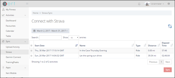
Once you complete a workout it’ll automatically show up in the dashboard to accept. In my case, I’ve set it to manually approve workouts into my dashboard. But for most people, you’ll just want to set it up to automatically import things. You can see below where I’ve got two workouts to accept. They even display the names I’ve given them in Strava:
(Unfortunately there isn’t a way to permanently mark something as ‘don’t bother to import’. I sometimes kinda wish there was a ‘permanently ignore’ function.)
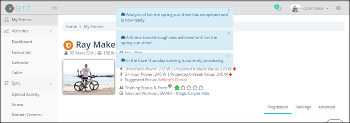
The whole sync process, even for a pile of rides, took all of a few seconds to complete (you can see them being shown briefly at the top as they process).
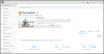
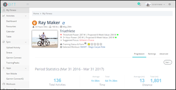
You can see changes from ride to ride in your general profile section under ‘My Fitness’, which then shows small changes with the arrows indicated (green in my case, because I’m becoming more awesome.) Note again that this is only rides, because the platform doesn’t support running, swimming, or cow-tipping.
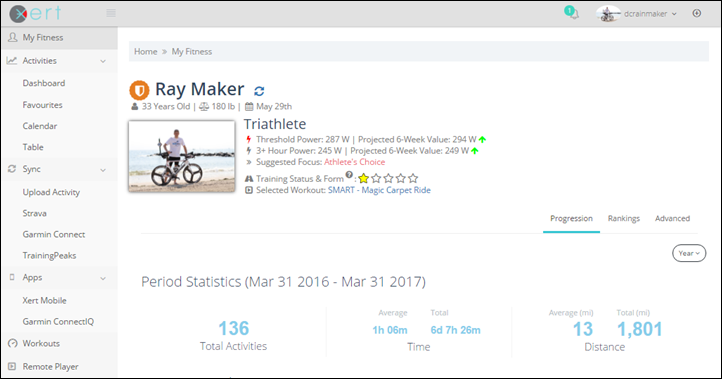
Here’s another example, this one showing the before (left) and after (right) importing the above two rides:
In this case the threshold power went from 272w to 287w, while my ‘3+ hour power’ went from 245w to 249w. So why the big jump? Well the last 3-4 weeks have been lower cycling-wise for me. With a week-long ski trip, a crapton of running, and a pile of swimming, I saw less cycling activity – so it presumed I was sucking more since it had only a handful of rides to go off of (which were mostly lower intensity). The reality of a triathlete/skier.
However, when I’m cycling every other day or so, then I tend to see shifts of only a watt or two.
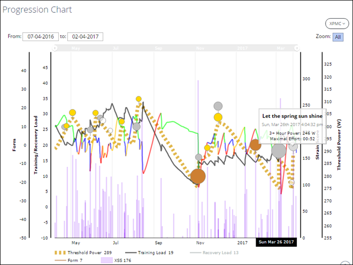
You’ll also notice above the predicted 6-week values, which look more at recent historical data and extrapolate it outwards/forward. All of this is also shown lower down on that same page, where it overlays against time. You can see how my cycling is really heavy from about now till the end of August. Then the hell that is Eurobike-Interbike-ANT+ Symposium conventions and travel sets in for September, where cycling drops off. And for some reason I didn’t upload much to Strava (and thus Xert) back in October. Weird.
In any event, if you look at the above, you can see the changes in threshold power plotted in yellowish, as well as key workouts that significantly altered the course of history. You can enable/disable any of these metrics just by clicking on them.
Note that there are slightly different terms here than in other platforms like TrainingPeaks, Strava, etc… That’s mostly due to trademark issues. For example, ‘Normalized Power’ is what TrainingPeaks calls one metric, whereas Strava calls it ‘Weighted Average Power’. Xert calls it it XEP – Xert Equivalent Power.
At a high level these might appear to be one and the same. But behind the scenes there are differences. For example, XEP takes into account rest more than normalized power would. So if you’ve got larger periods of rest you may see a difference between them.
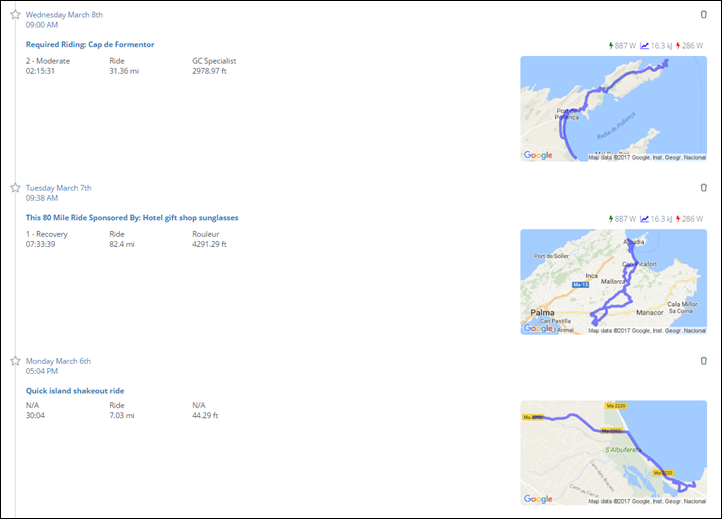
Speaking of activities, let’s dig into one. I can do that by clicking on any given workout in the views above, or I can go into a dashboard and see a long list of activities. Or calendar view to see the same laid onto a calendar.
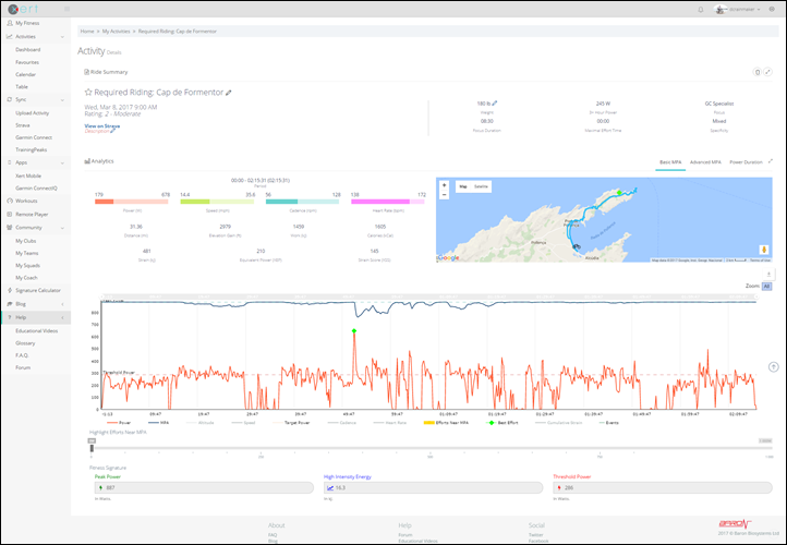
Selecting one will bring up the details of that specific workout. Here’s one of the ones from above (you can click to zoom in on it):
You can see you’ve got all the major data points you’d expect – such as distance, time, power, elevation, etc… Plus the map view seen above.
Down below I’ve got a chart that I can easily toggle different metrics on/off:
I can also switch that over to showing power duration, in a mean-maximal graph too:
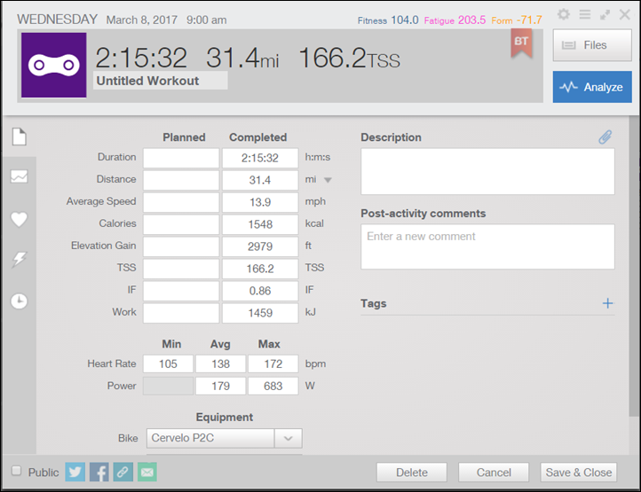
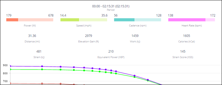
Just for fun, here’s how the two sets of core numbers such as TSS/Normalized Power/Intensity Factor vary between TrainingPeaks and Xert for this specific activity:
Or, in a text variant:
TrainingPeaks TSS: 166.2
Xert XSS: 145
TrainingPeaks Normalized Power: 232w
Xert XEP: 210w
Now, a few things to keep in mind on the above numbers. First is that since each of these platforms are basing some of these metrics on my FTP – you’re going to get different trickle-down values since my FTP was different in both applications. This is because Xert is tracking this dynamically, whereas TrainingPeaks requires manual updates (which I rarely do).
There are some metrics that aren’t shown in Xert. For example, left/right power balance isn’t seen anywhere. But, there are plenty others that are unique to Xert.
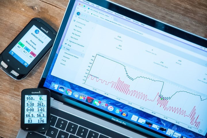
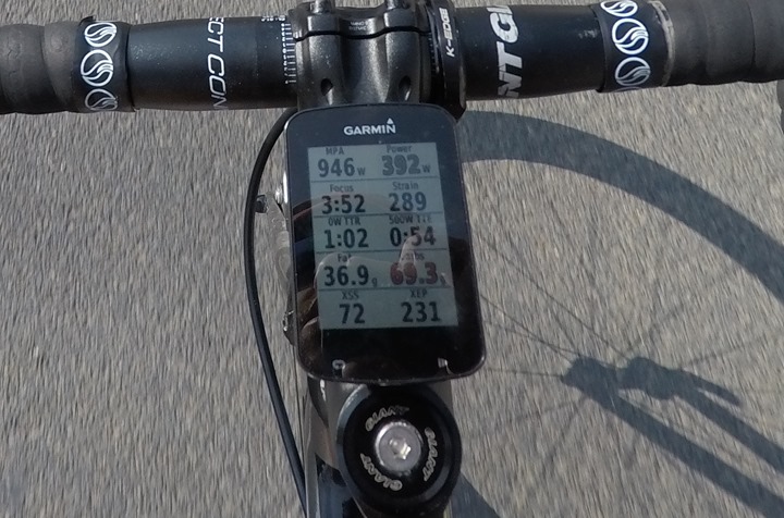
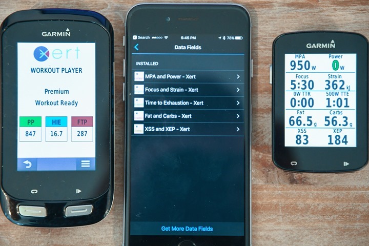
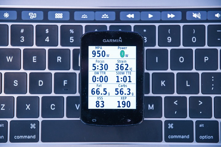
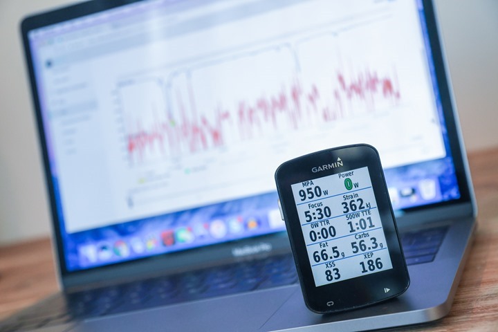
One of the most interesting is MPA – Maximal Power Available. Think of MPA as basically the absolute maximum power you can throw down at any given moment during a workout/race. This is your cap, your limiter. The MPA number is shown both in real-time on Garmin devices, as well as after the fact. You can see it below in the upper left. Also, note XSS in the lower left. You even get things like how long I can maintain 500w for at that moment and time (54 seconds).
Let’s look at one ride I did back in Melbourne that’s a great example of this. The dark line is my MPA, whereas the red line is my power throughout the ride. Gray in shadow is elevation.
What do you notice above? For the first portion of the ride, my MPA value (946w) remains essentially unchanged. As we cruise along at wattages between 150-300w, there’s very little impact to my MPA. It’s a group ride and things are pleasant.
But as we get into the middle section the group starts to surge up the hill, and my power along with it – moving upwards into the 400-600w+ territory (and those are 5-second averages too!). At the same time, you notice my MPA starts to decline. This tells me that I’m running out of juice.
Here’s a closer look at the climb. Notice how those slight flat sections on the hill (in grey) I reduce watts and my MPA starts to recover (goes up). Basically, I’m getting back ‘strength’ (kinda like back in the day in Street Fighter).
However, there’s one push that nearly did me in, where you see MPA and my actual power output nearly touch.
It’s at the above moment that I was giving it all I had, and MPA was correctly knowing that. I simply couldn’t output any more power than that. Keep in mind I was seeing this in real-time on my Garmin Edge device, using the MPA data field.
You can see above that over the course of the remainder of the ride I recovered my MPA during easy/rest periods, though some later sprints started to dive that down a bit more.
Now – there are some caveats here, primarily for triathletes. As noted at the beginning, Xert has no awareness of running or swimming (or any other sports). So the days before the above ride I did some pretty beastly trail runs with a lot of elevation gain in the heat. Thus, my legs were a bit more shot than Xert knew about. It thought I was fresh since I hadn’t ridden my bike in a few days. Thus many times for me as a multi-sport athlete, Xert will overestimate what I’m capable of.
On the flip-side, as a triathlete, MPA isn’t super important to me. It’d be unheard of for example to approach anywhere near MPA during a long-course triathlon race (if you did, you’re doing it wrong).
Still – MPA is one of the coolest features within Xert. And when combined with XSS, which I’ll discuss in the next section, it starts to be a different way of looking at things.
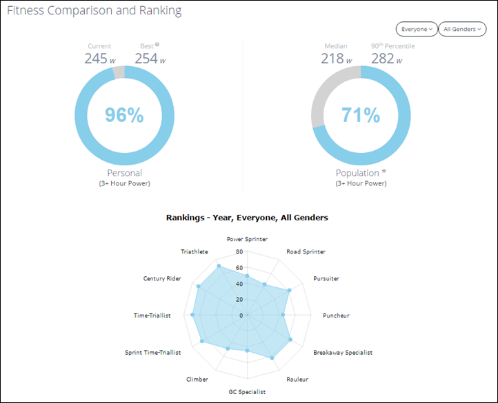
Oh, last but not least, for lack of anywhere else to put it – here’s a rankings page that they have:
The above tells you where I rank in the scope of life, but more importantly where one’s particular strengths are. Though, keep in mind that in some ways your strengths may reflect what you’re doing from a workout standpoint. Meaning, if your training is focused on time-trialing, then that’s likely what it’ll tell you you’re good at. Logical and all, but just keep that in mind.
Trainer & Connect IQ Apps:
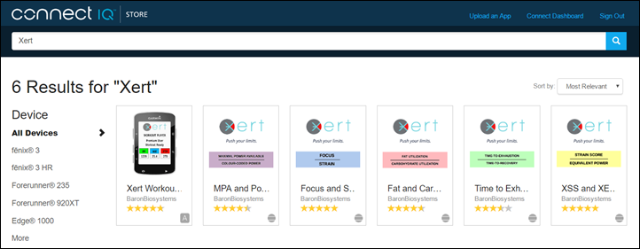
Since early in their existence, Xert has had Garmin Connect IQ apps. They’ve actually got a bunch of them. Some are technically data fields, while one is a true full-app (the Smart Workout Player).
When it comes to leveraging Connect IQ features, Xert is pretty much on the cutting edge of using everything Garmin has available to them. I’d easily argue that some of the features you see in Connect IQ today are directly as a result of the work the Xert team is doing to drive those capabilities into the products (even if they can’t be back-ported to every Garmin device).
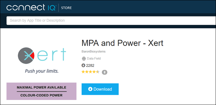
The data fields on these apps allow you to get much the same data as shown on the workout pages earlier in this post, but in real-time on your device. For example, the MPA metrics that we’ve been talking about are available as a data field. This is ideal since it doesn’t rely on a full-blown app, and can be used on almost every Connect IQ capable device (yes, even your Fenix 3’s and FR920XT’s!)
These are handy to arrange in an entire dedicated page if you want to on your device, or to use individually within other data pages:
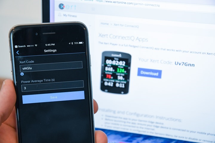
Note that you do need to remember to update your ‘Xert Code’ every once in a while (ideally each ride) for the data fields, which can be done via phone or desktop computer.
This tells the data field what your MPA and other metrics are. It’s a small code to copy/paste. Unfortunately, with Connect IQ data fields they can’t leverage a phone connection to a web platform behind the scenes to automatically update data like full blown Connect IQ apps can.
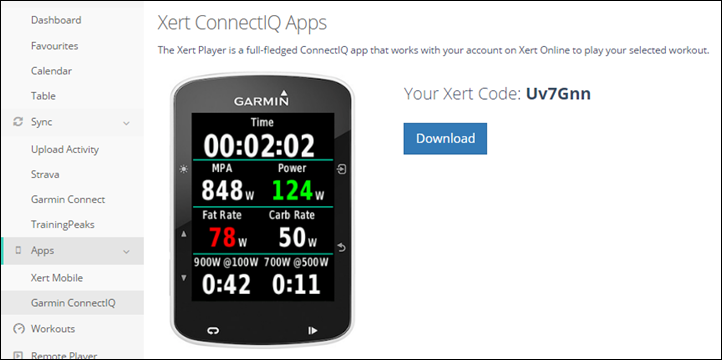
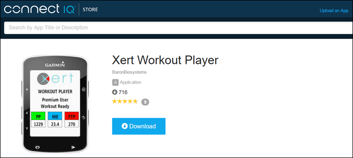
However, it’s not just a data field they have – but also a full Connect IQ app: The Xert Workout Player.
This app is designed to assist you in executing a workout, but does so in real-time in conjunction with their backend web services (though, it can work offline too). This is dramatically different than what I showed yesterday with the app from TrainingPeaks. In the case of that app, they’re essentially just handing over a pre-structured workout file to your Garmin device to execute. Basically the FedEx man.
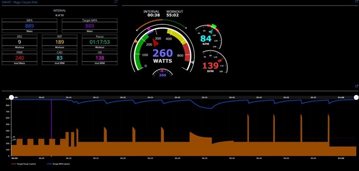
But in this case, Xert is actually running the entire workout experience. You never open up the regular Garmin cycling mode – everything happens within this Connect IQ app on your Edge device. Further, it’s dynamically adjusting the target durations in real-time as well as even streaming a live copy of that data in real-time to their servers.
Note that this is only available for Edge devices, and of course – only those Edge devices that support Connect IQ (Edge 520/820/1000 and the Edge Explore 820/1000).
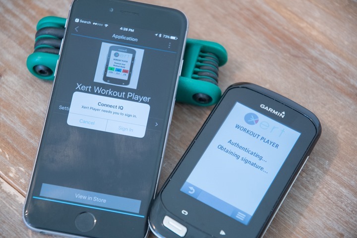
Here I am installing it on my Edge 1000. It’ll actually prompt you to authenticate with the Xert web service, via the phone (just once).
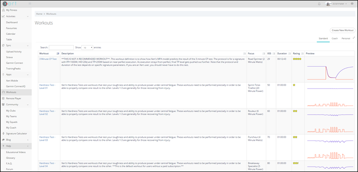
Now Xert has a huge pile of structured workouts that you can select from (just like TrainerRoad or Zwift does). As of this very moment, they have 92 to be exact. Plus, you can create your own, or if you have a coach on the platform, you’ll see their workouts too.
Workouts can roughly be divided into two camps: Normal workouts and ‘Smart’ workouts. Normal workouts have specific targets based on your current fitness (so they are still pretty smart in that they are based on your exact fitness level that day). For example, if I randomly pick this workout here – you’ll see it’s still filling in for me my target values. And, it’ll control the trainer to those values (if you have an ANT+ FE-C capable trainer).
So the above is pretty much like what TrainerRoad or Zwift or whoever else does it using estimated FTP values. There are small variations in terms of calculations and what-not. But the general gist of things is that once you press start, the workout will be exactly as you see it on the screen when you selected it, including the durations.
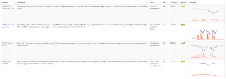
And that’s different than a ‘Smart’ workout. In a Smart workout the specifics of the workout can and will change dynamically. Specifically, the duration of each section. See, let’s pull open a ‘Smart’ workout. These are all titled ‘Smart’ in the name. Check out the list below (there are 37 ‘Smart’ workout as of this moment):
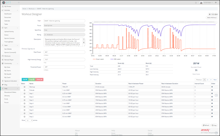
Notice the XSS column. The goal of that second workout is basically to accumulate 71 XSS points. XSS being ‘Xert Stress Score’. Sorta like TSS. The more XSS points you accumulate in a workout – the harder that workout likely was. Now, let’s crack open that second workout (Ride the Lightning). Here’s the overview first:
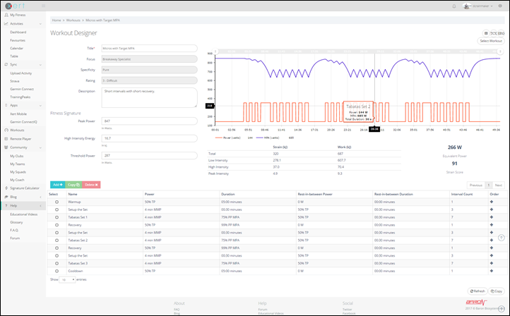
What you see above is that it’s bringing down your MPA (in purple) each time during the intervals – to a fairly significant amount in fact. And then it recovers them during the rest. But let’s look at a few of the exact steps down below:
So look at the ‘duration’ column. Notice how outside that initial warm-up (don’t worry, you can do a pre-warm-up if you want), there’s no times listed. No minutes or seconds. Instead, your duration is getting you to a specific MPA value. So basically, you’re going to keep working harder until you get to 95% reserve Maximal Power Available (on the first one). Then, you’re going to recover until you get to 99% MPA available (basically totally recovered).
No big deal, right?
Ahh, not exactly. What happens then is that the structured workout basically keeps hammering you harder and harder and reduces your recovery each time. But it does let you recover. What’s critically important to understand here on how this differs from others is that it’s dynamically responding to your ability to execute the workout. It’s not preset in terms of how long the workout can take.
Let’s put this into practice for a second. Here’s the app ready to roll on my Garmin Edge device. It’s loaded up and it knows which workout I’ve selected through the web interface. It then connects to my ANT+ FE-C trainer, as well as my power meter and cadence/HR sensors. You don’t need an FE-C trainer for this, but if you have one then it’ll do it for you. Additionally, if you have a power meter then it’ll do power matching to ensure your values match inside and outside. In fact, it’s continually calibrating this power meter difference in real-time behind the scenes throughout the workout.
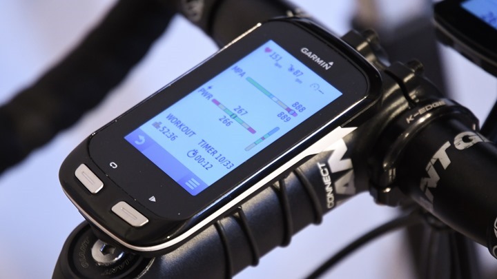
You can start-off with doing your own warm-up, or you can use the usually very small warm-up that’s baked into the workout. In general, I’d recommend doing your own 10-minute or so warm-up. In the below case, I’ve got 12 seconds left in this workout segment, with a target of 266w. I’m maintaining 267w at that moment.
It’ll show the time remaining for each step along the bottom right, as well as the target power and your power in the middle. Current cadence and heart rate is also shown above.
It’s going to automatically control the trainer for you (again, if you have a trainer with FE-C) and keep you on task. It’ll also chirp at 5 seconds before the end of each section.
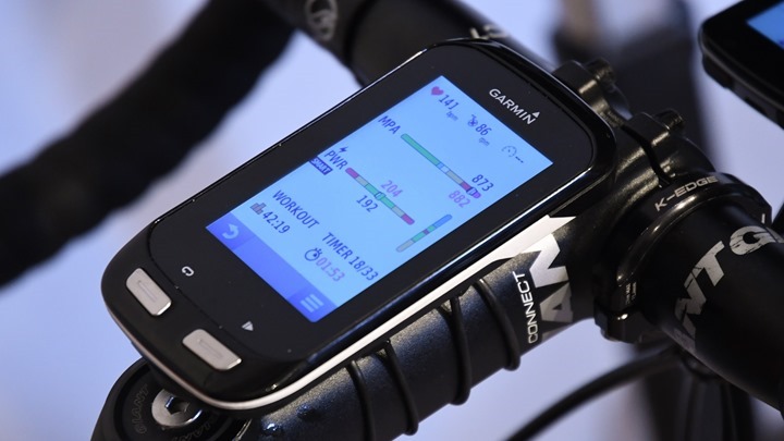
Where it gets ‘interesting’ is when you get into the ‘Smart’ section of a workout. The unit will then start to play mind-games on you. At this point you’ll be given a target, and a timer. But that timer will speed up or slow-down to keep you accumulating the exact amount of XSS (or hitting the specific MPA value). So even though it may say you’ve got a 4-minute recovery, that could really be 6 minutes or 3 minutes depending on how things are going.
In the case of below, I’m in a recovery segment that’s got me at 192w, and in theory has 1 minute and 53 seconds left. In practice, it was actually longer.
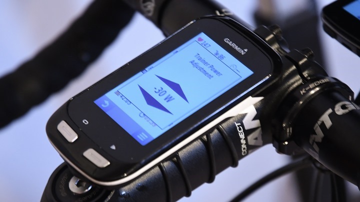
The good news is you can tweak the workout in real-time. For example you can swipe left to decrease resistance by 5w, or right to increase by 5w. Keep swiping to keep increasing/decreasing. That cascades down into speeding up or slowing down segments since you’re accumulating XSS faster or slower.
Now only that, but this is all streamed live to the Xert site, allowing a coach or yourself to view it on a desktop player. Speaking of which, while I don’t cover it here – Xert does have an entire coaching section too. That allows coaches to have athletes assigned to them and so on. But again, a bit out of the scope of this post.
What’s cool is that any of these sections with the tiny arrow in/next to them can be broken out into new windows – so you can overlay it next to Netflix/Hulu/YouTube/etc….
The behind the scenes on this is kinda techy-cool, since it goes from your Garmin Edge device –> Phone (via Bluetooth Smart) –> Xert online (via WiFi/Cellular) –> Your desktop (via interwebs). And the ‘lag’ response of that entire process is within about 1.5-2s. I’ve got a video coming up in the next day or so that shows exactly how it works (thus, subscribe to my YouTube channel!). Note there is no lag on the actual Edge itself.
Afterwards, you’ll get all of this data saved to the site to analyze just as I did for the rides up above. Pretty much same-same there. Though, you don’t get an overlay of the planned structure on-top of the actual executed workout if you sync via Strava, but rather, only via Garmin Connect. That’s because via the Strava route the Garmin .FIT file Developer Fields gets ripped out. Whereas directly from Garmin they don’t.
Btw – one oddity I had that some might remember is a few weeks ago I did a Smart workout where I basically failed to complete it. Meaning, I couldn’t pedal anymore. Lots of folks wondered if that was a Xert failure, a me failure, or something else. Well, a bunch of folks (Garmin and Xert) did a bunch of digging into my pile of files and found what was occurring was that Xert as using power matching from my power meter. But the head unit was seeing power meter dropouts for whatever reasons, so that was giving incomplete data to Xert, causing all sorts of problems. It had one skewed vision of reality. I haven’t seen that happen on other workouts.
Phew. So there ya have it – a deep dive into their apps. Definitely super cool stuff.
Finally, I want to note that there is also an Android version of their app – so if you don’t have a Garmin Edge device, you can get all this same data (and actually a fair bit more) on the smartphone variant. The reason it’s primarily Android today is that iOS doesn’t support ANT+ natively, and most folks are using ANT+ cycling sensors. I did cover the Xert Android app back in my Trainer App post this winter here, so check that out for more details on it.
Going forward:
I think what makes Xert fascinating is the blend of both a training platform with lots of depth, but also the various apps they’ve created to bridge that experience in front of the cyclist during the workout. And that’s key. There’s lots of apps to analyze training data, but there are far fewer apps that can give and change workout/race guidance in real-time.
One of the other things that’s been interesting to watch is how the Xert team reacts to feedback from the cycling community at large. Both in terms of proactive communications and explanations, as well as reactive ones. You’ll find them pretty active in many forums, but especially so on the Wattage forums. With any sort of complex sport science, you’re going to get dissenters about what you’re doing. Even myself; I’m not in a position to judge all the science aspects of something like this (I’m focused more on the tech). But what’s key here is that the Xert team is pretty happy to explain what they’re doing and provide real-world actual data to back it up. They’ve also been relatively up-front about when they’ve tweaked algorithms or assumptions.
Of course, for the triathlete like myself – Xert is harder to use in a standalone setting. Since it ignores the other and equally painful workouts, it’s going to be hard to predict and analyze accurately what I’m doing. But for a pure cyclist that has a power meter, it’s one of the most solid all-inclusive options out there today.
With that, thanks for reading!
(Side note: For another third party view on Xert, check out Richard Wharton’s couple posts on using it in training. His data is a bit ‘cleaner’ than mine as it’s a bit more structured.)


