Sometimes, beauty is only skin deep.
And unfortunately in the case of the Vivomove HR – that’s never been more true.
But let’s not get too far ahead of ourselves. The Vivomove HR is the second iteration of Garmin’s dabble in classic timepiece looking watches, which they kicked off last summer with the original Vivomove. These watches were Bluetooth Smart connected, but mostly looked like a regular watch. They did, however, have an internal step-counter in them, and could track other activity metrics like sleep and even some exercise. They were essentially Garmin’s take on the once popular Withings Activité trackers.
And while Garmin didn’t sell a ton of them – I actually thought they were pretty darn cool and looked really nice. The one challenge they faced though was lack of a heart rate sensor on the back (which Withings added in their Steel HR variant), as well as more clear smart notifications. Add those two things in, along with a pile of other features like stress tracking and you’ve got yourself a Vivomove HR.
(Yes, I’m slowly iterating through each of Garmin’s three announcements last Thursday. Given I only have so many wrists…and so many workouts…I’m spending quality time with each. Sometime tomorrow I’ll also post on the new Vivosport after I’ve finished a couple more workouts.)
The Tech Details:
As noted earlier, the Vivomove HR is designed to be the upgrade for the existing Vivomove. That watch lacked an optical HR sensor, or any sort of data fields on the display aside from mechanical step counters. On the flip side…man, it looked nice.
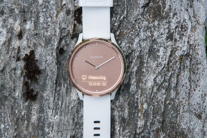
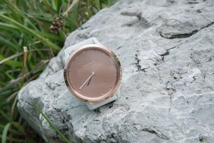
With the new Vivomove HR you’ve got a display hidden behind the watch face. It’s an incredibly impressive piece of engineering. If you look at the watch in any light, you won’t see the display hidden behind. It just looks like a normal watch:
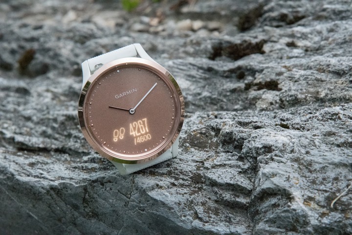
Yet once you tap it or raise your wrist, the display illuminates and you get data:
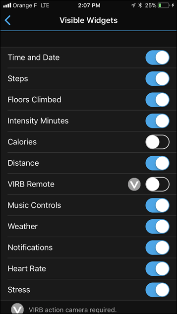
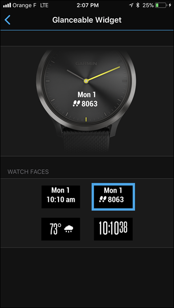
The watch can show all sorts of metrics, with similar data fields to that of the base Vivosmart units. For example, you’ve got the following data pages:
Date/Day + Steps
Date/Day + Time + Battery Status
Steps and Step Goal for Day
Flights of Stairs and Stair Goal for Day
Intensity Minutes and total goal for week
Distance walked
Music control (for phone)
Weather at current location, high and low forecast
Smartphone notifications (anything from texts to Snapchat)
Current Heart Rate + 7 day Resting HR
Current Stress Score
Calories
VIRB Action Cam Remote
Phew! Lots of options, all customizable via the Garmin Connect app.
Here’s a small gallery of some of the data pages:
I really like the icons and such on the weather page in particular, just super clean and well done.
Another subtle touch is that when data fields are illuminated, the watch hands actually move up and out of the way, kinda like doing the YMCA song. That way it doesn’t block the text fields. The split second the display turns off – the hands go back to their position.
When it comes to the band, the stock/default is a silicone material, though they use standard quick release watch bands – so any 22mm band should do just fine.
Charging-wise, they skipped the semi-universal (2017 anyway) charging cable that’s on the Fenix 5/FR935/Vivoactive 3/Vivosport and went with the same connector used on the Forerunner 735XT, Forerunner 35, and a few other watches I can’t think of at the moment. Battery-life wise, the unit claims 5 days in smartwatch mode, and two weeks in non-smartwatch time-only mode. Note there is no GPS in it, and it can’t leverage your phone for GPS either.
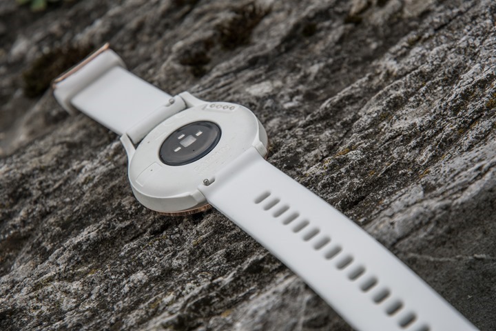
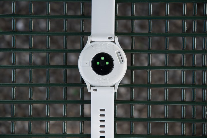
For the optical HR sensor on the back, it’s the same 2017 edition of the Garmin Elevate sensor you see on the FR935 and Fenix 5, among other watches:
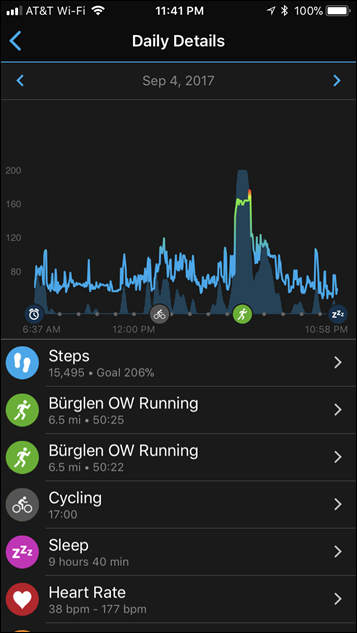
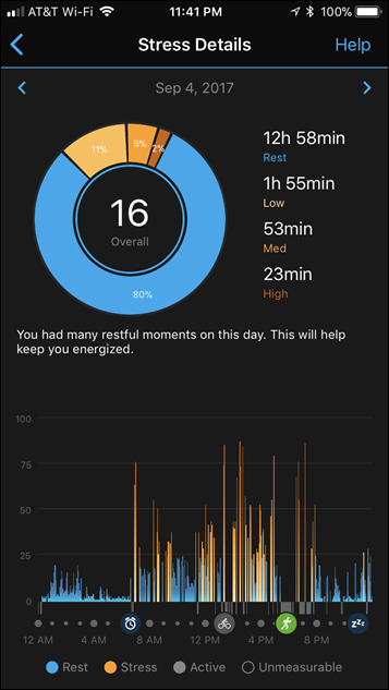
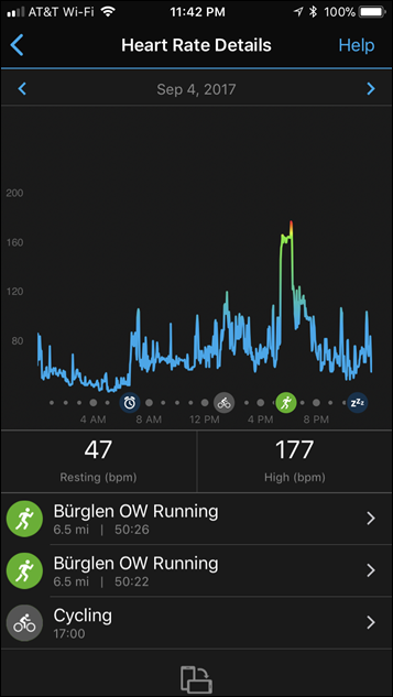
This means it’s recording resting HR 24×7 at 1-2 second intervals, which is kinda nifty. Same goes for daily stress levels, which was introduced on the Vivosmart 3 this past spring (and is coming shortly to the FR935 and Fenix 5 too). All of that is viewable on Garmin Connect/Garmin Connect Mobile as well:
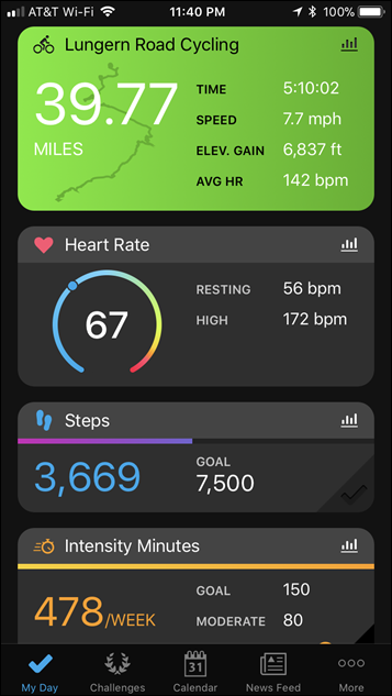
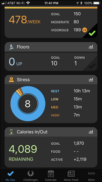
Furthermore, all of the step and related data will show up there too – and even in the new interface that consolidates the data far better on the home page:
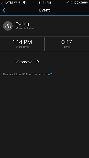
Same goes for sleep data and any other activity metrics. Note that there isn’t a way to manually start an official workout on the Vivomove HR, though it will automatically track certain activities like riding a bike or running. The default trigger time can be set within the unit, and then from there it’ll create legit activities in your activities page. Else you’ll just see them show up as sorta-activities on your calendar like below (my calendar is a mess because of all my devices, but note the 17:00 cycling activity):
Now everything I just covered works great. I’ve had no issues with anything above from a technical standpoint. It’s clean and happy and life is grand. Except one itty bitty thing.
Where it all went wrong:
What’s somewhat ironic is that I didn’t actually notice this…umm…’glaring issue’ at first. See, Garmin had sent over a white and goldish Vivomove HR to try out, mostly aimed at The Girl giving it a whirl. As such, I didn’t end up wearing it much the first few days at Eurobike, aside from pairing it to my phone and poking at it a little bit inside in the evenings. Then, over the following few days the weather was dismally rainy – so again, I was either inside or the thunderstorms kept the outside light pretty dark.
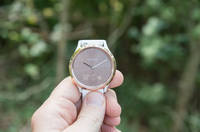
So it wasn’t until this past Sunday while walking around with it outdoors during the day that I realized something crazy: You actually can’t see the screen outdoors with any daylight.
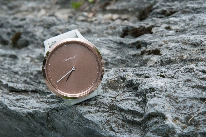
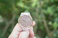
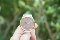
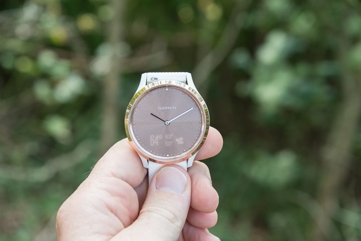
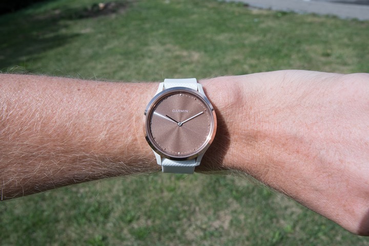
Here, let me explain. This is the screen outdoors:
Oh, and the above? There’s actually text on the screen showing my steps. But you can’t see it – it’s totally invisible. (You know the picture above is legit with data because the hands on the watch are doing the YMCA dance.)
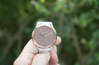
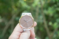
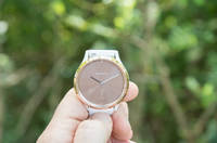
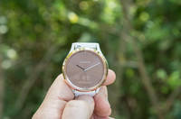
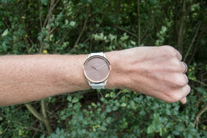
Here’s what happens if I find a darker/shadier spot near the bushes. The text is faint, but still visible (it actually looks better in the camera due to getting the exposure just perfect with the refresh rate).
And thus, the fail boat we have.
With confusion I went back to Garmin to ask what I was doing wrong, and unfortunately the answer was nothing (and it wouldn’t be appreciably different on the other color scheme model).
This was simply the tradeoff they made to make the underlying display totally invisible when not showing text. And to be fair – that part does work well. Really damn well – it’s incredible.
Except, the invisible part carries over to where it shouldn’t: When you actually want to see the text.
And thus you end up with a watch that doesn’t show you anything when outside.
And honestly, that’s really all there is to say about it. I’m not sure how many more ways I can say that the display is totally useless outside.
Oh, wait, actually, here’s The Girl’s official one word review on it: “Eck.”
She’s back on her Fenix 5S.
Wrap-up:
The Vivomove HR is a watch that is stunningly beautiful when used inside. It’ll look great on trade show floors, as well as inside your friendly Best Buy. Really – I’m not kidding when I say it’s a stunning watch, especially technologically to have the display hidden behind the watch face and only appear when you raise your wrist. It’s brilliant.
Unfortunately, it’s just a bit too far ahead of its time. Without the ability to go outside and use the watch for the very thing you’re likely to do outside with it: Use it.
As such, it seems half-baked at best. Yes, the display technology is cool, but not when you make an active watch that can’t be used outdoors. Hopefully, we’ll see them take another crack at this, because if it had worked I’d happily recommend it to those that fit a certain profile.
But in this case, I can’t see who I’d recommend it to.
With that – thanks for reading.
(As an aside, in the next day or so I’ve got a post on the Vivosport that was also announced last week. While I see the Vivomove HR as a flop, Garmin did announce five products in total last week – the others being very solid. So four out of five isn’t a bad ratio, or so says pharmaceutical TV commercials.)


