As might be obvious these days, publishing a study on wearables is the fashionable thing to do. There seems to be a new major (or at least noticed in the mainstream media) wearable study published every month. Sometimes more often. And that ignores the likely hundreds of smaller and never picked up wearable studies that probably occur each year in all manner of settings.
And in general – these studies are doing good work. They’re aiming to validate and hold accountable manufacturer claims. That’s always a good thing – and something I aim to do here as well. Many times these studies will focus on a specific claim – such as heart rate accuracy, or step accuracy. As those are generally somewhat easy to validate externally through a variety of means. In the case of steps it can be as simple as manually counting the steps taken, and in the case of heart rate it may be medical grade systems to cross-reference to.
All of which are 100% valid ways to corroborate data from wearables.
Except there’s one itty bitty problem I’m seeing more and more often: They’re often doing it wrong.
(Note: This isn’t the first time I’ve taken a supposedly scientific study to task, you’ll see my previous rendition here. Ironically, both entities screwed up in the same way.)
Why reading the manual matters
Most studies I’ve seen usually tackle 5-7 different devices to test. Almost always one of these devices is an Apple Watch, because that has mainstream media appeal. Additionally, you’ll usually find a Fitbit sensor in there too – because of both mainstream media interest as well as being the most popular activity tracker ever. After that you’ll find a smattering of random devices, usually a blend of Mio, sometimes Garmin, sometimes Polar, and then sometimes totally random things like older Jawbone or others.
From there, devices are tested against either medical grade systems, or against consumer grade systems. The Polar H7 strap is often used. Which while not quite as ideal as medical grade systems, is generally a good option assuming you know the obvious signs where a strap is having issues (remember – that’s still a very common thing).
But that’s not what’s concerning me lately.
(Actually, before we go forward – a brief aside: My goal isn’t to pick on this Stanford study per se, but that’s probably what’s going to happen. I actually *agree* with what they’re attempting to say in the end. But I don’t agree with how they got there. And as you’ll see, that’s really important because it significantly alters the results. Second, they’ve done a superb job of publishing their exact protocol and much of the data from it. Something that the vast majority of studies don’t do. So at least they’re thorough in that regard. Also, I like their step procedure for how they are testing it at different intensities. One of the better designed tests I’ve seen.
Next, do NOT mistake what I’m about to dive into as saying all optical HR sensors are correct. In fact, far from it. The vast majority are complete and utter junk for workouts. But again, that’s not what we’re talking about here. This is far more simplistic. Ok, my aside is now complete.)
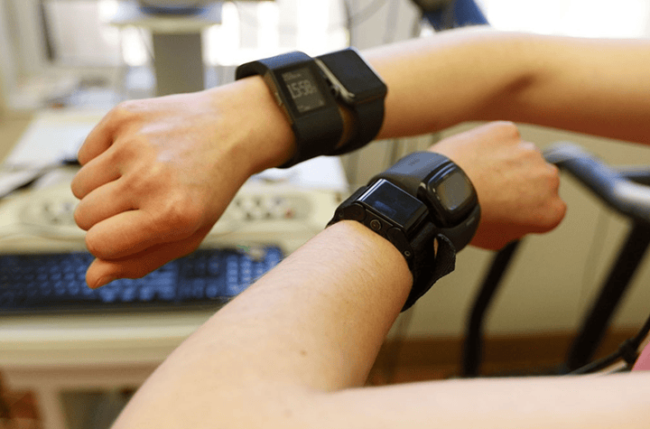
Instead, what’s concerning me lately is best seen in this photo from the Stanford study published last week (full text available here):
(Photo Credit: Paul Sakuma/Stanford)
As you can see, the participant is wearing four devices concurrently. This is further confirmed within their protocol documents:
“Participants were wearing up to four devices simultaneously and underwent continuous 12-lead electrocardiographic (ECG) monitoring and continuous clinical grade indirect calorimetry (expired gas analysis) using FDA approved equipment (Quark CPET, COSMED, Rome, Italy).”
First and foremost – the Mio Alpha 2 on the left wrist (lower one) is very clearly atop the wrist bone. Which is quite frankly the single biggest error you can make in wearing an optical HR sensor. It’s the worst spot to wear it. Don’t worry though, this is covered within the Mio Alpha 2 manual (page 6):
But let’s pretend that’s just a one-off out of the 60 participants when the camera came by. It happens.
The bigger issue here is them wearing two optical HR sensor devices per wrist (which they did on all participants). Doing so affects other optical HR sensors on that wrist. This is very well known and easily demonstrated, especially if one of the watches/bands is worn tightly. In fact, every single optical HR sensor company out there knows this, and is a key reason why none of them do dual-wrist testing anymore. It’s also why I stopped doing any dual wrist testing about 3 years ago for watches. One watch, one wrist. Period.
If you want a fun ‘try at home’ experiment, go ahead and put on one watch with an optical HR sensor. Now pick a nice steady-state activity (ideally a treadmill, perhaps a stationary bike), and then put another watch on that same wrist and place it nice and snug (as you would with an optical HR sensor). You’ll likely start to see fluctuations in accuracy. Especially with a sample size of 60 people (or 120 wrists).
I know it makes for a fun picture that the media will eat up – but seriously – it really does impact things. Similarly, see in the above picture how the Apple Watch is touching the Fitbit Blaze? That’s also likely impacting steps.
Another fun at-home test you can do is wear two watches side by side touching, just enough so while running on a treadmill they tap together. This can increase step counts as a false-positive.
Which isn’t making excuses for these watches. But it’s the simple reality that users don’t wear two optical HR sensor watches in the real world. But honestly, that’s probably the least of the issues with this study (which is saying a lot, because at this point alone I’d have thrown out the data).
In case you’re wondering why they did this – here’s what they said:
“1) We wanted to check for any positional effects on the watch performance –i.e. does right vs left wrist matter? Does higher or lower on the wrist matter? So watch arm & position was randomized (see supplementary tables in manuscript).
2) We are more confident in results obtained from same workout rather than separate workouts for each device.
3) Purely practical — having the same subject perform the protocol 4 – 7 times is infeasible. It would have been challenging to get compliance in a sufficient number of subjects.”
I get that in order to reduce time invested, you want to take multiple samples at the same time. In fact, I do it on almost all my workouts. Except, I don’t put two optical HR watches per wrist. It simply invalidates the data. No amount of randomizing bad data makes it better. It’s still bad data.
And when we’re talking about a few percent mattering – even if 1 out of 5 people has issues, that’s a 20% invalidate data rate – a massive difference. There’s no two ways about it.
Let’s Talk Fake Data
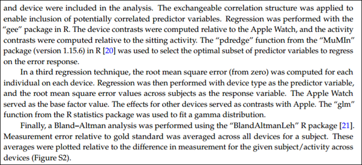
Another trend I see over and over again is using one-minute averages in studies. I don’t know where along the way someone told academia that one-minute sport averages are acceptable – but it’s become all the rage these days. These studies go to extreme degrees on double and triple regression on these data points, yet fail to have accurate data to perform that regression on.
Just check out the last half of how this data was processed:
Except one itty-bitty problem: They didn’t use the data from the device and app.
Instead, they used the one-minute averages as reported by various methods (most of which aren’t actually the official methods). For example, here’s how they accessed the Mio Alpha 2:
“The raw data from the Mio device is not accessible. However, static images of the heart rate over the duration of the activity are stored in the Mio phone app. The WebPlotDigitizer tool was utilized to trace over the heart rate images and to discretize the data to the minute level.”
Translation: They took a JPG image screenshot and tried to trace the image to determine the data points.
Pro Tip: They could have simply connected the Mio Alpha 2 to any phone app or any other watch device to gather second by second HR data via the rebroadcasting feature. After all, that’s kinda the main selling point of the Mio Alpha 2. Actually, it’s almost the only selling point these days.
Or here’s how they did the Microsoft Band:
“The mitmproxy software tool [15] was utilized to extract data from the Microsoft Band, following the technique outlined by J. Huang [16]. Data packets transmitted by the Microsoft phone app were re-routed to an external server for aggregation and analysis. Sampling granularity varied by activity J. Pers. Med. 2017, 7, 3 5 of 12 and subject. In cases where multiple data samples were collected each minute, the last data sample for the minute was utilized in the analysis.”
So, let me help you decode this: They didn’t use the actual data recorded in the app, but rather, they picked data at one-minute intervals in hopes that it’d represent what occurred in the previous minute. Yes, the Microsoft app sucks for data collection – I agree, but this isn’t an acceptable way to do deal with such suckiness. You don’t throw away good data.
Or, here’s how they did the Apple Watch data:
“All data from the Apple Watch was sent to the Apple Health app on the iPhone, and exported from Apple Health in XML format for analysis. The Apple Health app provided heart rate, energy expenditure, and step count data sampled at one minute granularity. For intense activity (running and max test), the sampling frequency was higher than once per minute. In cases where more than one measurement was collected each minute, the average measurement for the minute was utilized, since the minute average is the granularity for several of the other devices.”
So it gets better in this one. They acknowledge they actually had the more frequent data samples (they’d have had 1-second data samples), but decided to throw those out and instead average at the minute.
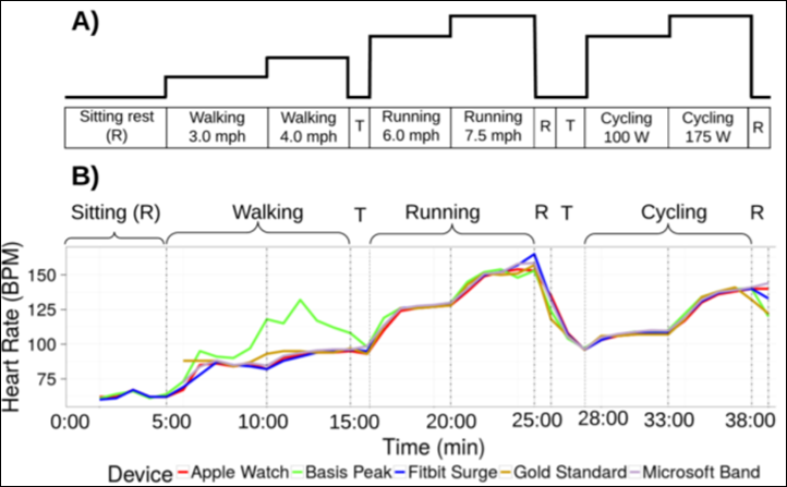
But what’s so bizarre about this is how convoluted this study attempt was when it came to collecting the data. Remember, here’s roughly what each participant did:
So you see what are effectively three and a half sports here: Walking, Running, Cycling, and…Sitting.
That’s fine (I like it actually as I said before). There’s complete validity in testing across all three and a half things. But where the mistake was, is trying to treat it as a single entity and record the data streams live. They skip over in the study procedure documents whether these devices were even switched between running and cycling mode for example. None of the devices they tested were multisport devices. So did the participant stop and start new activities? The graphs above certainly don’t show that – because doing so on most of these devices isn’t super quick.
None of which explains the most obvious thing skipped: Why not use the activity summary pages from the apps?
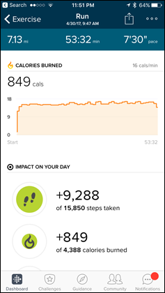
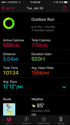
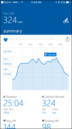
Every single one of the devices they tested will give you a calorie total at the end of the activity. Here’s a few pages from these respective devices that show just that (left to right: Fitbit, Apple Watch, Microsoft Band):
Calories is prominently displayed for these workouts on all three of these apps. This is the number they should have used. Seriously. Companies make this pretty little page so that every one of us on this planet can easily figure out how much ice cream we can eat. It’s what 98% of people buy activity trackers for, and in this case they didn’t use the one metric that the entire study is based upon.
Instead, they tried to triangulate the calories using minute averaged data. Which…isn’t real data anymore. It’s alternative facts data. And thus, you get inaccuracies in your results.
I went back to them and asked about this too, here’s why they didn’t use the totals in the app:
“This is a good idea, but unfortunately per-workout totals are reported as a sum of calories for a given workout. We were instead interested in per-minute calorie expenditure, which would not be reported in the per-workout summary. The reason for our interest in the per-minute values is that there is some adjustment as a person transitions from one activity to another (in both heart rate and energy expenditure). Consequently, in the 5 minute protocol for each activity, we used the energy expenditure and heart rate for the final minute of the protocol (to ensure that a “steady state” rather than transient measurement was obtained).”
I get what they are saying – but again, that’s not giving an accurate picture of the calorie burn. Instead, it’s only looking at the *average* of the one minute per each protocol chunk. I’m not sure about you, but I don’t typically throw away my entire workout, save the last minute of it. Also, by focusing on a single minute’s worth of data, it serves to exaggerate any slight differences. For example, if you take one minute where one unit may be off 1-3 calories, but then multiply it out over a longer period – it exaggerates what didn’t actually happen. We don’t know what happened in those other minutes, because they were thrown away.
And that all assumes they got the right numbers (for example, the JPG graph conversion is notoriously easy to get wrong numbers from).
Note: I did confirm with them that they configured each device within the associated app for the user’s correct age/gender/weight/etc as supported by that individual device. So that’s good to see, a lot of studies skip this too – which also would invalidate the data by a huge chunk.
Wrap-up:
Early on in the study, they state the following:
“All devices were bought commercially and handled according to the manufacturer’s instructions. Data were extracted according to standard procedures described below.”
The only thing likely true in this statement was that all devices were bought commercially. After that, nothing else is true. The devices were not handled in accordance with manufacturer’s instructions. Further, the data was not extracted according to manufacturer’s intent/instructions. And then to imply the methods they used were ‘standard’ is questionable at best. The standard method would be to just look at the darn activity pages given on every single app out there. Did the calories match? It’s really that simple for what their goal was.
Instead, they created a Rube Goldberg machine that produced inaccurate results. Which is unfortunate – because I actually agree with the theory of what they’re saying: Which is that every company does something different with calories. Unfortunately, they didn’t prove that in this study. Instead, they proved someone didn’t read the manual on how to use the devices.
Which ironically is exactly the same problem the last time I dug into a study. The folks in question didn’t use the products properly, and then misunderstood how to analyze the data from it. No matter how many fancy algorithms you throw at it, crap data in means crap data out.
Once again, you have to understand the technology in order to study it.
Sigh.


