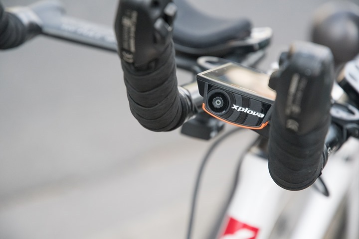
When the Acer Xplova X5 was announced last year, it got a lot of attention for its headline-grabbing features: An integrated action camera, cellular connectivity, full color touchscreen with maps, and integrated nacho cheese dispenser. Well, maybe not the dispenser. But certainly the others.
The question was – would it be a worthwhile unit? Actually, the real question was – why the heck is Acer making a bike computer? Aren’t they still making computers with 8X CD-RW drives?
Turns out they have a lot of potential. And since starting shipping a month or so ago, the end-result is both awesome and face-palming at once. It’s like seeing a lonely piece of bacon lying on the side of the road. It had amazing potential, but failed in execution.
And thus: The Acer Xplova X5.
But don’t mistake the above for thinking the potential in the X5 is bad. In fact, there are boatloads of lessons that companies like Garmin, Wahoo, Polar, and others can learn from the Xplova X5. And in turn, one can only hope that Acer reciprocates in learning those lessons from the leading bike computer companies. After all – the others didn’t get to be leaders for no good reason. Equally, with the Xplova X5 having an HD camera in it, cellular connectivity, and much more – there’s definitely some interesting tech to be seen. I’d highly recommend folks read through to understand where Acer has some really innovative ideas here.
So I’m going to shake things up a bit here in my standard review formatting. Many times I’ll never finish writing a review because I end up getting bored with a product. So much so that going through all the work to get a review out for a product that I know nobody cares about, seems silly. I have a graveyard of partially finished review posts. I just get distracted in that there are so many other interesting things out there (good or bad) to talk about. So I’m going to consolidate this down into four core sections:
– What’s in the box: Ok, we’ve at least got to have an unboxing, I took the darn photos after all
– The Basics: Let me just give you a flavor of things
– What I like: Here’s the things that actually do make it unique
– What I hate: And here’s why this is the dish that I don’t need any more bites from.
Simple as that. This gives you the key takeaways from my time with the unit, without expending time that could be used for going deeper on some other technology that you want to hear more about. Sound good? Good. Consider it an experiment.
What’s in the box:
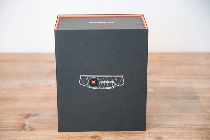
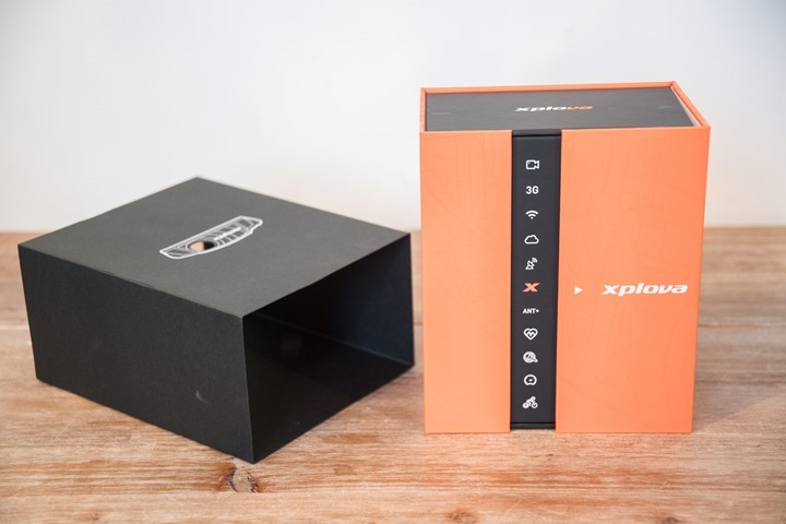
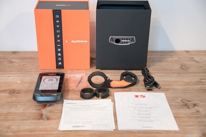
First up is getting it out of the box. It’s actually a pretty cool designed box.
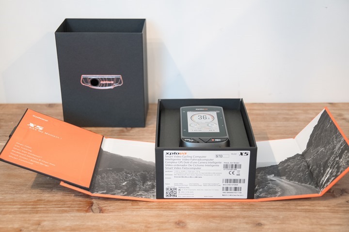
Inside you’ll find the unit looking up at you, with the extra parts sitting below it.
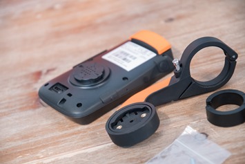
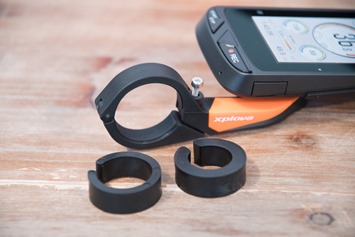
Those extra part goodness pieces are an out-front bike mount, some paper manuals, two out-front mount adapters (to fit different bar sizes), a small hex wrench (to attach mount), and a micro-USB charging cable.
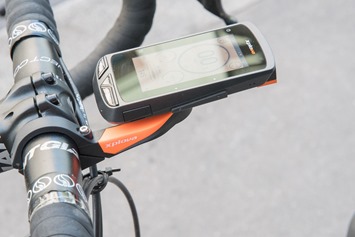
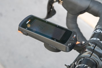
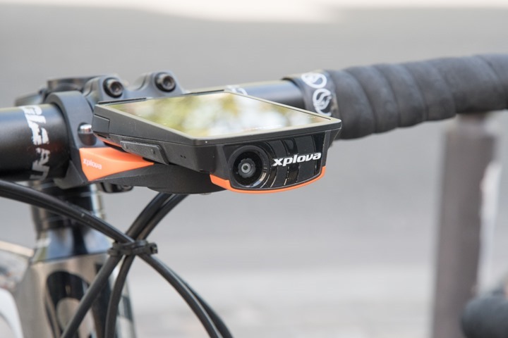
The mount uses the standard Garmin quarter-turn mount, and the actual mount itself is very similar to the one that Garmin provides in some bundles.
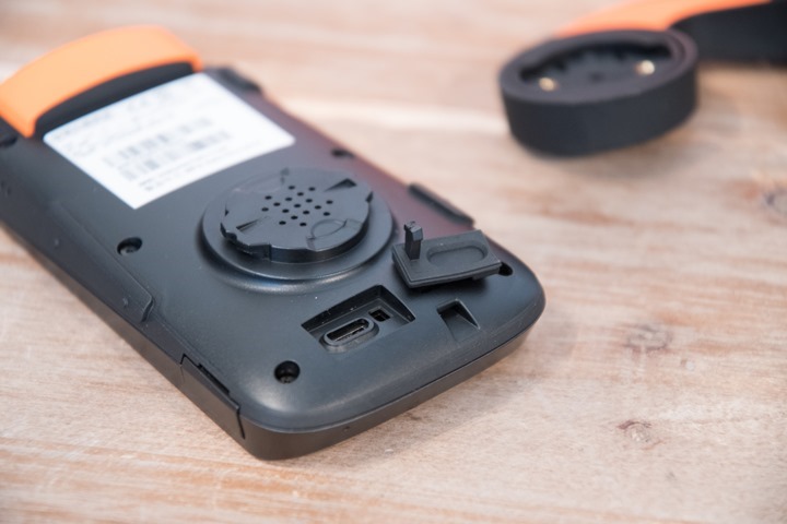
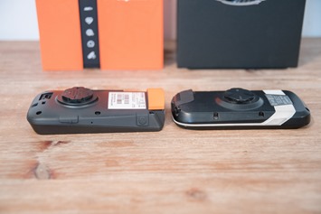
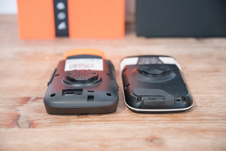
The back of the unit has a rubber USB port cover, though unfortunately that permanently fell off when I tried to uncover it for this photo.
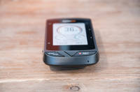
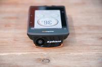
Here’s a few more pics of the unit:
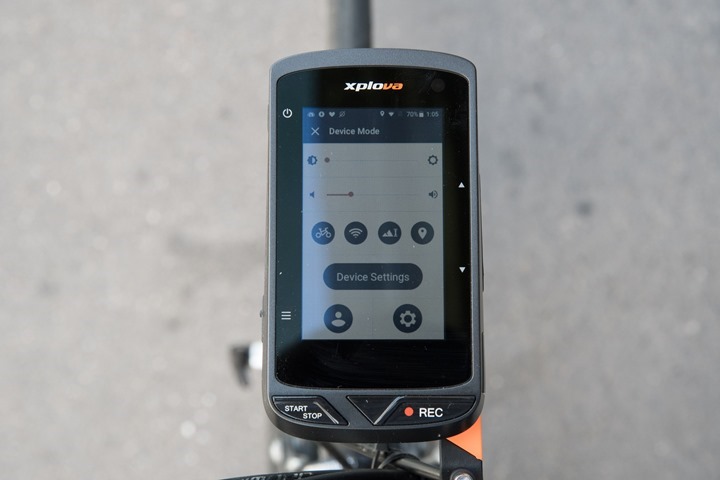
The one thing I did like during setup is that I could configure the WiFi directly on the screen itself, which leverages Android behind the scenes. Though, you will need to go to their site on a browser or their phone app to create an account on their web platform.
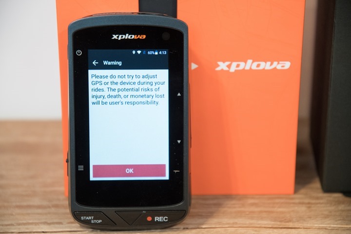
And finally, just remember to heed this warning. Do NOT touch the darn thing while riding.
With that, let’s move onto the basics of using it.
The Basics:
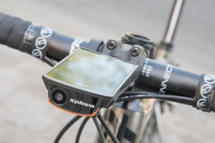
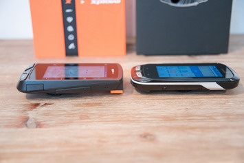
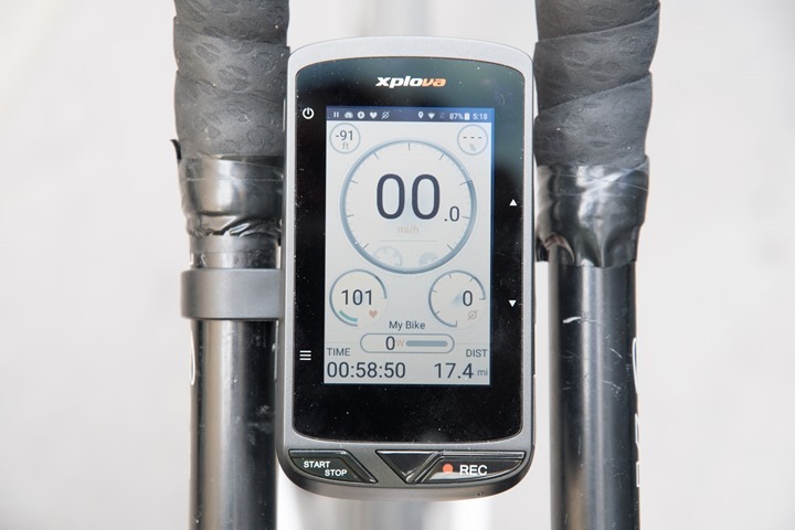
The Xplova X5 is a full-featured mapping bike computer, not unlike that of the Edge 1000. In fact, they are almost identical in sizing in every way. The Edge 1000 will look skinnier however, due to the industrial design on the Xplova X5 making it appear bigger than it is.
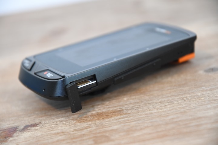
However there are some core differences in terms of componentry. For starts, the X5 has the camera sitting in the front (720p, don’t worry, we’ll talk about that in painful detail later), which the Edge series lacks. Further, it also has a SIM-card slot, which can be used for cellar connectivity (the Edge 1000 doesn’t have that either). However, the X5 does lack one thing the Edge 1000 has: A MicroSD card for storage. This is a slightly odd omission, since…ya know…it has a camera in it.
Once you power it on after setup, the X5 takes you to the main cycling screen. There isn’t a dashboard of sorts to pick functions like structured training or the sort – likely because those functions don’t exist. It’s really more about recording the ride and mapping than it is about a highly competitive endurance sports unit.
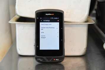
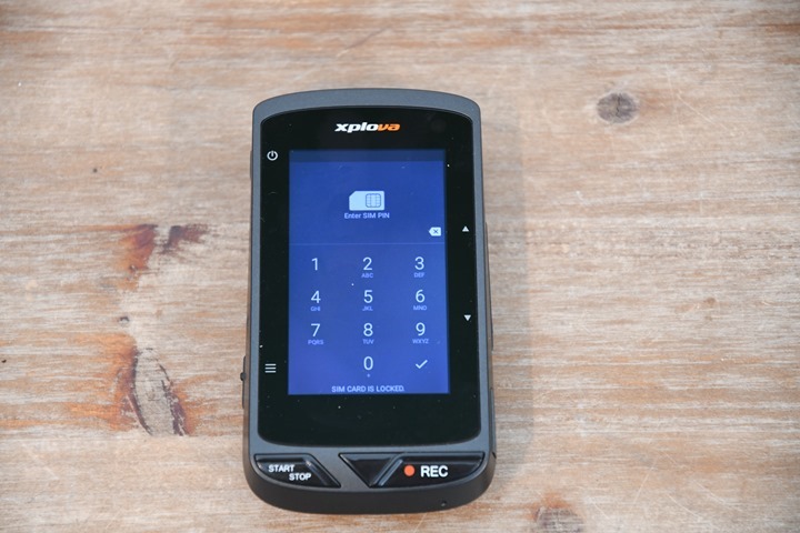
For the SIM card, you’ll insert that in the side:
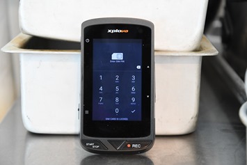
It’ll then ask for a PIN on boot-up each time, as well as allow you to control the roaming/bandwidth options.
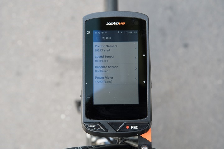
But it does have basics like creating bike profiles and pairing ANT+ sensors (it can’t pair to Bluetooth Smart sensors, it uses Bluetooth Smart for phone connectivity only). You can save sensors per bike, though the HR sensor spans all bikes.
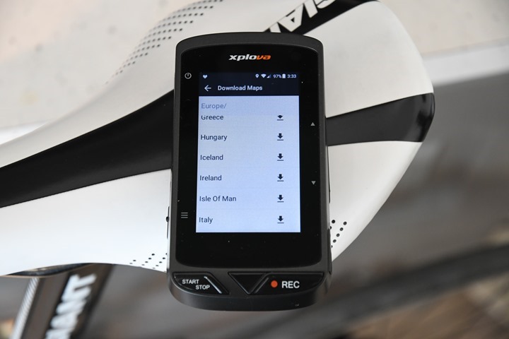
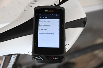
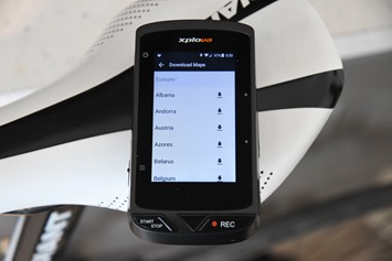
You can load maps on the unit easily using an internal interface that connects to WiFi and pulls them down for any region/country you select. It’s quick and simple, and works really well:
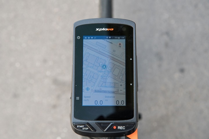
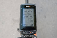
The full-color screen will then display your location as well as your track while riding, as well as the handful of data pages you can configure:
Data pages can mostly be configured as you see fit with the standard offerings of data you see on most computers. This even includes metrics like TSS, but not Normalized Power or Intensity Factor (IF).
There is one screen (the main one with the gauges/dial) that doesn’t appear to be changeable however:
You can change data pages by either swiping the screen, or by pressing the buttons on the side. Interestingly some in-ride data pages are only accessible via the left buttons, while others only from the right side. While the start/stop and recording buttons atop the unit are easily pressed mid-ride, the left/right side buttons are actually pretty awkward to hit during a ride, which is odd because that design is pretty similar to the Edge series devices. But I think it’s how hard you have to press them combined with them blending into the body a bit more. Not a deal-breaker, but a minor issue.
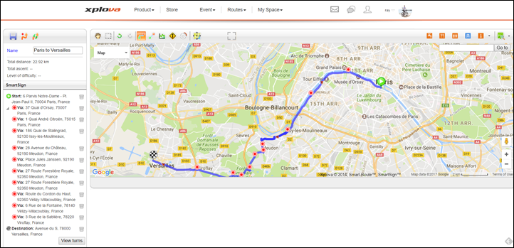
Still, despite some minor quirks, the unit does actually work fairly well in terms of being a straightforward bike computer. As I talk about in the next section, the graphs are a nice touch and work pretty well. Also, the unit can be used for navigation if you create routes online using their site.
While out riding you can press the recording button (top-right) to record a short video clip at any time. You can also use smart triggers to have it record automatically based on various events like speed or power. All of that also works well (and more on that in a bit too).
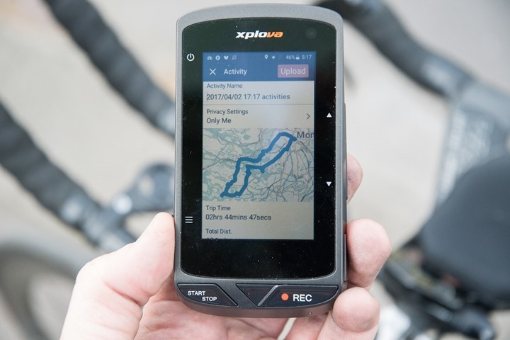
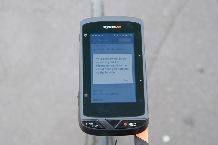
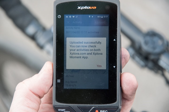
Once you’re done with a ride you can long-hold the button to save a ride, which takes you to a nifty summary screen. From there it’ll leverage wireless connectivity to upload to their Xplova platform, which is sorta like going back to 2002-2004 web design principals. But the core of things are there. Plus, you can setup sync to Strava. And the files recorded on the unit itself are thankfully in simple .FIT format (like almost everyone else).
In general, I see good GPS accuracy and really good elevation accuracy. However, I am seeing some interesting sensor drop issues on power data, where other units aren’t having the same problem connecting to the same power meter. I’ve seen it on multiple rides outdoors connected to different power meters and haven’t quite figured out the root cause.
Ok, so that’s the basic overview of things. Instead, I want to focus on the really cool stuff…and then the less awesome stuff. For better or worse there’s a bit in both camps.
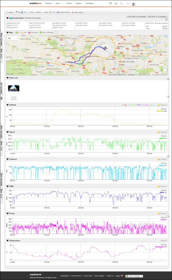
(I’ll add in a pile of DCR Analyzer links over the next 24 hours to look at GPS/Altimeter/Sensor data)
What I love:
There’s a number of really fascinating things within the Xplova X5 that aren’t seen anywhere else. Not just features for the sake of features, but some legit brilliant ideas that I looked at and was like “Why hasn’t anyone done that before?”. Some of them are obvious ideas that many have talked about, such as the camera (which I’ll come back to in a moment), and others are less obvious. Subtle really.
For example, check out this option at the end of a ride. It allows you to specify right then and there whether you want the ride to be public or private (or just friends only). Why can’t I do that on my Garmin or Wahoo or whatever, and then have that also trigger similar Strava privacy settings?
While we’re talking that screen – I like the way the map is inset into it on the summary page. Easy to see at a high level where I went.
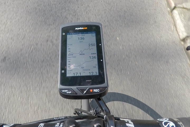
Next, during the ride are the graphs on the unit. I’ve actually come to like these. They allow me to more easily see how I’m trending than just a typical 3s/10s/30s power (or heart rate) data field. It’s quite useful in fact. While the Edge series does have this for heart rate, it lacks it for power. Also, there’s a lot of wasted space on the Edge series for the graph. Sure, there’s some Connect IQ data fields that kinda solve it – but not like this.
They also dynamically rescale the chart during the ride over the period of that last 30 seconds or so. So if you’re nice and steady at 220w, it won’t show you this wonky chart from 0w to 1000w. Instead, it’s just a smaller slice. But if you pump it to 700w, it’ll rescale the chart until that data point has passed…then scale back again. Logical.
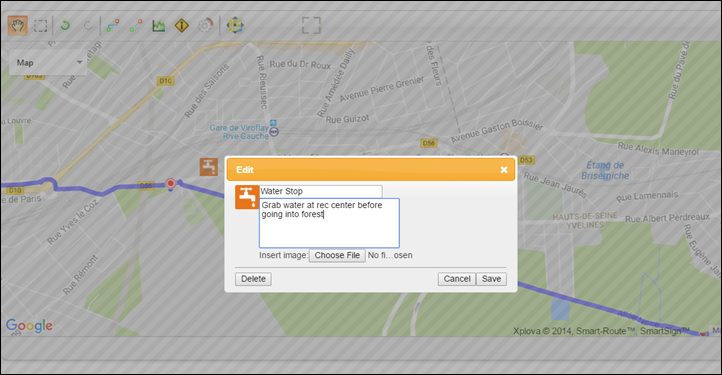
Next, unlike Garmin (or Wahoo), you can add waypoint and markers along the way on routes using their web site. These can be for food stops, touristy things, or just a reminder to take nutrition. This is especially ironic because Garmin has an entire outdoor wearables line, all requiring clunky desktop software to make waypoints. And even cooler is that for something like a cool section of the road you can create a smart-trigger for the video to automatically start recording when it passes it.
And then there’s the camera. Oh little camera…
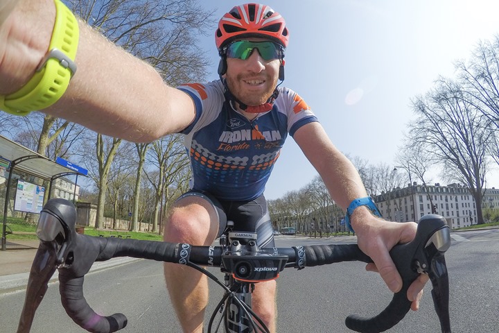
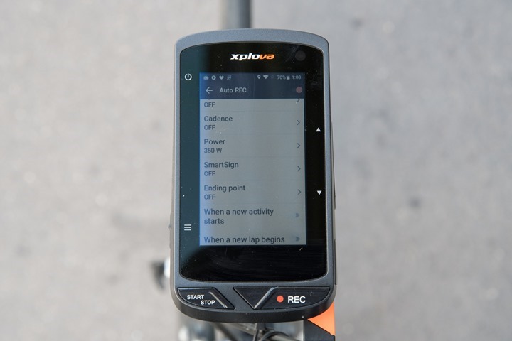
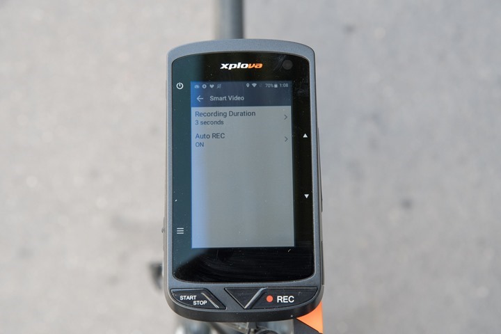
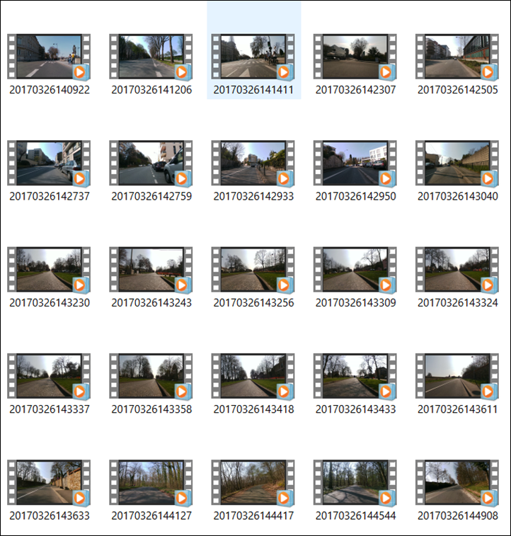
When I first saw the unit I thought – that’s going to be stupid, it won’t really work well. And in some ways, that’s true. But let’s talk about the good first. The camera has the ability to be enabled via smart triggers. These can be things like speed triggers or power surge triggers. It’ll then automatically record a short clip (3/6/9 seconds long). There’s a 2-second smoothing built in, to ensure false-positives aren’t constantly recording either.
So I setup mine for a minimum wattage threshold of 350w, which tends to keep things interesting. It won’t usually trigger at stop signs/stop lights unless I punch the power excessively. But it will trigger for most surges where I’m doing something interesting.
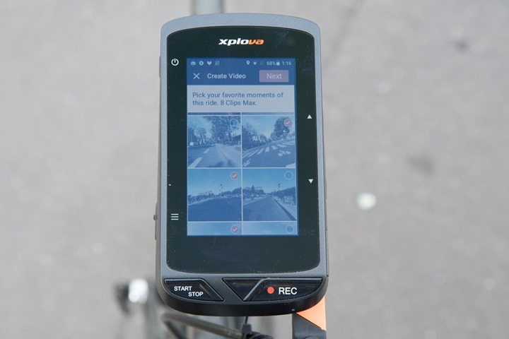
That all works just great and captures boatloads of clips to choose from. Next, I like that it’ll allow me to compile these clips together into a short video that’s uploaded with each of my rides on the website. That too is cool! Imagine if Strava ever stopped combing its hair in the mirror and allowed short video uploads in addition to pictures?
Of course, the camera isn’t totally awesome. There’s a boatload of shortfalls that I’ll talk about in the next section. But the basic theory of it is cool. It’s execution beyond the three paragraphs of goodness above is what kills it. But if a company were to make some very minor tweaks to the camera piece, it could actually be really damn cool. Acer themselves could make all but one of these tweaks today in software, but the final tweak would require them spending a few bucks extra on a better camera.
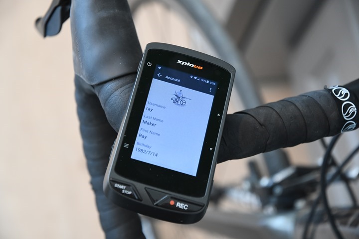
Moving on, here’s another nuanced thing that’s a nice touch. In the account settings on the unit itself it actually pulls down my profile pic and shows it on the screen. Nothing major, but a nice little touch.
Next we’ve got maps. While companies like Garmin include maps on their Edge 1000, that’s only for the region you bought it in. If you want other maps you have to either use a free 3rd party service, or you have to buy maps from Garmin. Wahoo includes maps too for the whole world (+ easily downloadable options), but they’re limited in that they don’t list street names and are black and white.
But the Xplova is the best of both worlds. They allow you to very quickly download fully detailed color maps onto the unit with nothing more than checking the box for the city/town/region/country that you want. It’s silly easy and doesn’t require fiddling with any 3rd party service.
Why on earth I can’t do the same thing on Garmin Connect for an Edge device is still a mystery to me. After all – many people want to use their touring bike computer to tour in another country/region. It’s one of the most popular questions I get about maps on bike computers.
Finally, we’ve got that SIM card. Now, by and large, I think their particular implementation of it is useless. But in the right hands this could actually be implemented well for races. For example in triathlons where you’re unlikely to bring a phone with you. This would allow for tracking (à la Quarq Qollector style) without the overhead of a phone.
In theory, the same would hold true for group-style tracking between friends, but with approximately 4 people on this continent using the Xplova X5, it’s harder for me to validate how that works. Plus, for most casual group rides you’re going to have your cell phone on you anyway, so leveraging it there is less exciting. But, what is cool is that non-Xplova loaded friends can actually use their phone app to look at tracking info – so that’s nifty.
The overall point here being that there’s actually a number of interesting innovations in this unit:
– Love the privacy setting option
– Love the 30-second graphs
– Love the smart triggers on the camera
– Love seeing a short compiled video clip at the end uploaded to site (when it works)
– Love that you can easily download maps for any area in the world
– Like the idea of a SIM card slot (not tied to a service fee by default)
– Like the idea of phoneless tracking for races
– Love that they used Garmin’s quarter-turn mount (compatible with 3rd parties then!)
– Oh, and the touch-screen still works surprisingly well when I unnecessarily dump water on it
So there ya have it – plenty of goodness to be found on the unit.
What I hate:
Now, to say the X5 is an an amazing unit all around is a bit of a stretch. It’s like saying that burnt toast is great because it’s still food. At some point you have to step back and realize there’s just no way to justify the price of the unit as it stands today, given all the oddities.
First, let’s start with what is the most obvious problem the moment you start using the unit: The linguistics.
It’s a mess. There’s no other way of putting it. Many things are poorly translated in many places, if translated at all. You’ll routinely find that every mappable action on the unit or website starts off with Taiwan. Wanna load your latest workout? Taiwan time. Wanna see where you are on the map? Taiwan time. Wanna find friends? Why not search in Taiwan? New routes? Taiwan is a great place to ride.
The default for anything involving a map is to show you Taiwan until it finishes loading. Most other devices simply show you a blank page/map/whatever until it finds your exact location.
Then there’s the prompts where the answer to every question is ‘Yes’. Not OK or cancel, but ‘Yes’. In my previous job I occasionally worked with folks in one country who could never give ‘no’ for an answer (i.e. ‘Will the project complete on time?’ ‘Can you find me a tiger in the next hour?’, etc…). No matter what you asked, the answer was always ‘Yes’, even when it was clear there was no chance in heck they could accomplish it.
That’s the Xplova. The answer is always ‘Yes’, even when it’s very much not a yes or no question:
Always…yes:
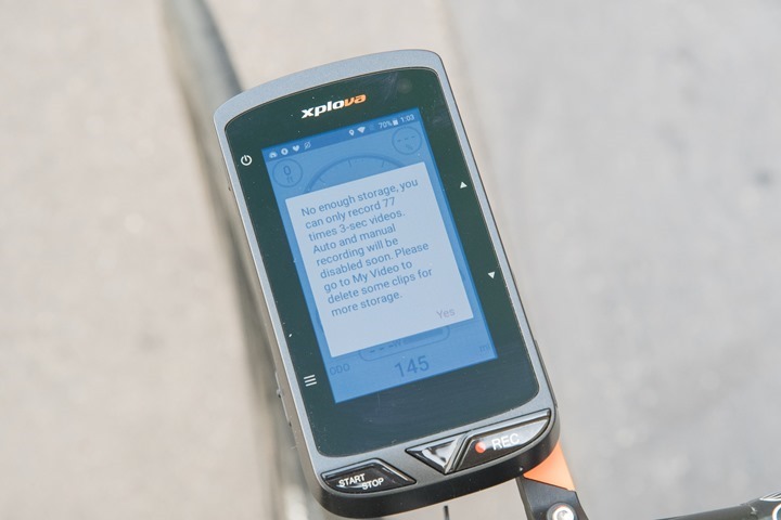
Just…yes:
Next, to say the setup is clunky would be an understatement. There’s so many moving parts, and a lot of it is left for you to figure out on your own. Similar to trying to configure data fields and settings. There’s very little logic in where specific settings are within the settings menu. Perhaps it would be easier if they were grouped in some sort of methodical manner. There’s actually a number of options buried in there, but finding them is always tricky.
For example, you create bike profiles in a dedicated bike profile area, but the only thing you set there is name/weight/wheel size. Then in a totally different menu area much deeper you can associate/set bike sensors to that bike. Why aren’t these grouped together?
Making it even worse, there is no concept of ‘back’ after changing a minor setting. Everything will reset you back to the main page every time. So when you want to change a handful of settings at once, it takes 5 times as long.
But don’t worry, you do get good at viewing all the settings pages – since you’ll generally have to do that each time.
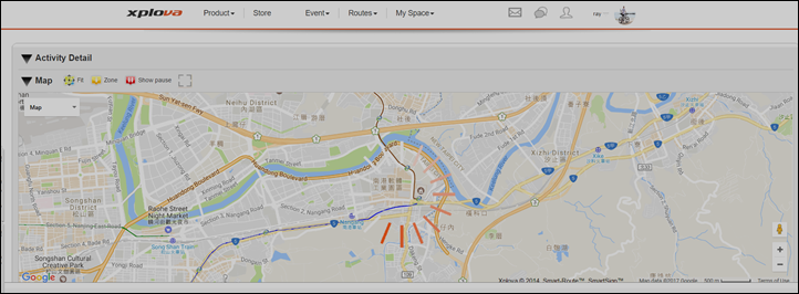
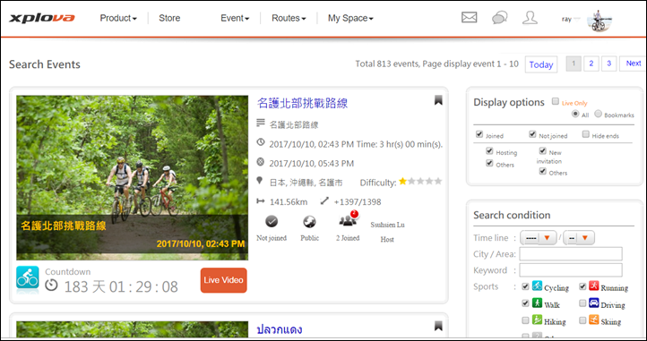
When it come to the site, a lot of it is indeed translated, but you’re going to find pockets where it’s not (or poorly translated things), similar to finding holes in Swiss cheese. Sometimes it’s user data like below, but other times you find things that just don’t make much sense. Because there’s so little of the platform focused outside of Taiwan, there’s not much content there for it.
But let’s talk about that camera.
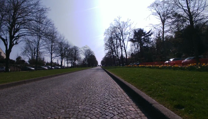
As I noted earlier, the camera is a much appreciated addition (really!). But unfortunately Acer made some critical mistakes that make it far less useful than you want to believe. First is that they went with a 720p sensor. That in and of itself wasn’t a deal-breaker, but what was is that they selected a crappy 720p camera (likely to fit into size/battery/heat/cost restrictions). As a result, it’s not even a good 720p image. That also means that photo screen-captures are equally low-resolution and usually poorly lit in anything but noon-sunlight.
Next is that they artificially limit you to selecting a clip-length of 3/6/9 seconds. There’s no other options. By itself that’s not horrible, since it actually ends up forcing you to get the most interesting moments. But I should still be able to record longer if I wanted. For example, a 60-90s finish on a sprint. Or descending somewhere cool. Or at least let me use that massive manual recording button and have that be whatever time limit I want – battery life be damned.
What’s worse is that you can only select up to 8 clips to include in your final video. So on my Sunday ride it automatically generated about 141 clips (using my trigger setting of anytime I go over 350 watts). With a 3-second recording time, that means my entire clip length is a mere 24 seconds. Which is fine for Instagram, but would be better at closer to 60-seconds for Facebook or Twitter. Or even longer for YouTube. Again, this limit is totally arbitrary.
Speaking of limits, there’s roughly a storage limit of about 10-15 minutes of total video clips on the unit once you add some maps. After which it’ll stop recording new clips (it’s not smart enough to delete already uploaded clips). Since there’s no micro-SD card, you can’t extend the storage.
Wait – I’m not done on this camera. Since the audio sounds the same as putting a bunch of bolts in a blender, why not overlay music automatically like GoPro and Garmin (and Polar and Suunto) do on their videos? Heck, since all clips are either 3, 6, or 9 seconds it’d be trivial to time cuts to the beat for a 24-60 second montage. Slap a Xplova X5 logo at the end and you’ve got great viral marketing in uploaded videos.
And while we’re at it, there’s no overlay of the data like on a GoPro/Garmin/Sony action cam, despite having said data. Same goes for automatically creating a montage for you based on acceleration/power/HR/etc data. So much potential here, but just failed execution.
Here’s a quick video looking at the quality of the camera and snippets. Remember the part I’m most disappointed in is the bounce, using either their mount or other 3rd party mounts.
Now some might look at the above and think it’s nitpicking, but in reality for anyone who has used the unit you realize how annoying all these things are on the X5. It’s death by a thousand cuts. When half the messages simply give you the option of ‘Yes’, or when things fail to upload (most of the time for videos, with no retry button), or when the feature is slow to react on the site – it takes away from the experience of a $500+ GPS unit. Especially since the issues are core to not just the unique features, but baseline functionality. Also, it drops power sensor data every once in a while when just starting backup from a pause in peddling (i.e. going into a sprint) – something I noticed when overlaying data together.
Which isn’t to say Garmin, Wahoo, Polar and others make perfect head units. One only need my Edge 1000 review to see that wasn’t the case at launch, I slaughtered it. And over time Garmin got it mostly right there. Just like Wahoo did over the last year with the ELEMNT to now. Even Polar has somewhat turned around their V650.
Acer can certainly do the same on the software side. But it’s going to take a while, and I’d guess that Garmin/Polar/Wahoo are in a much better position from a software development team standpoint than Acer is right now (ironic for a software/computing company).
Wrap-up:
As you can see, the unit definitely has some cool features – it really is pushing the boundaries of what you can do with the hardware side of a bike computer. The camera, the SIM-card slot, the mapping, built on Android, etc… All interesting and innovate areas for a standalone bike computer.
But unfortunately, the software lets it down. It’s just not a great bike computer because of it. Which isn’t to say that the company can’t make fixes. They probably will, but the depth and breadth of software tweaks it needs to be viable at this price point is pretty significant. It’s also missing common features like structured training (of any sort) and Strava Live Segments.
We aren’t talking a month or two worth of work here, but really a fundamental shift – especially on the website – to make it more appealing. I could see a scenario where a year from now with the right teams focusing on it that it could be really solid. But they’d need to make some minor hardware changes such as putting in a better camera and a bit more storage (or allowing a micro-SD card), as well as dropping the price. I’d say right now with some bug fixes this could be viable at $299USD, but not $499. If they upgraded the camera and storage, then I think $399 would be appropriate.
Still, I hope the other guys in the pond learn from this. If Acer is willing to dedicate resources for another year to this project, it could legitimately be a very viable and solid option a year from now in a refreshed unit. They’d likely still have to find a way to make inroads into the mainstream cycling scene, but I find that if you make a kick-ass product, the rest generally takes care of itself.
With that – thanks for reading!


