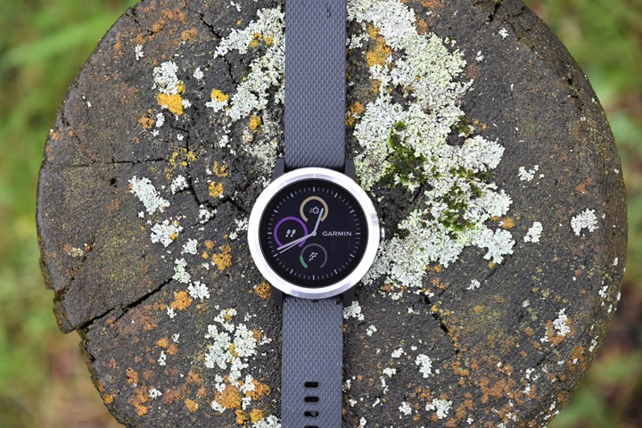
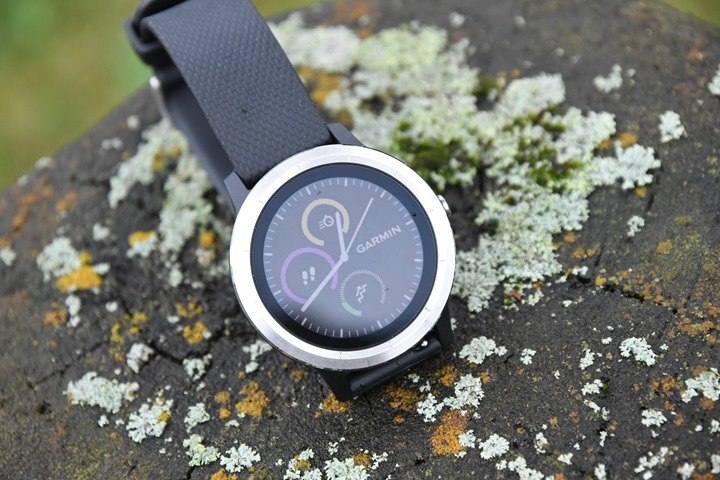
Today Garmin announced a swath of new Vivo-branded wearable devices. You’ve got the Vivoactive 3, which I’m covering here – but also the Vivomove HR and Vivosport, which you’ll see in another post. Those two are updates of the existing Vivomove and Vivosmart 3 (yes, the one that just came out 5 months ago).
But as I was saying – this is all about the Vivoactive 3, and the changes here are pretty sweeping. This is Garmin’s first wearable to add contactless payment capabilities (aka NFC), called Garmin Pay. Further, Garmin continued the trend of taking more expensive watch features and placing them into less expensive watches. So areas like Vo2Max estimation and structured workouts are now present (with pre-loaded workouts). Plus a new and improved optical heart rate sensor.
I’ve been using the watch for about a week now and have a reasonably good grasp of how well it works, both in day to day use as well as a handful of workouts. The watch software isn’t final yet (the hardware is), but it’s pretty darn close. The company expects to start shipping mid-late September, so on very similar timelines as the Fitbit Ionic that also just was announced a few days ago. The Fall 2017 battle of fitness watches has begun!
What’s new:
Let’s just start off with what’s new. Some of it is fairly obvious – the totally new design of the external interface, but a lot of it is under the covers in the functionality of the watch, or even internal to the hardware (like NFC). So since everyone likes bulleted lists, let’s just run through all the new/different things on the Vivoactive 3 compared to the Vivoactive HR of the past:
– Round Watch Design: No longer a square, the Vivoactive 3 is all rounded
– From two buttons to one button: Removal of the two front-facing buttons, and now just a single side-facing button
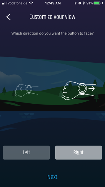
– Ability to flip watch 180°: You can make the button be on the left or right, your choice.
– Addition of two swipe interface points on side of watch: These allow up/down movement through menus
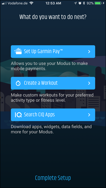
– Garmin Pay added: Contactless payments that utilizes NFC so you can buy your coffee with just your wrist
– Structured workout support added: This allows you to download custom workouts and training plans/calendars to execute
– Pre-loaded workouts added: These are for run, cardio, strength, and bike workouts
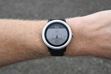
– Automatic Rep Counting added: For strength workouts, this was seen previously on the Vivosmart 3 this spring.
– VO2Max Estimation Added: We’ve historically seen this on higher end watches, so this is new at this price point.
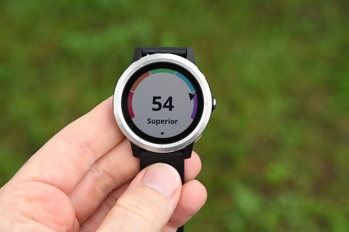
– Fitness Age Estimates added: This was also introduced in the Vivosmart 3 this spring
– Stress Monitoring Added: This monitors stress throughout the day, also a Vivosmart 3 feature this spring.
– New user interface in many areas: While not 100% new, there’s a ton of differences within how the user interface works (see my video below on it)
– New 2017 Garmin Elevate Optical HR sensor: The same more advanced HR sensor we’ve seen on the Fenix 5 and FR935 is here as well, bringing virtually constant 24×7 HR recording (no major gaps anymore)
– Connects to Bluetooth Smart Sensors: It can connect to Bluetooth Smart HR Straps, Speed/Cadence Sensors (both individual and combo), and Footpods.
– Up to four data fields per page: This used to be three on the Vivoactive HR.
– Ability to calibrate treadmill distances: This was quietly introduced on the Fenix5/FR935 this past spring, and allows you to match indoor runs to what the treadmill says you did (after the workout).
– Increased price from $249 to $299: Not much more to say on this one.
Next, just for the purposes of covering all the bases, the unit does maintain and/or have the following popular features/functions. Many of you may know these already, but in case you’re wondering whether some of these are still there, or whether they are offered in the unit – I’ve got the most common ones here.
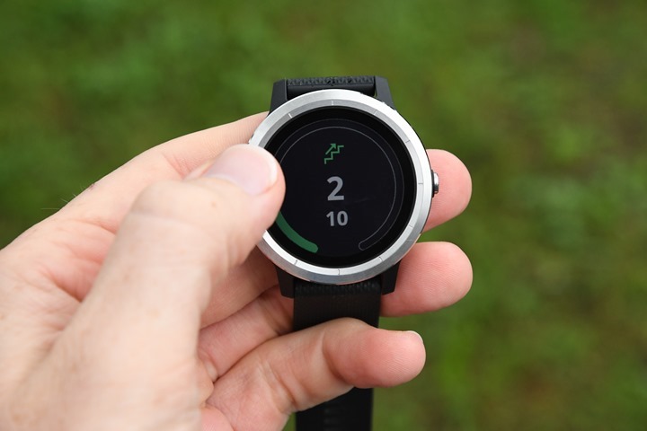
– Barometric altimeter included: Used for stair counting, but also workouts
– GPS with GLONASS for workouts: Also, this allows 1-second recording rate as is the trend on most units lately.
– Battery life: is 7 days in smartwatch mode, 13 hours in GPS mode (similar to Vivoactive HR)
– Connect IQ for 3rd party apps and watch faces: Again, standard on virtually all Garmin units these days over $200
– Music Control of your phone’s music: Note the unit does NOT store music on it. Again, there’s no music on the Vivoactive 3 directly.
– Numerous sport modes: This isn’t just a running watch, but has everything from cycling to yoga, pool swimming (not outdoor) to rowing. You can customize these individually (plus Connect IQ apps gets you more sport modes).
– Basic waypoint navigation: You can save waypoints and navigate to them, using the internal compass.
– Always on touchscreen display: Yup, the display is always on 100% of the time. There’s also a bright backlight if you need it.
– Re-broadcasts optical HR: You can select to re-broadcast your heart rate from the optical HR sensor over ANT+
– Connects to ANT+ sensors: Specifically the ANT+ HR strap, ANT+ Speed/Cadence sensors, Footpods, and Tempe units (also connects to Bluetooth Smart sensors per the above). It does NOT connect to power meters.
Phew – got all that? Good.
As you can see there’s a fair number of new features and tweaks, but also virtually everything is kept that I can find from the Vivoactive HR into this product. Of course, sometimes there are tiny little differences that I might not catch initially as I may not use it a specific way someone else does – but overall things look pretty solid.
If you’re looking for a bit of a video walk-through of all the features, I’ve got just the video for you. Nothing super fancy, just simple and easy to see everything that’s new (and the menu interface):
With that, let’s dive into all the basics of the watch.
The Basics:
While I covered the bulleted list above, I’m going to dive into some of the newer features in more detail. Keep in mind in the video I try and walk through almost everything in that list.
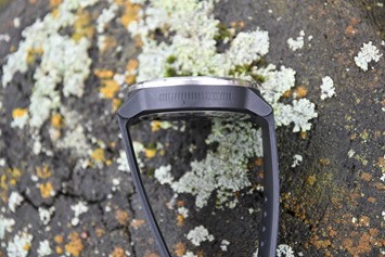
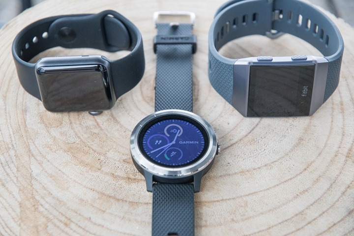
The most obvious new aspect is the round-watch design. If you compare the unit to the past, you can see that the new Vivoactive 3 has a much nicer looking design (at least in my opinion), and goes away from that clunky feeling design of the Vivoactive HR (though, I did like the super-slim original Vivoactive):
Within the unit there are three ways to control it. First is the touchscreen itself, which can be used to select items or swipe up/down through menus. I haven’t had any issues with the touchscreen in rain/sweat in workouts (in fact, it rained this morning during my run…and most of my rides lately). Though in the shower it kinda goes crazy.
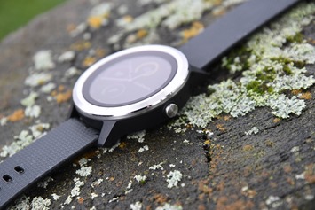
Then there’s the single button on the right side, followed two swipe points on the left side. These allow you to swipe up/down through pages and menus. Sometimes it’s a bit clunky (vaguely reminding me of aspects of the old Forerunner 405/410 touch bezel). But it does the job.
Oh, did I say button on the right? I meant left. Actually, I meant however the heck you want it. Seriously.
It’s BYOB: Bring Your Own Button.
Or I suppose more like CYOB: Choose your own button. Either way…
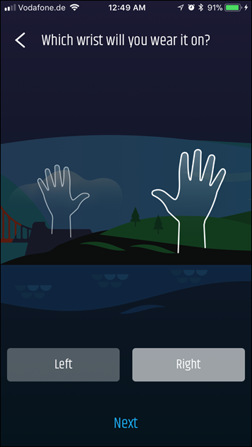
Within the Garmin Connect Mobile app you can choose which orientation you want. So if you want to wear it on the other hand and have the button face inwards versus outwards, you can do that. The watch bands pop-off in two seconds and you just rotate the watch around and change the orientation in the app. Pretty darn clever.
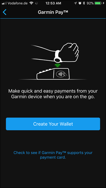
Next, we’ve got the new Garmin Pay addition. This leverages NFC within the unit to allow you to load credit cards onto the watch and then pay for items with them anywhere you find a contactless payment reader. Many stores have these, though not all are enabled/functioning. This is similar to what Apple Watch has, some Android Wear devices, and now also the Fitbit Ionic.
This isn’t yet enabled on my watch (maybe tomorrow), but note that it works with Visa and MasterCard to start – and only if your bank supports it. Garmin has a website that’ll soon list all the banks/credit card companies that are supported – but it sounds like at least in the US it’ll be all the big ones. Do keep in mind that just because something is supported on the Apple Watch or Fitbit, doesn’t mean it will be on Garmin. And vice versa. These all have to be individually negotiated with Garmin and the banks (or Fitbit and the banks, or Apple and the banks). Said differently: It’s a cluster.
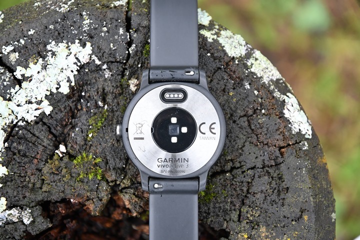
Meanwhile on the back of the unit you’ve got the new 2017 optical HR sensor from Garmin, which is the same as found on the FR935 and Fenix 5. This is not only slimmer, but has better battery management – enabling them to record at 1-2 second rates.
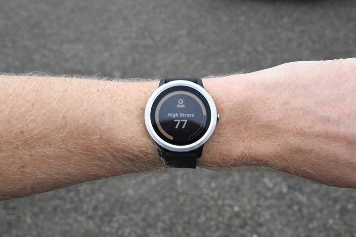
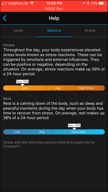
Within that optical HR sensor they’re also leveraging it for HRV at rest, specifically around stress scores. You saw this feature come to the Vivosmart 3 earlier this spring and it’s surprisingly accurate for me. There are really two elements to it. One is on the watch itself where I swipe down to the stress widget to see my current stress score:
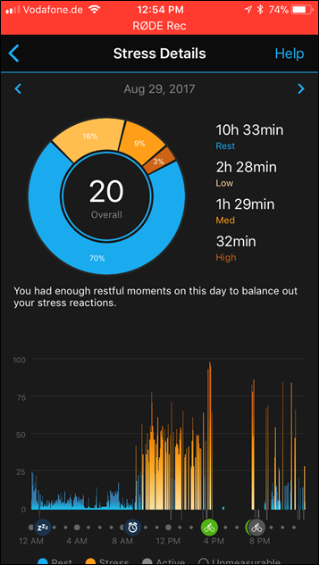
And then there’s stress details on the mobile app, which shows me my stress score over the course of the day continuously. I’ve found this fascinatingly accurate. In my screenshots below there are large gaps of time where I wasn’t wearing the watch (because I was at a trade-show and didn’t want to wear an unannounced watch around), but the other times are super-accurate. Check out that day on Monday where you can see my stress level rising as I was rushing to prepare the Fitbit Ionic post and videos. And then after that it just drops off once I hit publish. Neat, Huh?
Now as you can see in the video there’s a fair bit of change to the user interface here, mostly upon actions. Aspects like selecting or ending a sport/workout, or how activity summary information is displayed. None of it revolutionary, but some of it interesting for those UI geeks in the crowd.
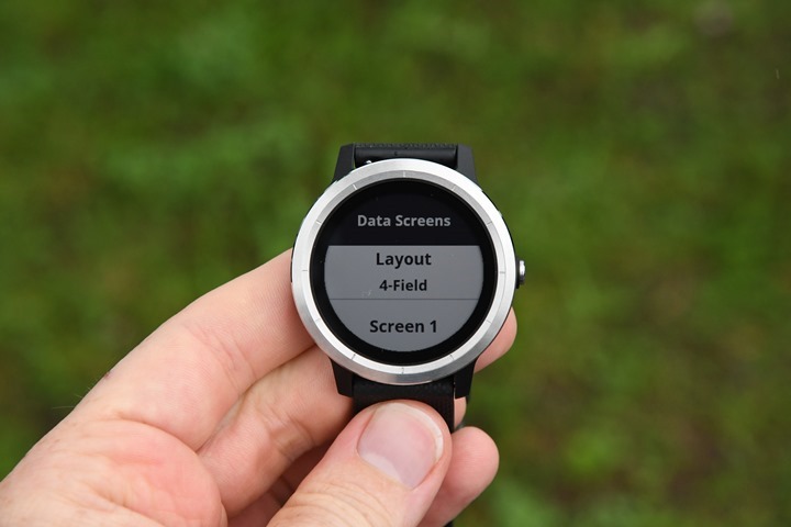
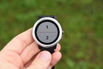
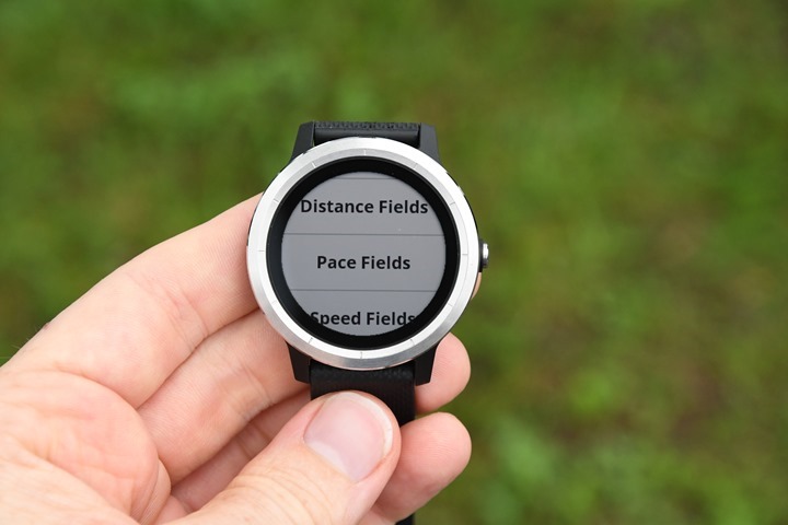
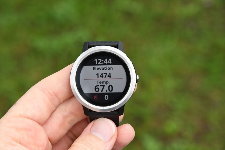
In fact, some of this becomes super-evident when tweaking your sport data page profiles. It’s here Garmin has totally changed up stuff. First up you’ve now got four data fields per page, and a total of three customizable pages (+ 1 HR focused page). But it’s a little more complex than that. You need to choose a specific layout of 1, 2, 3, or 4 data fields for all your pages. It’s a bit wonky since that means all pages are four fields (or just one field), even if you want to mix and match.
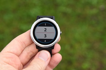
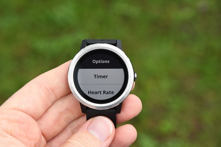
In any event, the next unique piece is that while you can customize those four-field pages with whatever you want, only the middle two metrics are totally customizable. For these middle two metrics on each page you can choose all the usual data fields.
Whereas the upper edge and lower edge ones are a subset of fields, specifically just: Timer, Heart Rate, Calories, Distance, and Time of Day.
I suspect the reason they limited it was to ensure they’d fit within the smaller space. But realistically most metrics should fit in there just fine.
Moving along, the unit now allows you to access structured workouts that you can create on Garmin Connect or with Garmin Connect Mobile. The new Garmin Connect Mobile app rolling out soonish enables that functionality right from your phone
And while not yet in the beta software I have, they are pre-loading workouts for a variety of sports directly on the device, sorta like Fitbit is doing. Also now seen is VO2Max estimation for workouts (not all workouts, just ones that you’d cross the threshold on), which was previously only seen on higher end devices.
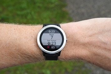
Speaking of workouts, the automatic rep counting for strength training is included as well within this, enabling you to track both reps, weight, and rest time automatically (and if it miscounts, you can edit on the fly).
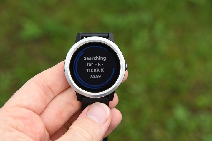
Finally, in the sport arena, we have the ability to connect to Bluetooth Smart sensors (plus of course ANT+ sensors). This started with the Garmin Fenix 5 back in January, then the FR935, then the Edge 1030 this week, and now the Vivoactive 3. You can see below as I pair to a Wahoo TICKR heart rate strap on the Bluetooth Smart side:
Ok – there ya have it – a run through of all the features of the Vivoactive 3. Wanna see some data? No problem, here’s a run I did a few days ago along the mountains with the Vivoactive 3 on one wrist, the Fitbit Ionic on the other, and then another unit with a chest strap. That allowed me to validate both GPS and HR accuracy across three units. You can dive into the data on the DCR Analyzer here, if you’d like. I’ll add in some more runs and rides later today as well – stay tuned!
Comparing the options:
Obviously, there will be plenty of comparisons to the Fitbit Ionic, and to a lesser degree the Apple Watch. At first glance these are similar, and for a certain subset of people – they will overlap heavily. But there are actually nuances to each that are worth pointing out.
But before I do that – note that the answer to everything isn’t always an app. So while Apple has a much greater collection of Apple Watch apps (and some fitness ones are awesome), you’re still limited by the hardware. So you have to start with the hardware limitations on any of these devices before you can assume that an app may fill the gap. Further, while I could try and compare these watches while using every app on the planet, the reality is that some of those apps suck, and some won’t always be here. So I’m mostly going to focus on native functionality here.
Garmin Vivoactive 3: The core strength here is a cohesive fitness and sport experience, specifically around the number of sport modes, and the accuracy of the heart rate. Generally speaking, I see slightly better accuracy with the 2017 Garmin Elevate sensor than with the Apple Watch or Fitbit sensors. Not always, but mostly. Also, Garmin natively supports things like cycling sensors and footpods, whereas neither Apple or Fitbit do. And in the case of Fitbit, they don’t support the HR strap at all. Garmin and Fitbit are semi-similar for aspects like pre-loaded workouts and Fitness Age, but when it comes to pieces like Rep Counting, Stress Monitoring, and custom Structured Workouts, Fitbit has none of them (and Apple has none of those natively). On the flip side, the huge gap here for Garmin is the lack of music internally. Given the $299 price point I think that’s a pretty substantial miss. Folks have been begging for it for years, and given it’s commonplace on so many other units now, it’s tough to not have it. Finally, the Garmin battery is almost three times that of Fitbit, and more than a dozen times longer for daily-watch usage than Apple. Of course, the screen isn’t as pretty, but it’s also always on.
Fitbit Ionic: The core strength here is less sport and more general fitness. The unit plays to the strength of making things super easy to use, and stunningly pretty as well. They’ve also got more custom bands to work with, and have a deeper set of training programs available (all for a fee though). Of course, Fitbit’s biggest asset is the platform around activity tracking, especially with friends and family. They’re very strong there with lots of engagement – far more than I usually see on Garmin. Whether it be challenges or giving people kudos, there’s a lot of ways to make it feel less isolating. When it comes to music, their integration with Pandora is looking pretty sweet, as is their ability to store music onboard. Though that’s not terribly different than what Apple does. While they do have an app system for Ionic, it’s pretty much empty right now since it’s not opening till the end of the month. So that’ll limit things initially. Like Garmin and Apple, they also have NFC payments too.
Apple Watch: The Apple Watch is stunning in design and how it looks, but I find it makes a better all-around day to day watch than a sport watch. I do think it makes for a decent general fitness watch, but I find accuracy of both heart rate and pace to be a bit wobbly at times depending on the sport. Of course, the unit’s biggest asset is its app platform. With so many phone apps also having companion apps on the watch, you’ll have far more apps to choose from. Now many of those apps are ‘throwaway’ in the sense they provide no true value beyond saying someone has an app (basically extended notifications). But some apps like Runmeter are fantastically detailed and deep, and really make the Apple Watch platform shine. Like the others above, Apple has contactless payments and music. But one limitation can be the touch display which isn’t quite as reliable natively when running hard interfaces as the buttons on the Ionic or the swipe aspects of the side of the Vivoactive 3. Still, they make a fantastic all-day watch. Keep in mind you will have to charge it roughly every night, maybe every other night if you’re lucky. And, it only works with an iPhone.
Android Wear: I know someone will get all bent out of shape if I don’t include it here. And yes, there are Android Wear variants that roughly compete here – I think in the sport realm you’ve got the Polar M600 as one example that’s very similar to the Garmin in many ways. Polar lacks NFC contactless payment, but makes up for it in music. Polar does also lack many of the core stress/fitness age/rep counting type features, but stands ground when it comes to structured workouts and optical HR accuracy. The only thing is I personally find the watch a bit clunky.
I’ll detail more of the differences in my upcoming in-depth review of all products later in September. But that’s just a taster of where things stand today.
Summary:
Overall this is a nice evolutionary update of the Vivoactive line. We saw them break ground with the original Vivoactive a few years ago in being the slimmest GPS watch on the market, and then in the last iteration they greatly expanded the sport aspects of it to make it more competitive with other mid-range watches.
In this iteration we’re seeing them round out areas that are non-running focused with things like rep counting and pre-loaded gym workouts. As well as make it more appealing to mainstream audiences with NFC contactless payments, stress scores, and better 24×7 HR tracking.
I do think though the lack of music is a substantial miss – especially at the $299 price point. If it were $249 that’d be less an issue, but given Fitbit and others are floating in the $299 price point – it makes it fairly competitive. On the flip side, the Garmin watch is by far the most sport-focused of the three, and so there are certainly tradeoffs to be made in features.
With that – stay tuned for my full in-depth review later in September once they start shipping final production units. Thanks for reading!
—
Update: You can pre-order the unit through Clever Training for delivery in late October, else Best Buy currently has an exclusive prior to that. Ordering through Clever Training does help support the site, plus you’ll get 10% back in points with the VIP Program. Oh, and ya get free shipping too. And it makes you awesome.


