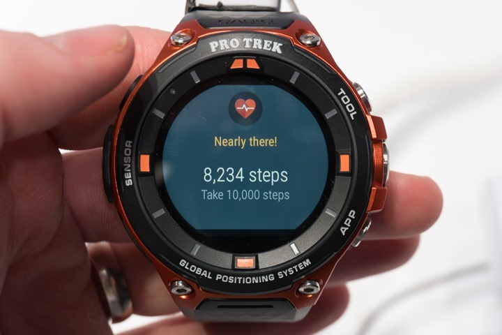
Earlier this week, Casio officially unveiled their all new smart outdoor watch, the Pro Trek Smart. This is their second GPS watch aimed squarely at the outdoor market, following last year’s announcement with a relatively similar model.
This year though the plan is to ship following release of Android Wear 2.0 on April 21st with a retail price of $500. Casio has taken a slightly different approach to the GPS watch, forgoing things like an optical heart rate sensor in favor of focusing more directly on outdoor sports. There is quite a bit to cover here so let’s jump right in.
The Watch itself
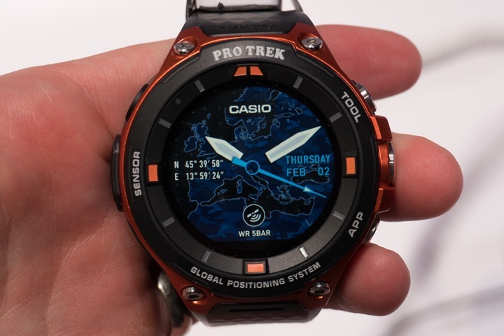
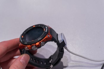
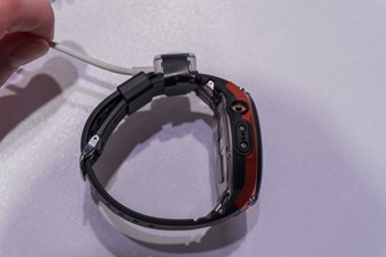
The watch itself will ship with two color variants, orange and black. The Pro Trek Smart is equipped with a touch screen and three physical buttons (Power, App, and Tool). All three of the buttons are located on the right side of the device while the left side is reserved for the charging port and a spot for the device’s barometric altimeter. In terms of overall design I’d have to say it leaves a bit to be desired. It looks authentically Casio with the outwardly blocky design, but I’m not sure that is a good thing in a GPS smartwatch where you are already going to be adding bulk due to battery and other components.
As noted above, Casio decided to leave out an optical heart rate sensor. In talking with the company at length, it sounded as though they felt that optical HR data isn’t accurate and therefore users aren’t actually using it.
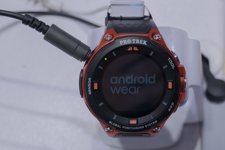
Obviously, I’m not sure I totally agree with this (and the market also seems to overwhelmingly disagree), but at least you still have the option to add a Bluetooth Smart heart rate sensor thanks to Android Wear. Speaking of Android Wear, the Pro Trek Smart will ship with AW 2.0, and the company did confirm that their previous Android Wear watch, the WSD-F10, should receive the upgrade to 2.0 this Spring. However, it’s important to note that the timelines for Android Wear itself aren’t finalized, so hanging their hat on an April release date may be risky if Android Wear continues its release date slide. Still, many other companies are also making that same bet – so at least they’re all in the same boat.
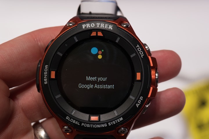
Outside of the functionality that Casio is shipping with the watch, Android Wear provides things like interactive notifications (meaning you can take direct action from the watch – like replying to a text message), Google Assistant, and all of the 3rd party apps that are being written and released for Android Wear 2.0.
That’s a pretty big list, and of course is a major selling point for aligning to the Android Wear platform. You’re talking apps like Strava, MapMyFitness, and many more. All of which can help fill gaps in the platform as it stands out of the box.
Dual Layer Display
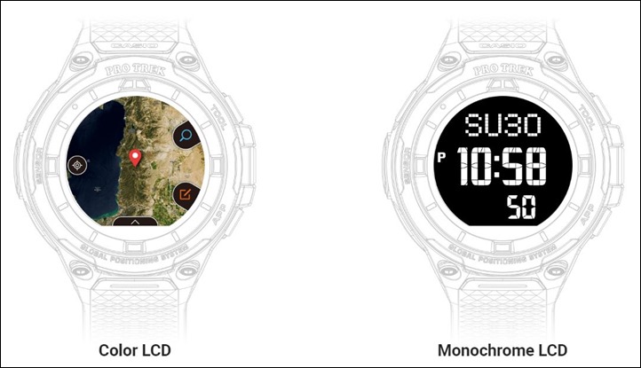
One of the more interesting hardware components of the Pro Trek Smart is the inclusion of a dual layer display, something that was also found in its predecessor. This component allows the watch to essentially have two modes:
A) Smartwatch mode
B) Monochrome mode
The watch has a dual layer LCD, allowing it to have a full-color LCD screen for things like maps, notifications, and activities; as well as having a monochrome LCD with extremely low power draw. The watch can be configured to switch the displays as necessary, allowing the monochrome to be visible whenever color isn’t necessary.
This hybrid mode allows for the Pro Trek Smart to function like a normal watch with low power draw when not in smartwatch mode. Speaking of battery life, Casio was a bit careful with battery claims. They say that battery validation is ongoing and they hope to have exact figures soon but users can expect similar battery life to the WSD-F10 (roughly 1 day in typical smart watch mode and up to 30 days in monochrome mode).
Maps
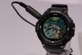
Casio has made a point to include offline maps in the Pro Trek Smart. With the inclusion of a bright color LCD touchscreen and the ability to load color map data for offline viewing, Casio is positioning the Pro Trek Smart as a watch for those who enjoy the great outdoors. They are leveraging Mapbox to provide offline maps for a given area allowing the user to be completely disconnected from cellular service while retaining navigational abilities thanks to GPS.
Maps can be downloaded from Mapbox in advance and loaded onto the watch. If you are looking to take a break from technology and go hiking through the woods but also want to be able to find your way home, the Pro Trek Smart has your back.
Pro Trek Apps
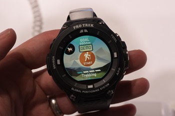
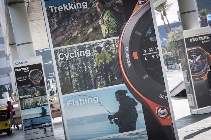
In addition to the growing ecosystem of Android Wear, Casio has chosen to include a handful of first party applications – Activity, Location Memory, Moment Setter, TOOL and Moment Link. Each of these was written by Casio and build off the showcase activities that Casio is supporting (Trekking, Fishing, Cycling, Snow, and Paddle Sports). The apps will capture data relevant to the event (Activity), allow you to create waypoints based on an event (Memory), provide relevant information to a given activity based on time, location or even preferred fishing conditions (Moment Setter), display environmental and other user data (TOOL), and allow you to share these experiences with friends (Moment Link).
All of the watches available were in demo mode and so the full functionality of these apps wasn’t on display. For a device that isn’t expected to ship for three months, that’s understandable but unfortunate. My only real impression was that there didn’t seem to be much synergy between the Android Wear 2.0 design and the Casio custom design. I feel that the true value of the app ecosystem is going to be from the Google Play store and not from the inbox applications.
Thankfully the activity tracker portion of the watch is a native Android Wear feature so it looks right at home and appears to work as expected.
Summary
When I showed up to the Casio press event the day before CES I wanted to like their watch. Ray had seen it posted around the convention center on their sponsored materials ahead of its announce and it was clear they were going to make a splash with the Pro Trek Smart.
After sitting through the press event they had several watches on display for photographs, but you weren’t allowed to touch them or change the screens. If you’ve been reading Ray for long enough you know that is a bad sign. Thankfully, they had plenty of units in the booth set up and open to the public.
I’m not entirely sure the difference a day makes, but alas, I was thankful to get hands-on with them today. After a few minutes of walking through it myself I spoke with some of the booth staff who were very helpful.
Unfortunately, there just isn’t much you can do if the product doesn’t fit the market. While I could be woefully misjudging the Pro Trek Smart, I doubt it. Ray has had the chance to speak with a number of different people about the product (industry analysts, other media, sports tech companies) and the general consensus is confusion as to who Casio is planning to sell this watch to. At $500, they aren’t likely to get the casual GPS purchaser. That is a significant amount of money and the customer is more likely to do their part to be well informed and possibly even get hands-on. When you stack this watch up against the rest of the market (Garmin’s Fenix5, Suunto’s Spartan Ultra, and Polar’s M600), the Pro Trek Smart just isn’t competitive. Heck, you could compare it against products from a year prior and reach the same conclusion.
Though oddly – the overarching comment of everyone Ray and I discussed it with was the same: Their baby is ugly. And unfortunately, in the wearables world – having an ugly baby is a tough hurdle to overcome. And at this point in time the combination of clunky design, a crappy charger and a $500 price point don’t add up to a best seller.
—
With that – thanks for reading!
Don’t forget to check out all the CES 2017 coverage, as well as continual updates throughout the day on Twitter. It’s gonna be a crazy busy week!


