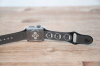
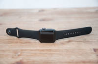
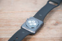
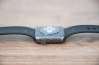
It’s now been a few months since Apple released their second generation watches, both the Apple Watch Series 2 and the Nike+ Edition. These watches built upon the initial Apple Watch first generation units by adding GPS capabilities and improved waterproofing. Further, they made internal updates to a faster GPU (graphics) chip and processor, as well as a brighter display. Beyond that, virtually all other updates have been software driven and are also available on the first generation Apple Watch.
I’ve been using both an Apple Watch Series 2 unit I bought, as well as a Nike+ Edition that Apple sent over as a loaner to test. I’ve done so since earlier last fall, switching back and forth between the units over that time frame. I’ve now got a crapton of miles on both watches, across a wide array of activities: Running, Hiking, Cycling, Openwater Swimming, Pool Swimming, etc… Like always, I’ll send that loaner unit back once this review is done. The one I bought I’ll keep, till death do us part.
This review focuses heavily on the fitness and sports side, like most of the reviews here. There are plenty of other reviews out there talking about generic Apple Watch usage. Though, I do cover some of the Apple Watch non-fitness pieces later on just to provide some context. With that, let’s dive into it!
Making Sense of The Models:
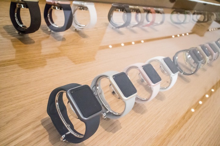
As with the initial Apple Watch, there are numerous models. Last time the differences in those models were largely focused on styling and external materials. Once you look at software, everything was identical. Meaning there was the gold model for those that apparently had too much money, and there was the sport model for the rest of us. Plus 238 different bands to ensure fashionistas were happy. All was simple in some ways.
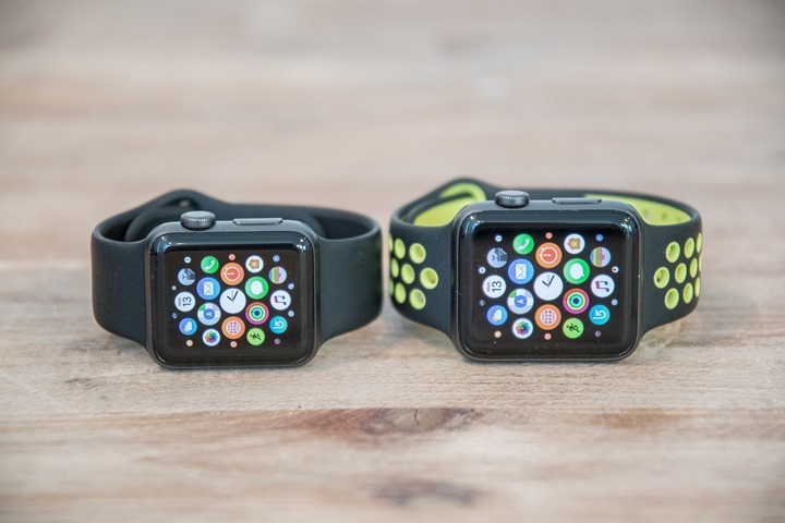
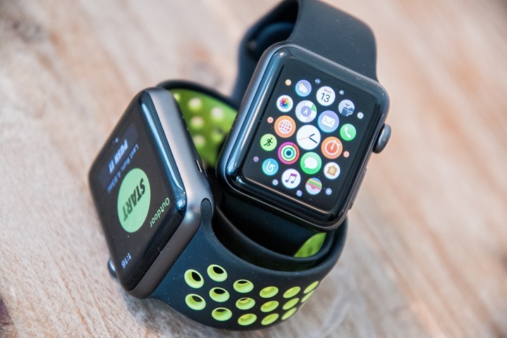
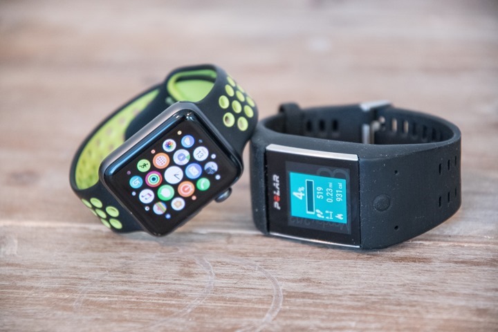
Moving forward to the Series 2, they’ve reduced the number of models. Apparently, people were smart enough not to buy the gold edition, so that’s gone, and the list has been distilled a bit to a handful of core models. Bands continue to be vibrant, which is good because on a watch your band becomes like a smartphone case – a way to make it unique. There’s two sizes – a 38mm and a 42mm, as seen above (left is 38mm, right is 42mm).
Except there’s one specific difference which throws a monkey wrench into everything: The Apple Watch Series 2 Nike+ Edition. That unit booth looks different from the outside, but also notably has different software on the inside. From a hardware standpoint though (excluding the band), it’s identical to other Apple Watch Series 2 units. Here, let me make it super-duper clear:
A) Nike+ Edition has a yellowy-green and black band (other editions have other bands)
B) Nike+ Edition has the *exact same internal watch hardware* as other editions
C) Nike+ Edition has the Nike+ Run Club app pre-loaded on it
D) Nike+ Edition is exactly the same price as the non-Nike+ edition: $369USD
And that’s it. Well, except two very minor software tweaks:
– The Nike+ edition includes a two unique Nike+ watch faces you can select
– The Nike+ edition allows you to ask Siri to start a run, which will launch the NRC app on the watch (but only if the phone is next to you)
So basically, you pay exactly the same amount and get a different band and a software app on the watch. An app I’ll dive into more detail on in a few sections from now. Note that you *can* install the NRC app on a non-Apple Watch Nike+ edition just fine. You just won’t get the Nike+ watch faces. Insert sad panda face here.
Finally, what’s this about the Series 1 watches? And how do those differ? Well, Apple has taken the existing non-GPS enabled original Apple Watch units and rebranded them ‘Series 1’. With that rebranding though they did get a very minor hardware update, specifically they received two changes:
– Dual core processor added (Series 1 add)
– Display brightness increased (Series 1 add)
The above two changes were also rolled into the Series 2 watches, which additionally received two further changes:
– GPS was added (Series 2 add)
– Full waterproofing (Series 2 add)
Here’s a quick recap of how they differ:
Apple Watch (Original): Released in April 2015 (shipping date), no GPS/no waterproofing
Apple Watch Series 1: Released in Sept 2016, no GPS/no waterproofing, brighter display, doubled processor
Apple Watch Series 2: Released in Sept 2016, has GPS and waterproofing, brighter display, doubled processor
Nike+ Edition: Released in Sept 2016, has GPS and waterproofing, brighter display, doubled processor
Got all that? Good.
As for this review, it’s been completed on both an Apple Watch Series 2 and an Apple Watch Series 2 Nike+ Edition. With that, let’s get into the unboxing.
Unboxing:
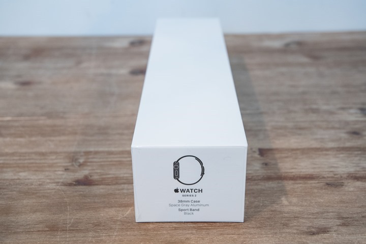
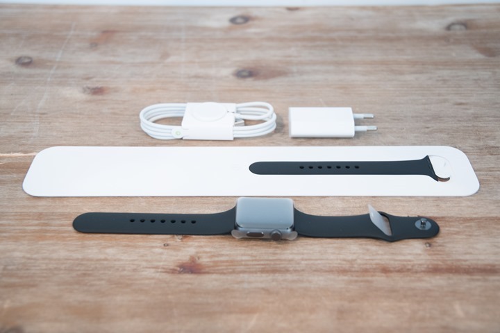
Like the previous generation Apple Watch, the Apple Watch Series 2 comes in a long box, one that feels absurdly heavy for what you expect is inside it.
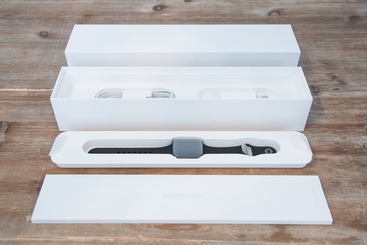
If we crack open the box you’ll find the watch lying there looking up at you. I’ll then separate out the multiple layers of the box, which allows you to find the charging cable and manuals.
If we lay everything out, you’ll find the three components: The watch, the extra watch strap length, and the the charging cable.
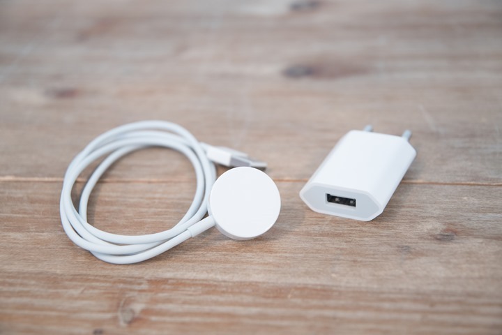
To take a quick look at things, first up is the charging cable. It’s identical from the original Apple Watch charging cable. It uses a small magnet on one side that attaches to the back of the watch. The wall adapter will vary based on where you purchased it. For example, in this generic Apple Watch one I purchased in France (in Paris at the Apple Store under the Louvre!), so it came with a European adapter. Whereas one purchased in the US will come with a US adapter. It doesn’t much matter, you can use any standard USB port on earth to charge it. Except a new MacBook.
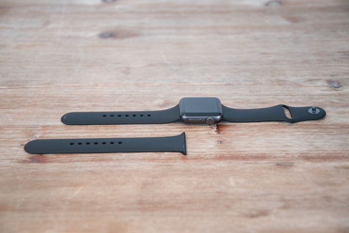
Next we’ve go the additional watch strap, which is inside the box. This one is longer than the one on the watch by default.
And finally, a closer look at the watch from all sides. A mini-gallery of sorts.
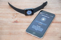
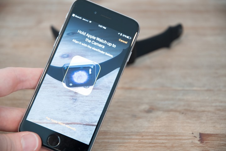
Once that’s done, we’ll want to get it paired up to the phone. This is probably the coolest aspect of things, since it uses this crazy little QR code embedded into the moving image shown on the watch.
It only takes a second and then you’re ready to roll!
Daily Activity Tracking:
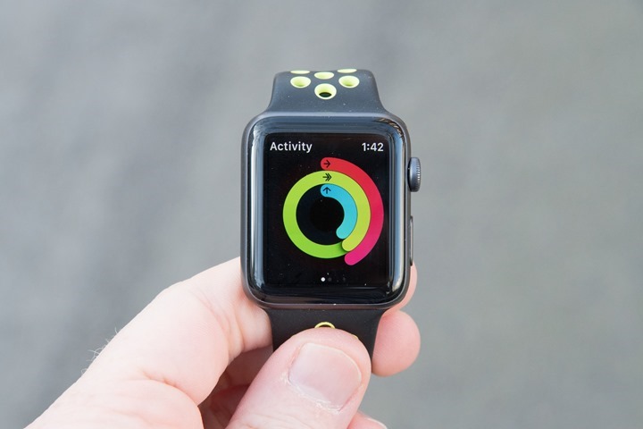
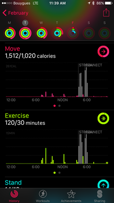
While most activity trackers focus on meeting a daily step goal, the Apple Watch takes a slightly different tack. Instead, the platform focuses on ‘filling’ three different circles each day. These circles are visible through the activity tracking app on the watch, or just by using a dedicated watch face that you can set.
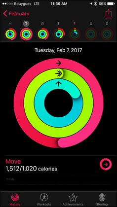
These three circles are color coded, and will complete their entire rotation (hopefully) each day:
Move: Red
Exercise: Yellow/Greenish color
Standing: Blue
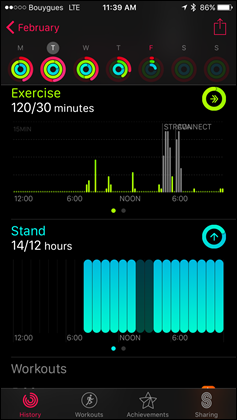
The first one, Move, is akin to steps and movement (though measured and goaled in calories). While the second one, exercise is for cases where the Apple Watch believes you’re doing some form of workout. Even if that workout is a brisk walk. It doesn’t have to be an official workout started without the workouts app. I find that even a quick walk to the subway station will trigger it into me earning exercise.
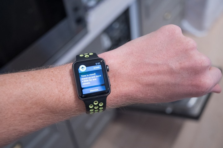
Lastly, we’ve got the Standing metric. This aims to get you standing at least once each hour. The hope there is that by getting you to stand that you’ll in turn go off and run a marathon. Or something like that. And to be fair, it does work. In general since it’s trying to get me to stand, I’ll usually go and wander somewhere – even if only for 30-45 seconds. But sometimes I’ll get further distracted and walk even more – thus Apple achieving its goal of getting you to stop working at your desk or sitting on the couch.
It’ll remind you each hour at 10 minutes to the hour (i.e. 10:50AM, 11:50AM, and so on), to stand – if you haven’t already done so that hour.
Throughout the day you’ll also get occasional fitness status updates on your day – summarizing your activity awesomeness (or enshrining your laziness). You can also dive into the Activity app on your watch and see the same information at any time.
All of this data is rolled into the Apple Watch ‘Activity’ app on your phone. This app details each day and allows you to look at each of the different components:
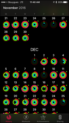
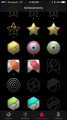
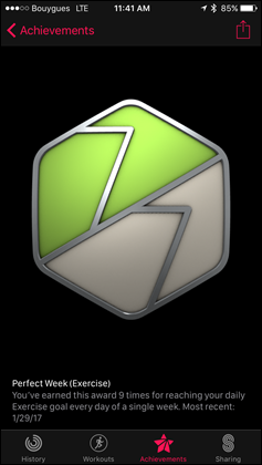
Further, you can then look back at months worth of data as well as earn small achievement medals for hitting various goals:
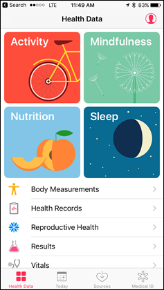
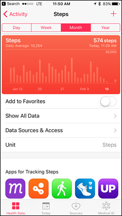
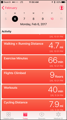
It’s worthwhile noting that Apple is actually feeding data into two different apps. First is the Activity app that I talked about above. But technically behind the scenes they’re also sending data to the Health app (in fact, it’s likely that the Activity app actually pulls from the Health app). That Health app is more commonly known as Apple Health, famed for its “Health Kit’ interface for developers.
You can see virtually all the same data in Apple Health, it’s just in a less pretty manner:
So what are the differences? Here’s a more clear explanation I put together a while back:
Activity App: This is basically the Apple equivalent of what you’d see with the Fitbit App, Garmin App, or Polar apps. It shows your day to day progress around activity tracking (steps/etc…) and workouts. However, think of it like a super-simplified version. For example, if I complete a run with GPS tracking, I’ll see my track on Apple Maps (but no satellite views). I can connect to friends here, allowing me to challenge them or mock them. However, the overall app is fairly simplistic and there isn’t anything when it comes to getting data to other apps or platforms.
Health App: This is also often interchangeably called Health Kit by folks, though there is a small technical difference. Health Kit is the set of services & API’s that apps can use, whereas Apple Health is the app that you as a consumer use. Nonetheless, this is basically a massive database for all sorts of health and wellness information. While it does feature some basic dashboards, the average person probably isn’t going to set these up beyond the defaults. The potential here is vast though, and this is where 3rd parties can add data. So for example, Garmin pumps some data into this, as does Withings. Fitbit does not however, due to their general pissing match with Apple.
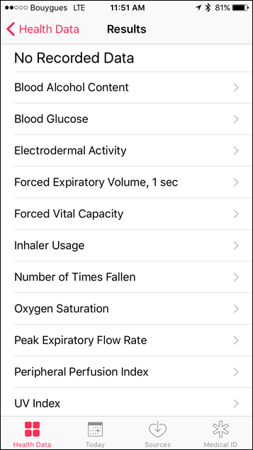
If we look more deeply into the Health App, you’ll see it supports many more data types than the Apple Watch can or ever could measure. For example: weight scale data. Some other metrics are things that we’ll likely see Apple add over time of course with new hardware.
Now, it’s really important to understand one key thing about Apple Health: It lives on your phone. End of story. There is no Apple Health ‘Cloud’, or online platform (such as with Google Fit, Garmin Connect, Fitbit, Withings, and everyone else in the world). The idea behind this is to increase security of your personal health (and potentially medical) data. But there are pros and cons to everything. By doing so it requires that when 3rd parties want to add data, they must do so through an app on your phone. So for example, lets say you had the Withings WiFi Scale. That can’t directly talk to Apple Health. Instead, you have to stand on the scale, let it do its WiFi sync thing, and then open up the Withings App on your phone. Then from there the Withings App will sync to Apple Health using Health Kit API’s.
It’s worth noting that unlike every other mainstream fitness tracker company – there is no desktop app for the Apple Watch sport/fitness activities. There’s no website you can check. That’s because everything sits on your phone. So there’s no way a 3rd party website can reach into your phone unless you sync that data via a 3rd party app installed on your phone. In any case, there’s no equivalent to Garmin Connect website, or the Polar Flow website, or the Fitbit website.
Lastly, it’s important to mention that the Apple Watch does not track sleep in any way, shape, or form. At least not natively. This is likely because the limited battery life means that Apple is basically edging you towards charging at night, versus wearing it to track sleep. Of course, virtually every other wearable on the market – even $29 Misfit trackers – has sleep tracking.
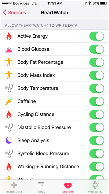
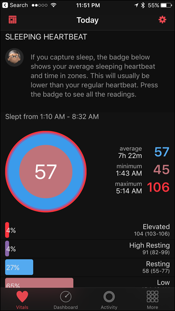
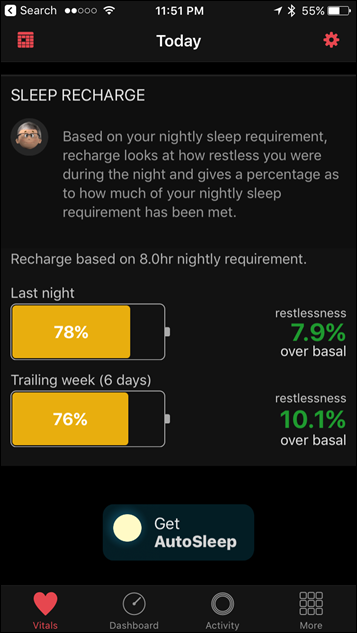
Still, if you want your sleep fix, there are some solutions from 3rd party apps. One that I’ve tried previously, and again here, is the 3rd party app called ‘HeartWatch’. This app allows you to start a sleep session from your Apple Watch, which will then record sleep metrics from the watch overnight. Below you can see the details from a few nights ago:
And the app actually does far cooler resting heart rate analysis than Apple does. Mostly because Apple does none (except storing the data, which HeartWatch leverages).
Finally, as you probably noticed in the screenshots above, the app apparently has a new ‘AutoSleep’ option that you can download/buy that will automatically capture sleep data as opposed to manually starting it. Though, I haven’t tried that yet.
General Workout/Sport Use:
The Apple Watch includes a workout app that allows you to track workouts. The Nike+ edition also includes a separate running-focused app – Nike+ Run Club – as well. I cover that app in the next section. For this section though it’s all about the default app, which is an important way of noting that with a device like the Apple Watch, 3rd party apps will fill in many of the gaps that the default app has.
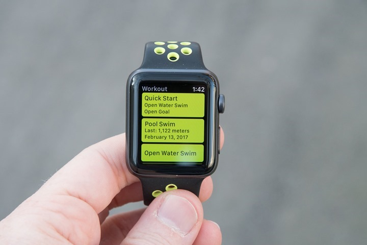
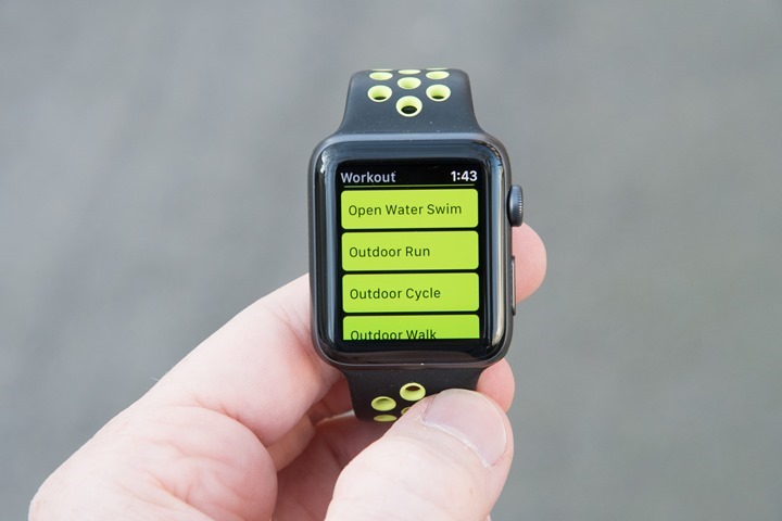
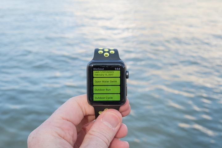
Of course – one of the most notable improvements to the Apple Watch Series 2 lineup was the inclusion of GPS. Previously the watch would depend on you having your phone with you. Whereas now it can go untethered. Still, the starting procedure is identical. To begin a workout you’ll tap the Workout icon on the home screen, which will bring you to the photo above.
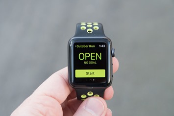
At this point you can select any of the workout types. Your most recently used sports will bubble to the top and offer a quick start mode, which begins the count-down immediately. Else, for other sports you can select the sport name and configure settings.
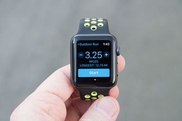
These settings include goals – distance, time, or calories.
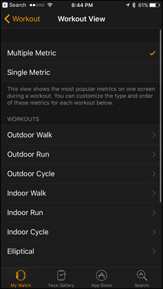
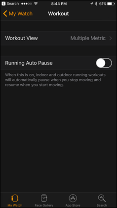
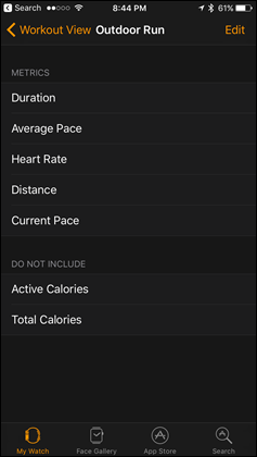
Note that overall settings are pretty limited here. You can change a handful of data page options within the Apple Watch App on your phone, but only those seen below:
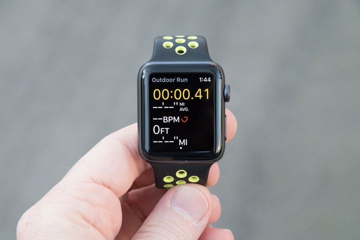
With that set, you can go ahead and begin your workout. We’ll use a run for this basic example – all workouts offer effectively the same page and structure. Said differently: Once you’ve seen one, you’ve seen them all, aside from configuring which data fields you want on your workout page. It’s here that 3rd party apps can greatly expand your choice.
The data will update automatically. To give a look at pacing stability, here’s the current pace as shown on the screen while running. Note that many companies these days will utilize the accelerometer to provide more stability than GPS data alone. So by holding up the watch to take video of it, I am slightly impacting that. Still, I found that the pacing stability levels shown in the video I made below is virtually identical to that of what I’d experience when not holding a camera above it. It doesn’t matter. It sucks either way.
As you can see – it’s dismal. Like, horribly bad. I think the video basically says all I can possibly say about it.
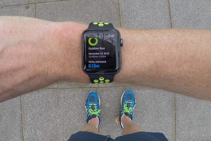
Upon completing your workout, you’ll get a summary page that shows you overall metrics from the run.
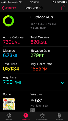
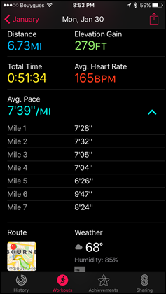
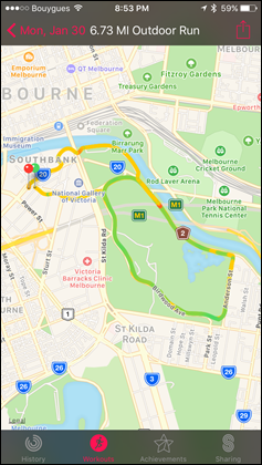
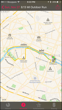
Further, if you dive into the ‘Workouts’ app on your phone, you’ll get additional workout-specific data, including a basic map of where you ran. Note that unlike every other GPS fitness tracker on the planet, you *cannot* export out your GPS track to 3rd party apps. Even apps like Strava can’t receive workout data from the native Apple Workouts app. Strava can however use its own app to record data. So keep that in mind when starting your workout, as to which app/platform you want. The three screenshots below capture 100% of what you can display within the Workouts portion of the Apple Watch app. There’s no other data pages to show.
Now of course, like most products these days, the Apple Watch does have an optical HR sensor in it (the exact same sensor as the original Apple Watch). Optical HR sensors are becoming commodity in the activity tracker and fitness realm. What isn’t commodity however is the quality of the sensor, which varies heavily from company to company. But more on that in a moment.
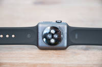
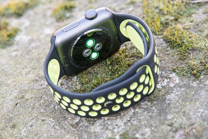
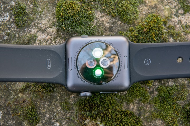
The way optical HR sensors work is that they shine an LED light down through your skin to your blood capillaries. From there, the optical sensors (photodiodes) then pickup that light and measure the blood flow, and thus your heart rate. Apple employs two green LED’s, and two photodiodes on the back. The technology has been around for many years in a number of different forms. But it’s really only been the last 3-4 years that we’ve seen it migrate into the sport world (well before Apple got there).
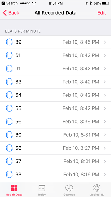
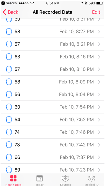
However, the Apple Watch also has a secondary method for capturing HR, which is using infrared. It does this when it’s capturing your 24×7 HR, whereas the green LED’s are used for sport activity. In the 24×7 mode, Apple Watch measures your heart rate at random intervals – seemingly based on movement. It could be 15 seconds apart, or 10 minutes apart. All of these data points can be seen in the Apple Health app, deep in the menus under sources.
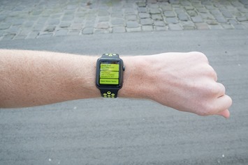
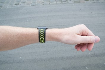
Meanwhile, in workout mode it’ll leverage the green LED’s to provide continuous HR throughout the workout. Like all optical HR sensor units on the market, you need to take some care when it comes to positioning on the wrist. For example, the further away from the wrist bone the better. Being right on the wrist bone just won’t work well, no matter the brand. Below is an example of good placement and snugness. Note my wristbone about 2-3cm to the right of the watch (you can click to expand).
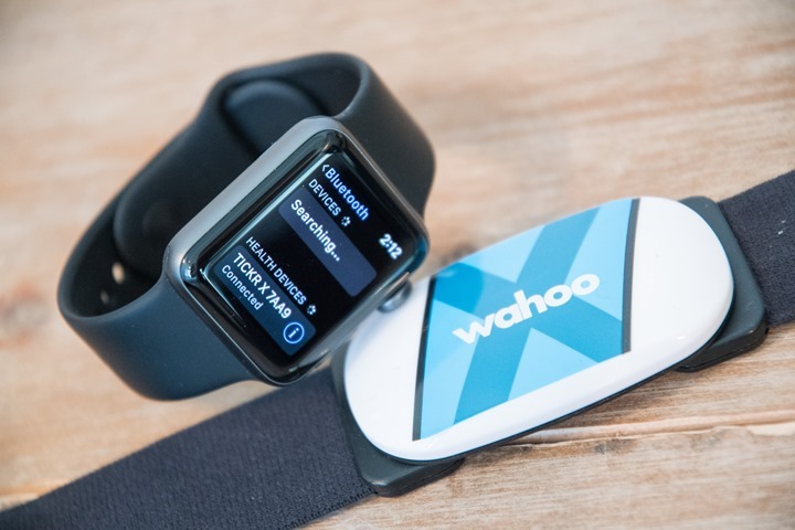
You can also pair a heart rate strap directly to the Apple Watch to provide more accurate data. I talk about the optical HR sensor’s accuracy a few sections down from here.
Now one final quirk that’s worth mentioning. My testing I found a bizarre oddity that can prevent the Apple Watch Series 2’s GPS from functioning at all. In my case, I was using a Garmin Edge device with Live Track enabled while out riding. Yet, if I use that device with Live Track enabled, it somehow blocks the Apple Watch Series 2 GPS from functioning (it’ll give zero distance and speed readouts). Bizarre, given the whole point is to have a GPS chipset within the watch – which should have no dependence on the phone. It’s hard to know ‘who’ to blame here. Apple’s mum on the issue, only to confirm that they can confirm it. Obviously it’s an edge case, but it shows what might be an odd dependency/bug within Apple’s logic that any 3rd party app can apparently break GPS on the watch itself. Note that I can reproduce this issue at will, and other readers have confirmed it.
Nike+ Run Club:
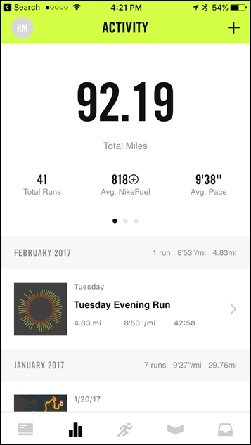
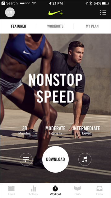
Unique to the Nike+ Edition (but still available to install on other Apple Watch units) is the Nike+ Run Club app. This app comprises two pieces. First is the Nike+ Run Club (aka NRC) app that runs on the watch itself. And second is the NRC app that runs on your phone. And not to be forgotten, there’s technically a third component to this – the Nike+ Training Center app that can also be installed your favorite fruity phone device. Though, that’s not required.
(Nike Run Club app left, Nike Training Center app right)
The NRC app on your watch is designed to be that slightly nagging coach that’s tapping on your shoulder each day asking if you plan to get in your workout.
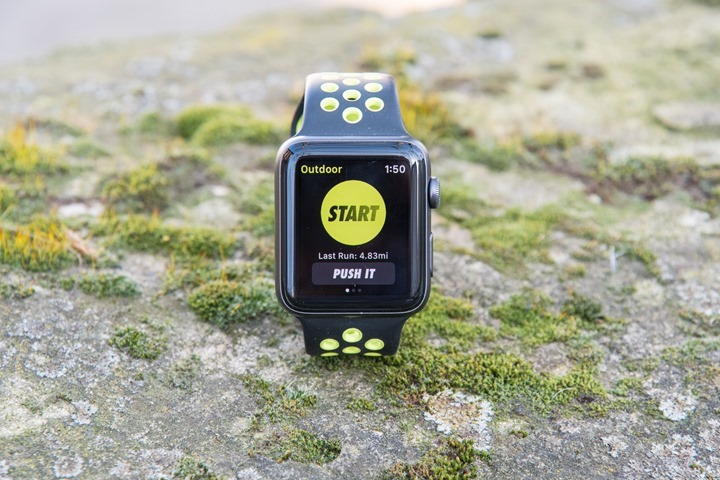
Once launched, the app has a few basic pages to begin with. First is the main page which lets you start a run. We’ll come back to that in a second.
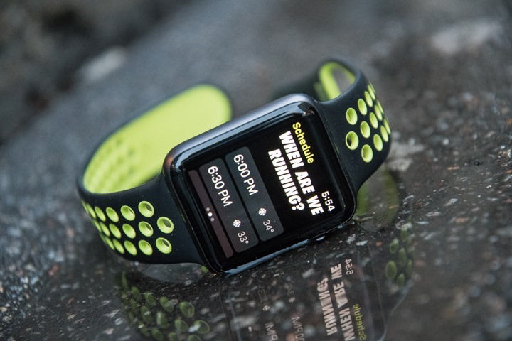
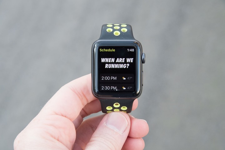
Then if we swipe right we can schedule a run, which shows the weather for the remainder of the day.
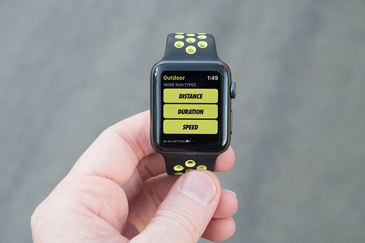
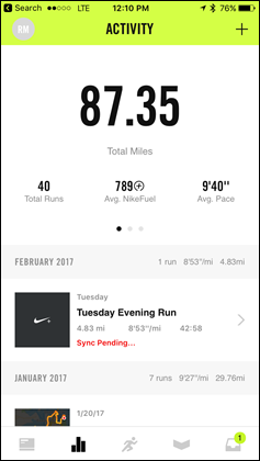
And finally, we see a summary of the mileage we’ve put into the NRC app thus far this month in runs. Note – it’s only this app, and not other apps. So if you use the baseline Workouts App (as I often do instead), that doesn’t count. In any case, back to the start button. It’s here you can swipe down to get to different types of runs, based on distance, duration, or speed.
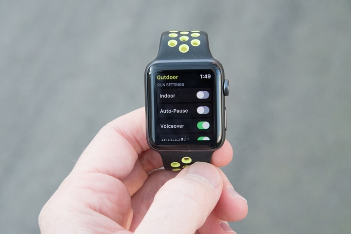
Also, you can configure some super basic settings – including whether you’re inside (i.e. a treadmill), or if you want auto-pause enabled, voiceover enabled (speaks metrics), or if you want additional metrics shown during the run (All Metrics). Finally, you can set a playlist for music.
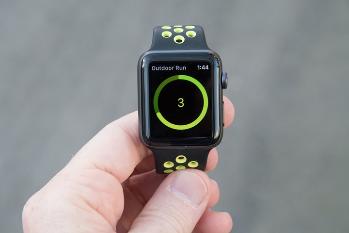
Back up top, we can hit the start button to start the run, or the ‘Match It’ button, which gives you the goal of your last run’s distance. You can tweak that distance as you see fit by adding or removing. So the slogan should really be: ‘Match it, unless you’re lazy.’ Finally, after whacking the start button, you’ll get a 3-second countdown.
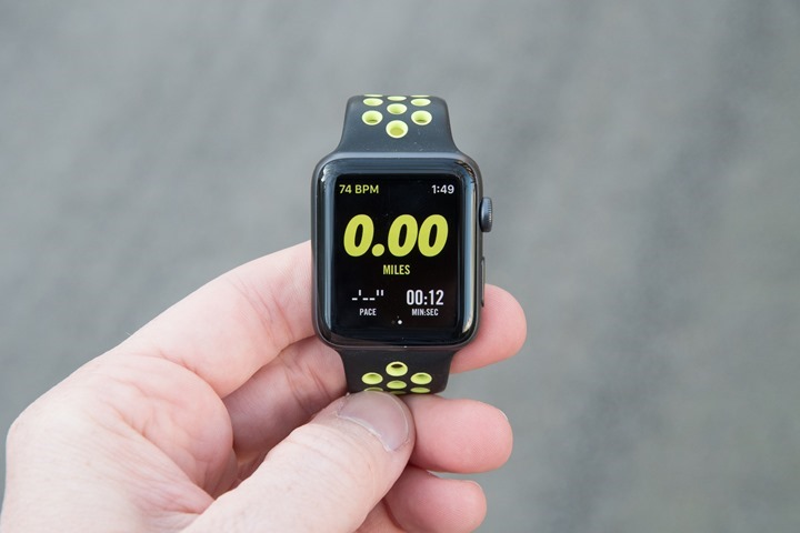
At which point it’ll show your total distance, current pace, and current time. Your heart rate and the time of day are displayed along the upper edge. Along the bottom, it’ll show progress towards a goal, like the installation bar on an app.
And that’s it when it comes to metrics. Nothing more, nothing less. Well, actually, if you deselect ‘All Metrics’, then you will get less.
Lastly, once done with your run (and really, it’s only runs, not other sports), you’ll get a summary screen of the workout, including even a nifty breadcrumb style map.
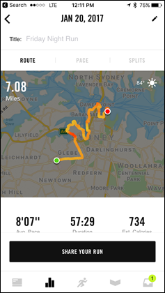
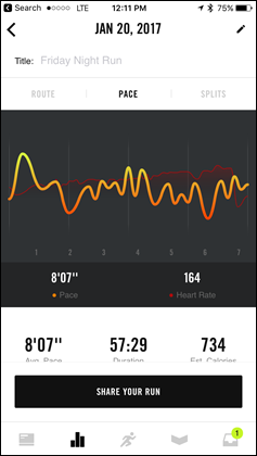
These workouts can then be opened up using the NRC app on your phone to dig into more detail. Like much of the Apple Watch workout experience, the app is somewhat basic when it comes to the data displayed. For example, you can’t change to satellite or terrain view in the maps.
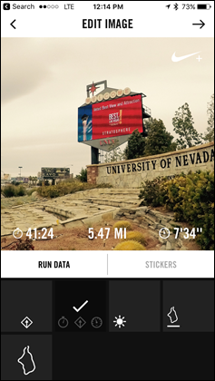
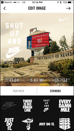
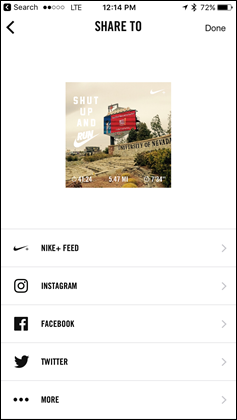
Though, you can share out your run as a picture, using a photo you took along with the route/metrics overlaid onto it:
It’s funny and somewhat astounding to me that Nike has had this forever, and yet majors like Garmin, Polar, Suunto, and others lack it. I have a number of friends on my Facebook/Instagram feeds that share these out – complete with the Nike logo each time. It’s perfect advertising for the platform.
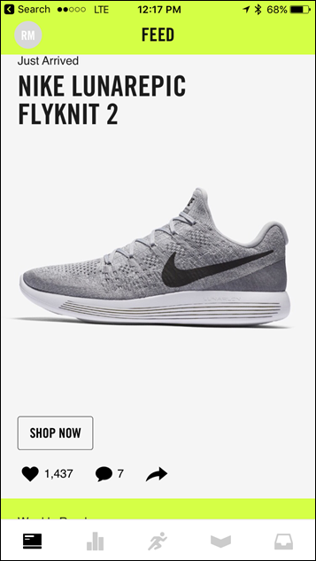
Lastly, while there are other sections of the NRC app – such as the leaderboard and events pages, the timeline page instead seems to be filled with ads for Nike branded gear.
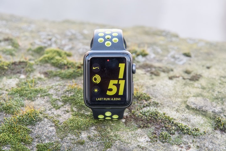
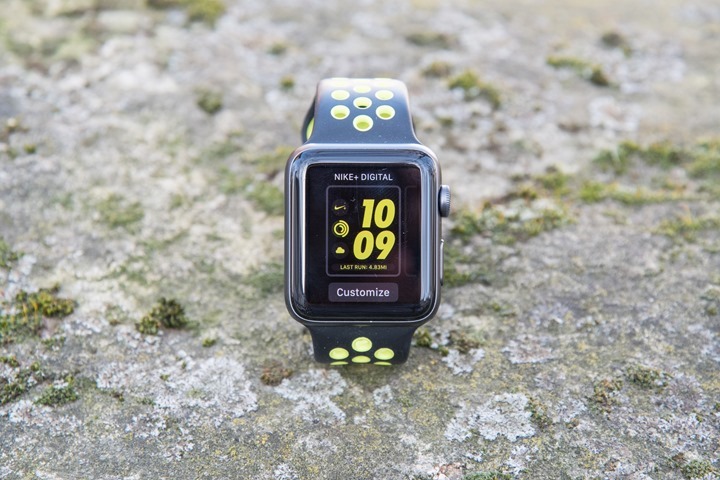
There ya have it – the Nike+ specific features. Note that the only unique features of the Nike+ edition of the Apple Watch compared to the regular Apple Watch Series 2 units, is the dedicated watch-face (below), and then the ability to tell Siri you’re going for a run and have it launch the Nike Run Club app.
Thus ultimately, I’d let your style/fashion choices drive which Apple Watch unit you want – more than a specific Nike branding or not. If you like the Nike+ straps – then go forth (you can always swap straps later).
Swimming:
One of the biggest changes (aside from GPS) implemented in the Series 2 was enablement of swimming functionality. While the previous edition was largely waterproofed just fine (as I showed in my videos), Apple played it safe and declared it not waterproof. In fact, they even went as far as blocking swimming apps from the App Store, in fear that folks might use their non-aquatic first generation watches in the pool.
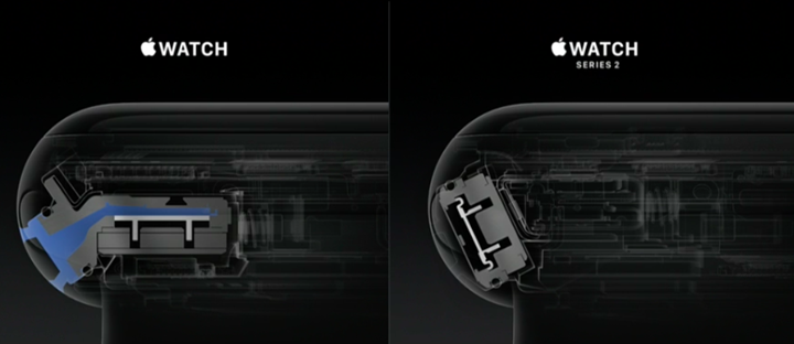
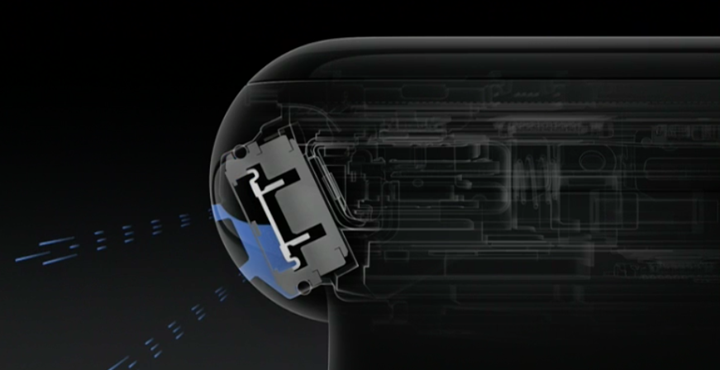
But Series 2 dispenses away with all of that. Not only is the unit fully waterproofed to 50m, but it’s also got tracking modes for both indoor and outdoor swimming. Further, the unit actually has a water ejection mechanism, which spits out water like a drowning cat. Albeit, a cat with a backup alarm sound to it.
The way it works is by using the speaker to vibrate the water out. Apple showed some pretty cool pics during their opening announcement presentation on how it works mechanically:
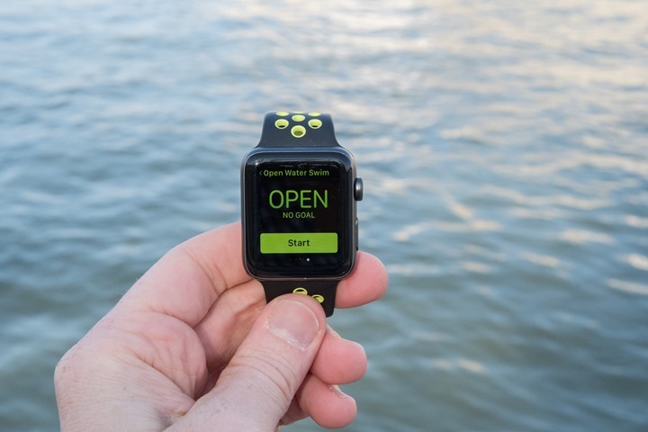
So with that in mind, we’ll start with an openwater swim or two. Like other sports, you’ll select the ‘Open Water Swim’ option from the sport menu list in the ‘Workout’ app.
From there you can specify a goal, such as elapsed time, calories, or distance (yards/meters). Or simply leave it open to specify no goal.
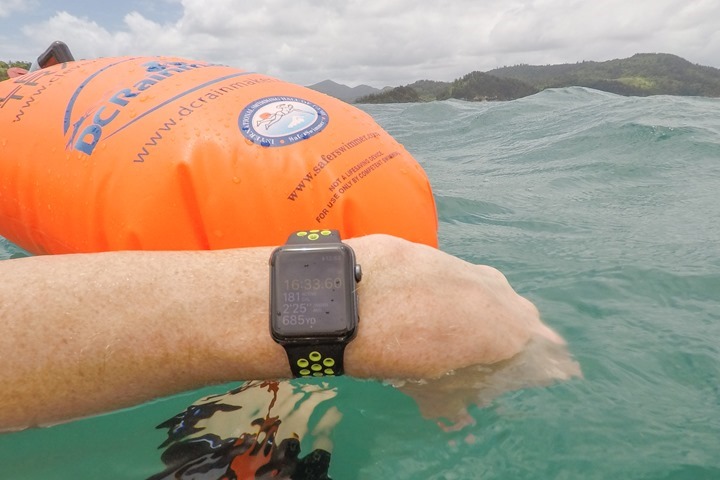
Next, you’ll get your count-down as usual, and it’s off to the races…or water. What’s notable here though is that the screen is now locked by default. Because the Apple Watch has a touch screen which won’t work underwater, it doesn’t want it to be going all crazy on you, so it locks the screen:
So you’ll only get one data screen to work with, which shows time, calories, distance, and swim pace.
In order to access the other screens you’ll need to turn the digital crown to unlock the unit. At which point it’ll do its water spitting routine shown above.
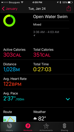
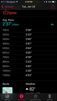
When unlocked the unit is still tracking/recording, until you slide over to the control page to pause/end/lock your workout. After you’ve completed the swim you’ll get a summary screen showing total distance, total time, dominant stroke, active calories, total calories, average pace, average heart rate, and the weather.
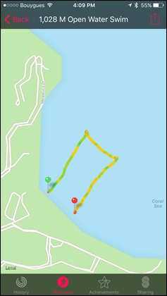
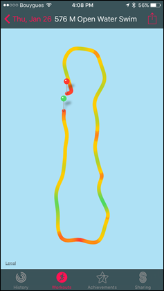
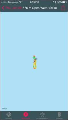
Meanwhile, let’s head over to the Apple Watch Workouts app on the phone to look at nearly the same information, yet this time with a map:
Now what’s missing here is any satellite view. This is a huge bummer since for many people the satellite view is more useful for openwater swims because it provides more context around terrain. Oftentimes generic map displays are inaccurate when it comes to coastlines. Or, they’re useless. For example – this swim I did on the Great Barrier Reef. Here’s what Apple displays:
And here’s the increda-bam that I actually swam using satellite imagery from Google:
Every other GPS watch allows you to overlay data onto satellite view, except Apple. What’s that you say? Why not just export it as a GPX file?
Ahh…that’s right. You can’t.
For real.
You can’t export out any GPS tracks from any of Apple Watch’s native apps. So no uploading this to Google Maps, or Strava, or Training Peaks, or MapMyFitness, or anything. It’s just a fart in the blue wind.
What about swim distance accuracy though? Well, it’s a bit hard to compare exact tracks because I can’t actually export these out. So instead, I’ll have to go by total distance. So in this case, here are a handful of swims compared to other GPS watches worn at the same time. In this case, I included a ‘reference GPS’, which is a GPS that floated on a swim buoy about one foot behind my butt. It’s a great way to test swimming GPS.
Openwater Swim – Jan 24th:
Apple Watch Series 2: 1,028m
Reference Swim Buoy: 1,046m
Now, to Apple’s credit, their GPS track accuracy is among the best I’ve seen when it comes to openwater swims (other sports, less so). I mean, in my swim cases, they truly nailed exactly where I went – even if it’s difficult for me to demonstrate that because I can’t overlay tracks in any scientific manner (again, because I can’t export).
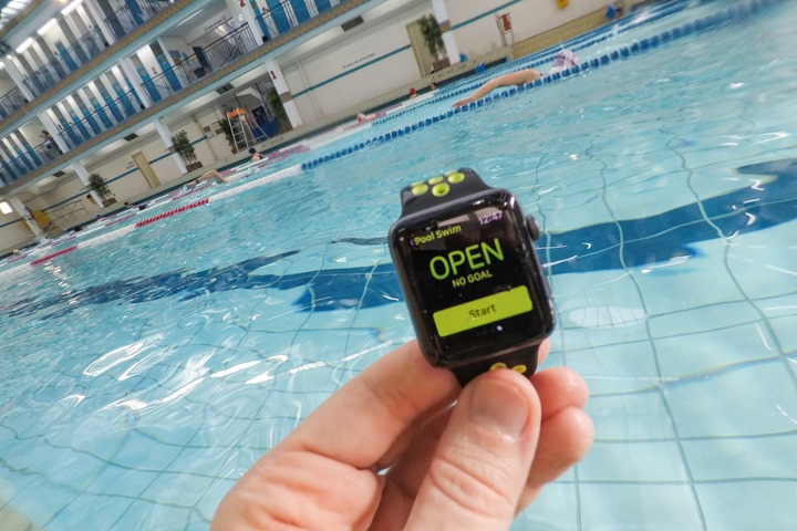
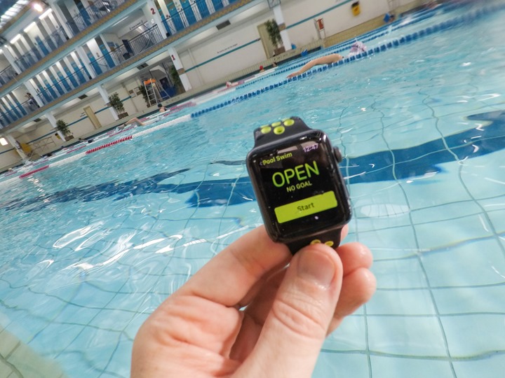
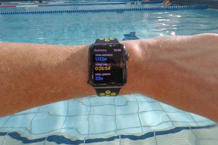
Shifting gears – what about indoor swimming? Well, it pretty much works very similar to outdoor swimming, except without the GPS. For indoor use it’ll use the internal accelerometer. To begin, you’ll start by selecting ‘Pool Swim’ in the Workouts menu.
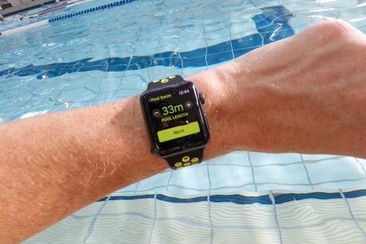
Next, you’ll need to select your pool length. You’ll do this by pressing up/down on the +/- arrows. The minimum pool size is somehow 1 yard, and the maximum pool length is somewhere north of 1,054 yards. I got tired of holding the button down. What’s odd though is that you can’t simply select presets like 25y or 25m, or 50m. In fact, even odder because in reality many people in the US for example will rotate between a 25y and a 50m pool. You can toggle between yards and meters by holding down the center of the screen for a second.
Still though, you can’t select some common pool sizes. For example, I happen to have an odd-duck 33 1/3rd meter pool. Which…I can’t select (though virtually every other swim watch on the market has this size supported).
In any case, that annoyance aside – you’ll tap next and be given the usual goal selection: Calories, Time, Distance, Open. In my case, I just went with Open.
From there the unit will lock the display just as with the openwater swim, and it’ll start tracking your swim. It’ll show you: Time, Active Calories, Laps, and Yards (Total). And just like before there are no further screens to change to, except to unlock the screen using the digital crown and then pause/end the swim.
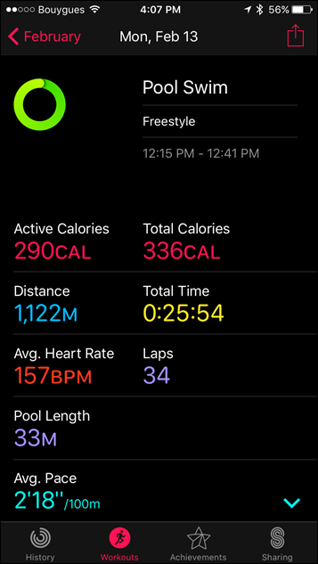
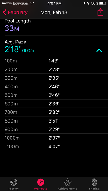
Once that’s done you’ll get the same summary metrics as above, as well as the summary metrics offered in the Apple Workout app:
From an accuracy standpoint, I didn’t see any issues with accuracy during indoor swims, which matched that of both my actual distance/laps swam, as well as that of other watches I was using.
Optical HR & GPS Accuracy:
So what about both optical HR and GPS accuracy? Since I’ve covered swim accuracy already, so I’m not going to re-hash that. I’ll put swimming that in the camp of ‘Good’.
But what about that optical heart rate sensor? Well, nothing has changed there since the first version of the Apple Watch. Apple themselves has noted it’s identical hardware to the original watch. Of course, over time Apple has made improvements in software for both editions – so you will naturally see some tweaks between the two.
Of course there’s certainly been lots of commotion in the mainstream media about how well the Apple Watch works on various skin tones and things like tattoos or hairier arms. The reality is that this is no different than other optical HR sensors. Some companies will add in secondary LED colors to add more breadth to their optical HR measurements. Yet others with just green-alone are able to do just as good. But ultimately, the non-click-bait headline is actually that Apple isn’t really any different than anyone else. For some people it’s just not going to work – no matter if their skin is white or black, or tattooed or not. There are plenty of reports of perfectly functioning Apple Watches with optical HR across a wide variety of skin tones (just as there are on other sensor companies).
What is FAR more important than skin tone, is really just how you wear it: Snug, and away from the wrist bone. If you do that, you’re rather likely to at least have a starting point for good results.
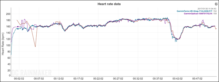
With that in mind – how does it handle? Let’s start off with a simple run to check things out. In this this case a run I did a nice 5-7 minute easy warm-up, before getting into the groove for about 3K at a relatively even pace. From there I then kicked it up a notch or two for another 3K, doing a loop around a park.
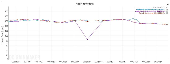
What’s notable to start with is that it took almost 2 minutes after pressing the start button for the Apple Watch to decide on a heart rate. At which point that heart rate was incorrect by 40 beats. It wasn’t until 7 minutes into the run that it agreed with everyone else.
Once that 7-minute marker hit, it was generally pretty good across the remainder of the run, minutes a small blip at the 12 minute marker. But still, what you see early on in the run is quite normal for the Apple Watch.
Apple seems to be hesitant to simply tell users to wait until they have a HR lock – so they pretend like all is well, when it reality it doesn’t have a lock at all. The cascading effect of this is that it takes far longer to establish a lock while running. Had the Apple Watch simply told you to wait another short bit – even 10 seconds – it’d have a drastically different result. Clearly a case of software form over function. Note that every other watch on the market tells you to wait a few extra seconds while it finds a lock. Every one.
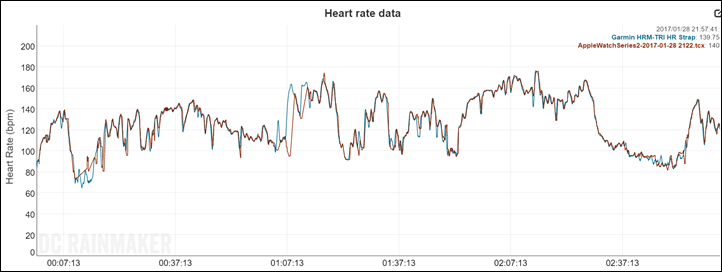
Next, let’s look at an outdoor ride. This as about 3 hours long, and over varied terrain. Intensity level was generally easy towards the beginning, a few solid hills in the middle, and then a bit harder intensity towards the end.
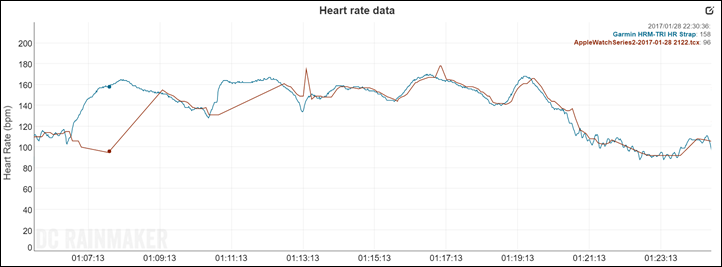
The above is smoothed at 20-seconds, meaning that in order to see gaps more easily in such a large plot of data, the smoothing helps. It’s clear that by and large it does pretty good matching the HR strap. You can see that it completely misses the start of that section in the middle where the HR spikes up (due to the hills). It also misses some earlier intensity shifts (briefly). It catches up, but let me show you how long that takes if I remove the smoothing in the graph above, and focus just on that hill section:
What you see here is that the Apple Watch basically gives up. It takes about 4 minutes after my first increase in intensity until it gets anywhere near, at which point it immediately loses the plot again for another 2-3 minutes. After which, it seems like it’s good to go again.
But what you see above is common – when it loses the plot, it just gives up entirely for many minutes at a time. On the flipside, when something like a Garmin or Fitbit’s optical HR sensor loses the plot, it kinda keeps on trying (albeit, for better or worse). Generally though, with Fitbit or Garmin, their optical sensors will re-lock faster.
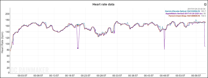
And finally, let’s look at another run – this one a much tougher trail run. This is tough and notable for a few reasons. First is that with the quick increase in incline, my heart rate increases rapidly. This can often be trickier for optical HR sensors. Second though is that with trail running my cadence is going to vary more with the terrain. Steeper terrain causes slow-downs, while descending speeds it out. When optical HR sensors fail to track, they often do so by matching your run cadence. So here’s how that performed:
In this case, you see that overall it actually did pretty darn well (above smoothed 10 seconds). All of them tracked rather nicely for the most part. You see three blips where things dropped out of nowhere on the Apple Watch unit, for no particular reason. It wasn’t at a tough part or an easy part, it was just…out of nowhere. It took about 60 seconds for it to re-find itself in that first blip – as you can see below.
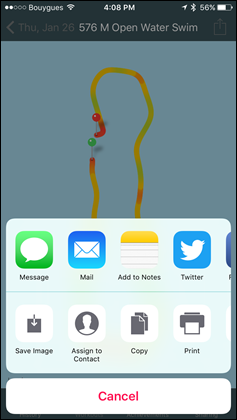
Now you may be wondering about GPS accuracy. And that’s where things get a bit trickier. See, the Apple Watch platform (either the Activity App or the Apple Health app) doesn’t allow export of GPS data. The only export you can do is of a small picture of your run:
That’s it.
As such, I can’t export out the GPS data and overlay it against other GPS devices at the same time. This is of course pretty disappointing. At best I can compare total distance, but that’s easily skewed. A device could cut one corner while going wide on another – resulting in the same end-distance, but being otherwise incorrect. That said, here’s what I’ve got for a handful of runs and rides I’ve picked out at random:
Outdoor Run – Jan 20th:
Apple Watch: 7.08mi
Garmin Fenix Series: 7.09mi
Garmin Fenix3: 7.41mi
Hike – Jan 23rd:
Apple Watch: 4.17mi
Garmin Fenix Series: 4.06mi
Garmin Fenix 3: 4.06mi
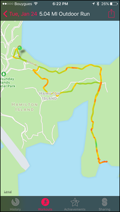
Outdoor Run – Jan 24th:
Apple Watch: 5.04mi
Garmin Fenix Series: 4.97mi
Suunto Spartan Ultra: 5.05mi
Outdoor Run – Melbourne – Jan 30th:
Apple Watch: 6.73mi
Garmin Fenix Series: 6.82mi
Suunto Spartan Ultra: 6.91mi
Outdoor Run – Melbourne – Jan 31st:
Apple Watch: 3.25mi
Garmin Fenix3: 3.29mi
Suunto Spartan Ultra: 3.22mi
Treadmill (indoor) – Feb 7th:
Apple Watch: 4.83mi
Garmin Fenix Series: 5.00mi
Actual Treadmill: 5.07mi
In general, I find that it seems to short the actual distance of the run in almost every scenario (these are all GPS-on runs). And even on treadmill runs, it’s also a few percent shorter than I’d expect otherwise. Of course, treadmill runs are tough, but still, it’s short more than other devices I’ve tested.
Now in the sport device world – being short is far better than being long. Measuring long is the cardinal sin, because it means you’ve likely run both slower and less than you thought you did. Both of which give you a skewed assumption of your actual fitness. In this case with the watch often measuring short, you’ve likely run both faster and longer than you actually did.
Which isn’t to say that’s good. It’s not. But it’s the lesser of two evils.
Ultimately, neither the Apple Watch’s GPS or optical HR performance is anything to write home about. It’s below average at best. Not horrible for optical. But not great either.
Fitness Apps (3rd Party):
Now the good news is that where Apple’s own apps lack functionality, 3rd party apps will be able to fill those gaps. For example, apps like RunMeter (or CycleMeter) – ones like HeartWatch (as I talked about earlier), Swim.com, and even mainstays like MapMyFitness are all solid options that give you far more flexibility than the default apps provide.
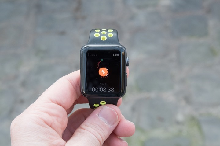
Then we’ve got long-awaited apps like Strava for the Apple Watch Series 2, that’ll be able to take advantage of the standalone GPS. Strava says that you’ll start seeing that available in just a few weeks.
Of course – one of the challenges these apps have though is that they still depend on the underlying data from Apple to be correct. That means that it’s garbage-in, garbage-out when it comes to stuff like heart rate or GPS. Certainly apps can try and smooth some of that data themselves, but if they’re left with sub-par data, there’s little they can do to make the situation better – at least from an accuracy standpoint.
Also – many apps are still very much dependent on your phone, negating the benefit of the Series 2 devices. Of course, a lot of apps have updated to become phone independent, but it’s still a mixed bag. Heck, even Apple’s own Nike Run Club app bundled with the Apple Watch Series 2 Nike+ Edition requires the phone to use the ‘Speed’ workout option, asking you to crack open the app on the phone.
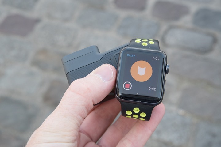
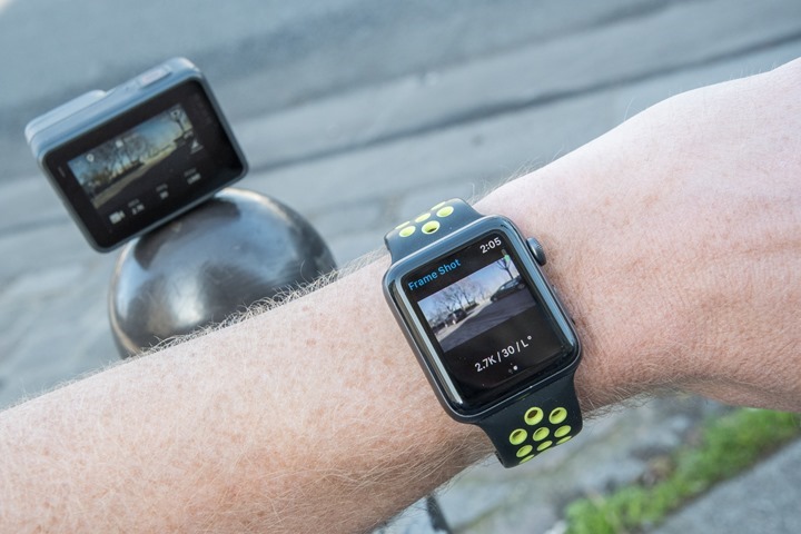
Some apps split the difference on utility. For example, the GoPro app (for use with their action cams), allows some basic control of the GoPro. You can change modes between video and photo for example. But they miss the mark on allowing me to actually change settings (i.e. from 4K to 1080P, or from 30FPS to 120FPS). Though you can make highlights, which is handy.
But the app has to be in range of your phone, because all communication routes through the phone. Further, the app allows you to preview what the camera sees. Unfortunately the delay is so significant and the update rate so low – that it’s truly only to be used for framing a shot (which, the top of the Apple Watch does somewhat make clear). In this case we’re not talking frames per second (FPS) but rather seconds per frame (about 2-3 seconds between each update).
Which isn’t to say I don’t appreciate GoPro’s attempt here. I just wish it could be more. For example, I’d much prefer to be able to connect the Apple Watch straight to the GoPro instead – cutting out the middleman and giving me a bit more flexibility.
Of course – the main focus of my review is the built-in features of the Apple Watch. I’ll be circling back later this spring to talk in more detail about my top fitness apps and seeing whether they can be true replacements for the advanced athlete.
Non-Fitness Usage:
Of course, while much of the press around the Apple Watch Series 2 is about the GPS and waterproofing, the reality is that a big behind the scenes update was the processing power. That processing power is largely about making 3rd party apps run seamlessly – and making the watch act more fluidly. And the primary audience there tends to be folks who are using the watch as a smartwatch, more than a fitness watch.
And that’s really where the Apple Watch is best – as a day to day smart watch. As I said in my original Apple Watch review – there’s no smartwatch out there that’s as good as the Apple Watch. Period.
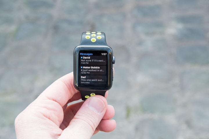
There’s no watch out there that has either the app selection or the nuances of the Apple Watch. And most of it’s silly stuff. It’s things like the vibration alerts (or ‘haptic feedback’ in fancy Apple language) are so nuanced that they don’t feel overpowering like most smart watches. Or it’s that when you receive text messages during a meeting while your hands on on the table, it won’t display those notifications on the watch until you finally twist your wrist towards you.
It’s smart enough to not show that incoming sext to all your coworkers at the table, but rather wait until only you want to look at it. At which point you can respond with various pre-canned responses (some of them seemingly smart), a bit of functionality lacking on almost all fitness smart watches. Not to mention that conversations are far cleaner on the Apple Watch than they are on other watches. They’re neatly organized by contact, rather than a flood of random notifications.
It’s funny, I talked with a few different senior people at five-letter fitness giant over the past few months about the Apple Watch, and it’s clear nobody has tried it for more than a few minutes. They lack a basic understanding of why these nuances have made people love the Apple Watch. Seriously, someone needs to force a whole bunch of employees to wear an Apple Watch for a week and understand the attention to detail beyond fitness. Which isn’t to say Apple is good at everything – hardly (as noted above, fitness leaves a lot to be desired).
Shifting to 3rd party apps – when I first reviewed the original Apple Watch, the main concern I had was that most apps were little more than notification pushing things. They didn’t really do anything more than the standard notification center would. And in many ways, that’s still mostly true for non-fitness apps.
Still, there are specific examples where a given app is driving more functionality than before. For example, the GoPro app I talked about before. Or the Drip (for Dropcam) app allowing me to check in on the baby’s room.
Yet there are examples of utter failures of apps. For example, the official Nest app has a single function: Toggling whether you’re home or not. That’s it. Why bother with such limited app? Well there’s a reason: Apple’s applies incredible pressure to app developers to submit Apple Watch apps in conjunction with their iOS app. If they don’t, then they’ll generally not be considered for including on the ‘Featured’ app pages of the Apple App store.
So while you’ll get many apps that have Apple Watch apps – a large chunk of them suck. I suppose that’s like the old saying “Tis better to have sucky apps, than never to have sucked at all?”. Or something like that.
But all watch platforms suffer from sucky apps. Garmin and Android Wear (and up till recently, Pebble too) certainly have their share of sucky apps.
And thankfully in this case, the watch itself as a day to day business watch stands on it’s own without need for many apps. In fact, the vast majority of the time I don’t use any apps. It’s the entire smart notifications piece on the Apple Watch that sells me on it. Nuance matters.
Product Comparison Tool:
I’ve added the Apple Watch Series 2/Nike+ Edition into the product comparison tool. Note that the Apple Watch is a bit unique (kinda like an Android Wear device) in that there’s a base level of sports/fitness functionality that’s usually somewhat primitive compared to companies like Suunto/Garmin/Polar. However, through 3rd party apps you can extend that functionality quite significantly.
I’ve always struggled a bit here on where to draw the line. Do I say ‘No’ for intervals, since it doesn’t have that functionality? Or do I say ‘Yes’, because you can get it through 3rd party apps. And what if you can through 3rd party apps but only with payment? And for some more nuanced features (i.e. tides or parachute modes), do I try and track down every single app – and what happens if those apps go out of business? It’s not really sustainable to try and track every possible feature and find a 3rd party app to fill those gaps. Ultimately they are just that: Gaps.
So by and large I stick ‘No’ in those boxes – because the watch doesn’t have it out of the box. In the same way that I stick ‘No’ in boxes for Garmin devices if a feature isn’t inbox, but may be available through 3rd party apps. Make sense? Good.
Note that you can make your own comparison table from any devices I’ve reviewed, here in the product comparison tool. In this case, I just picked three other products that are often compared. The Android Wear based Polar M600 (has music), the TomTom Spark 3 (has music), and the Garmin Vivoactive HR (doesn’t have music). From a functionality standpoint, these three are closest.
| Function/Feature | Apple Watch Series 2 & Nike+ Edition | Garmin Vivoactive HR | Polar M600 | TomTom Spark 3/Runner 3 |
|---|---|---|---|---|
| Copyright DC Rainmaker – Updated February 10th, 2017 @ 4:42 pmNew Window Expand table for more results | ||||
| Price | $369 | $249 | $329 | $149-$299 (Features Vary) |
| Product Announcement Date | Sept 7th, 2016 | Feb 19th, 2016 | Aug 3rd, 2016 | Sept 1st, 2016 |
| Actual Availability/Shipping Date | Sept 16th, 2016 | Q2 2016 | Sept 2016 | Sept 8th, 2016 |
| Data Transfer | Bluetooth Smart | USB, BLUETOOTH SMART | USB/Bluetooth Smart/WiFi | USB/Bluetooth Smart |
| Waterproofing | 50m | 50 meters | IPX8 (good for swimming) | 50m |
| Battery Life (GPS) | 5hrs GPS on time (24-48hrs standby) | 13 hours GPS on | 10 hours | Up to 11 hours (varies) |
| Recording Interval | Varies | Smart Recording | 1-second | 1s |
| Satellite Pre-Loading via Computer | Yes | Yes | Yes | 3 days |
| Quick Satellite Reception | Great | Yes | Great | Yes |
| Alerts | Vibration/Audio/Visual | Vibrate/Visual | Visual/Vibration | VIBRATE/SOUND/VISUAL |
Remember, you can mix and match any of the watches I’ve reviewed here in the product comparison tool.
Summary:
There’s no doubt that for a large portion of the population, the Apple Watch Series 2 upgrades (specifically the inclusion of GPS) will hit the spot. The watch feels slightly faster, and core functionality is just as clean as it’s even been on the Apple Watch. In many ways, that’s what’s so much better about this watch than others: Being a really damn good smart watch.
On the fitness front though, it’s a bit mixed.
The accuracy of both the optical HR and even the GPS leaves something to be desired. Of course, some of that is hard to really dissect given that Apple locks much of your GPS data behind a wall. They also fail to make it easy (or even possible) for 3rd party apps to gather data like your runs and share it on other platforms like Strava or MapMyFitness. Albeit, the instant pace is easy to dissect: It sucks.
Of course you can always use the plethora of 3rd party apps to do that. And sometimes that’s certainly the answer, be it fitness or day to day apps. But no matter which watch platform I use, I prefer that Fitness aspects like data openness and data portability be core and foundational to the device. I don’t want a walled garden.
Still, as a day to day smart watch there’s simply no comparison out there. It’s the best overall smart watch. It’s just not the best fitness watch. Someday it could be – with improved accuracy and data openness, it’s definitely an option. And if you don’t really care about highly accurate data, then it’s certainly a good all around fitness watch. Though, there are a lot cheaper fitness watch options that are more accurate.
Either way – having Apple in the fitness realm is good for consumers. It drives companies like Garmin and Fitbit to produce better products. At no point in history have we seen the choice, versatility (or market sales) greater in the fitness realm than today.
Thanks for reading!


