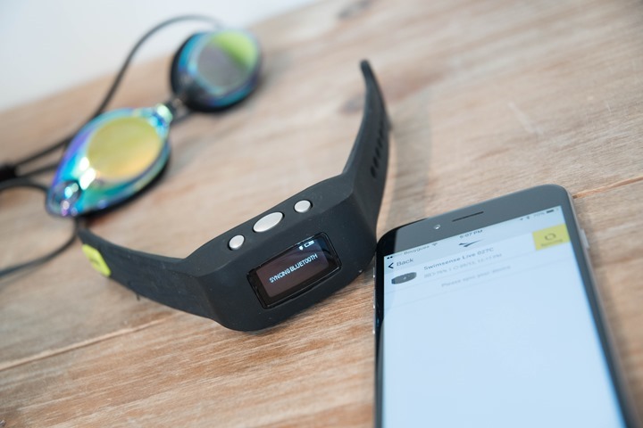
I’m not entirely sure how to start this post. In the now 9 years this month of writing this blog, I’ve never quite been as confounded by a product as this. Sure, I’ve tested numerous bad products. Products where they just failed and fumbled from a ‘bad code’ perspective. Bugs and such, releases being too early, or price points far out of whack. Or even nefarious companies with phantom products. But this was totally different.
On paper (a PowerPoint to be precise), it had all the potential to be a really solid device. It was priced* well compared to competitive offerings, and the company was well known in the space. Realistically, after Speedo, people think FINIS when they think swimming. Heck, they even bought a technology company years back focused on swimming and released a pretty good swimming watch for that time (6 years ago).
Yet somehow things went sideways here. This afternoon after using the device for the first time I circled back to FINIS to get a bit more details on why I had such different expectations for the product than what was delivered. I figured before I published what was looking like a pretty rough piece, I’d at least give them a chance to explain how things went so horribly off the rails. I don’t usually give companies much insight into my posts ahead of time, unless I have technical issues and am trying to get them fixed – at which point they probably have an idea if something is going well or not. Other companies might be able to take a guess at things based on the tone of my follow-up questions.
But this time I just called their baby ugly in an e-mail and went with it. All of that culminated in a call with CEO John Nix to try and dig a bit deeper. I’ve included those anecdotes (both written and verbal) throughout the post below. To his credit, John was thorough (and polite) in his explanations. I may not agree with most of them, but, at least they were willing to entertain my opinions – and do so in a detailed way.
(Note that this wasn’t really slated to be an in-depth review, hence why I’m writing after just one swim. It was slated to be a simple first-look style post.)
*Update: The price is $179USD, which I had initially mentally read as $129USD, which is obviously far less competitive than $129. Though, there actually isn’t much in that ballpark for swimmers and a display with Bluetooth Smart connectivity except finding an older Vivoactive.
What’s in the box:
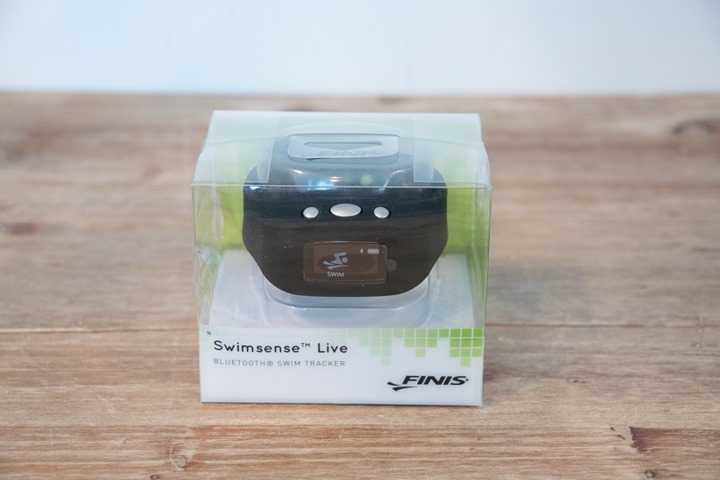
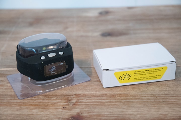
The unit comes in a simple and see-through plastic shell that shows off the watch nicely.
Once we remove the watch from the outer shell, you’ll find the lower box and the watch sitting on a plastic stand:
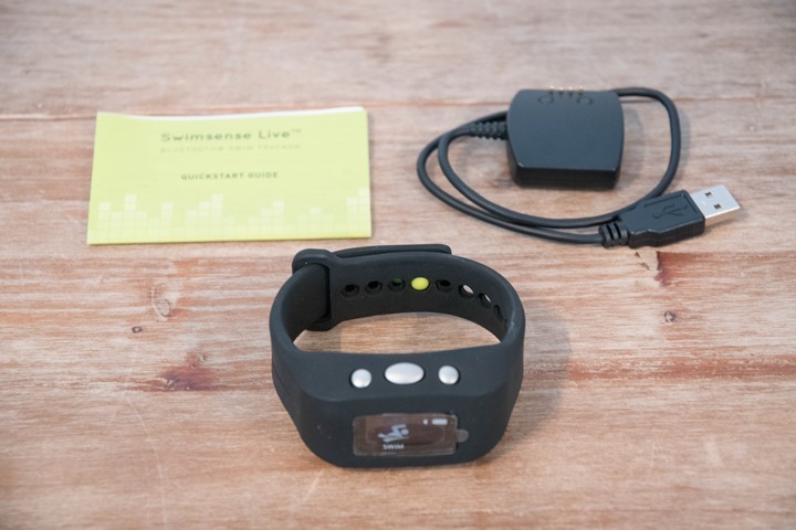
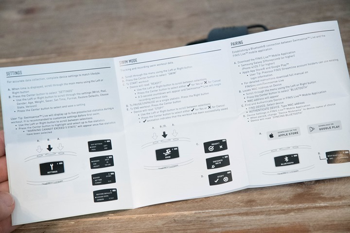
Inside that box is a small manual, alongside the charging adapter.
Then of course was the watch itself, prominently displayed on the plastic stand:
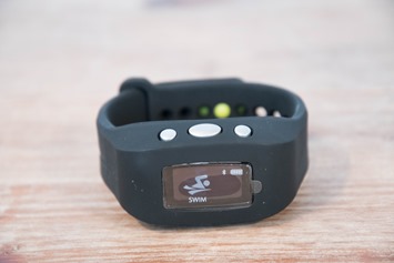
Here it is all nice and removed:
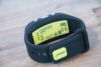
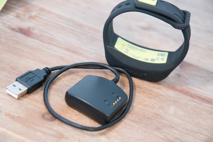
Here’s a closer look at that charging connector dock. It uses a standard USB port, whereas on the watch side it’ll use a more waterproofed charging connector. This is common for any waterproofed devices, versus trying to futz with micro-USB covers and such (there are internally waterproofed micro-USB ports, but numerous companies/devices have tried this and find that long-term it just doesn’t work well for swimming units).
And with that, we’ve wrapped up the unboxing portion. Quick and easy.
Sizing it up:
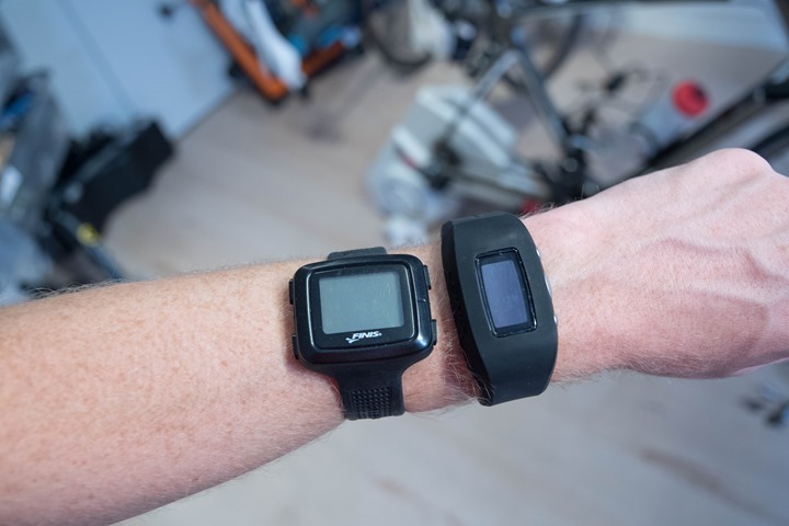
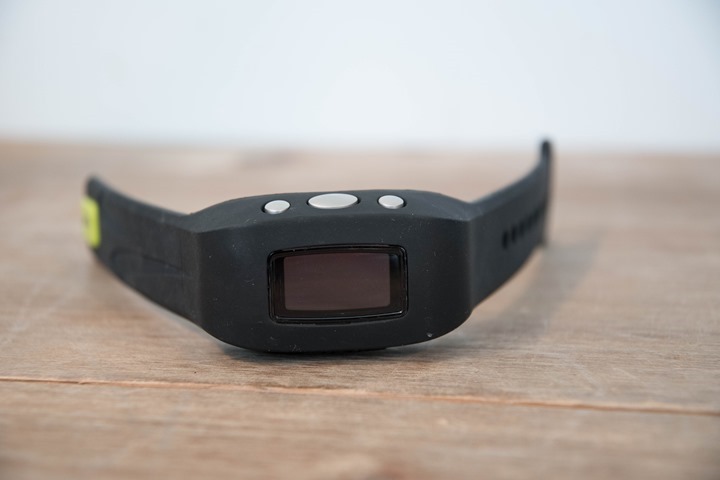
Now, as one friend noted today when he arrived at the DCR Studio and I was mid-photo shoot: Holy @#$# that’s big!
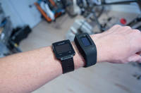
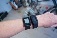
And yes, it is. To give you a bit of a comparative understanding of the unit, I’ve placed it on my wrist against some common swimming watches. These watches being the: FINIS Swimsense (now 6 years old), the Garmin Swim (now 4 years old), the original Pebble, and the Vivoactive.
I specifically selected these based on price range primarily. I saw no reason to compare it against a new FR735XT at $400, or the Apple Watch Series 2 at $369. Obviously, if you want to pay that much – go forth. I’ll save you the reading time: Those devices will be better at swim metrics (well, in theory on the Apple Watch 2 anyway).
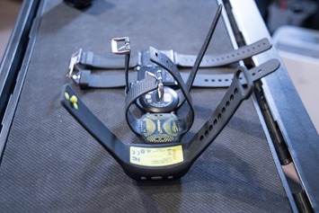
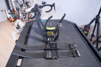
Here’s another look at that lineup from a few different directions (click to zoom):
Bottom line is that it’s really big. I talked to FINIS about this and it sounds like it just comes down to their volumes (sales) being lower than the other companies, and thus they can’t quite get the same access to parts/components. While I get that to a degree, their own previous swim watch proves that it can be done. And that was 6 years ago.
Getting Setup:
With everything set, I headed out for a swim this afternoon. This being a first look type post, I was mostly aiming to understand how the device works and give you some initial impressions. It’s not an in-depth review.
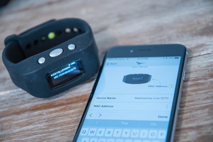
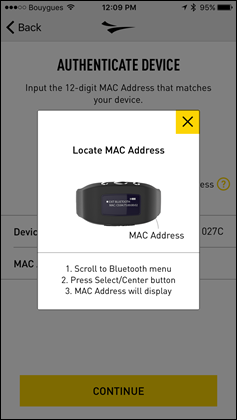
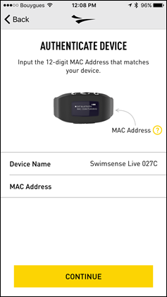
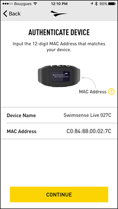
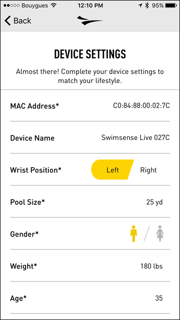
The first thing I needed to do was get it all sync’d up to my phone and configure the settings. The Bluetooth pairing process started off fairly normal, but took a slightly odd turn at actually having to manually type in the MAC address of the watch. Not a big deal, but…peculiar nonetheless. I’ve paired a lot of Bluetooth devices in my years, and this is a first.
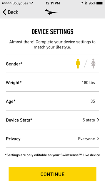
Once that’s done you’ll be brought to a page where you’ll be shown all your settings for the watch. This includes things like your preferred wrist, the pool size, which data metrics you want, and so on. Perfect; off we go to tweak things.
Except, you actually can’t change any of them here. Nope – that legalese-like text at the bottom goes on to explain that it actually doesn’t allow changing of anything. That has to be done on the watch instead, manually. Even basics like time sync require using the VCR-style controls on the display.
I circled back to FINIS about this, and here’s what they had to say:
“This was an option that we explored during the past several months of beta testing but having the ability to change the information on the device and/or the app through Bluetooth created an uncertainty with the user when the devices were being shared. In a coaching environment where a coach may desire to do test sets and look at data from different swimmers using the same device during a workout – it was our decision that being able to look at the settings on the unit would be more appropriate than the settings in which might be both private and public to the swimmer and any coach they may be working with. When the device is plugged into the computer in what is now called FINIS connect the user can adjust the settings on the computer directly to the device.”
I can see some logic there in terms of a coaching environment and settings. But I think it doesn’t have to be either or, but rather both. Many devices follow this scheme, allowing changes on either phone or device. The web capability is handy, but given the singular new/major feature over the older Swimsense unit is the Bluetooth connectivity for mobile phones, that seems like the most logical place to focus on.
One of the things noted above is the coaching aspect. It’s an area that in talking with John about they want to increase their user base on. Right now only about 10-20% of their Swimsense customers are coaches/teams. The rest are individual consumers. As part of this product, they believe they can more than double that ratio, and increase not only consumer sales, but team/coaching sales. So there are aspects of the app that are designed to allow a coach to have multiple units paired to a phone and sync them through that. John elaborated on this a bit in his e-mail:
“…capture all of the data at which time during a workout a coach could stop after any specific test set – grab the data off the devices and then resume the work out which would in fact be seen as a new workout on the device and in the app downloads. From all of the data of previous users the main desire was to be able to have a display of the key metrics and the workout summary available on the users phone immediately following any work out.”
And I get all of that. Except, I don’t think it should be at the expense of the regular consumer. When I see 80-90% of my business is one target market, I don’t ignore that 80% and instead focus on the 10-20% at the expense of the 80%.
As far as the actual sync process (which I’ll briefly mention later), it actually sync’s quite fast. So that piece works well and is efficient. I had no problems getting my phone to see the device and to happily pair up with it.
John did note (in numerous cases) that the vast majority of my concerns are solvable via firmware updates, and they stand ready to do that based on user feedback. And it’s true, I think about 80% of my concerns can be easily addressed. Obviously, being the size of a lime on my wrist can’t be, but many of the others can be.
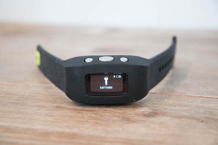
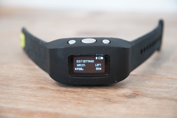
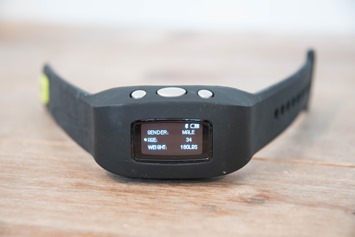
Now since the app configuration of the watch wasn’t an option, I manually cracked open the settings page on the watch and worked my way through the settings.
The only one that was of moderate annoyance was the lack of 33 1/3rd meter pool option. Its sorta common (at least in France), and is a quick-option on Garmin, Suunto, TomTom, and Polar watches when it comes to pool-size selection. It also happens to be the size of my horribly overcrowded pool that’s about 100 meters away from the DCR offices. John says that if there’s feedback from folks that’s a common pool size, that they’ll definitely get it added in – noting that it was pretty trivial.
Lacking that, I just selected 33m, which means that I lose 10m per 1000m of swimming. With everything all configured (manually), I headed down the street to the pool.
In the pool:
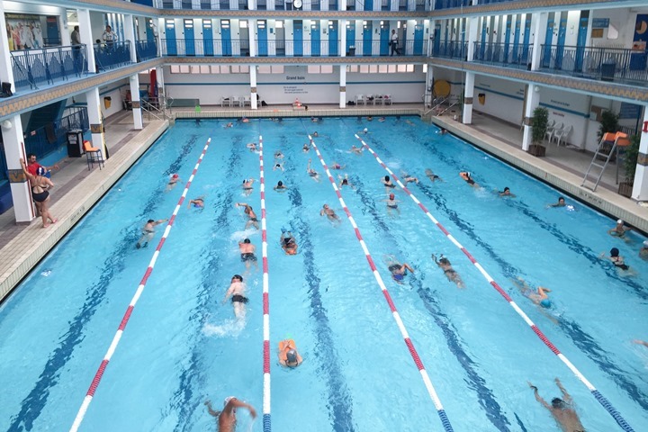
Ahh yes, lunch time at my pool. I peaked at 18 people in my lane today. I’d like to say it was of all abilities, but in reality it was mostly people trying to imitate a frog drowning upside-down going up and down the lanes. The backstroke is the most favored stroke in Paris for reasons that still defy logic.
On the bright side, that’s a great way to test accuracy of swim watches, as all of the swimming around/over/under and stopping/starting can really screw up some watches.
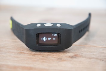
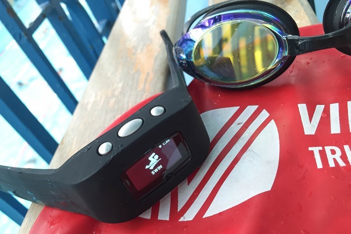
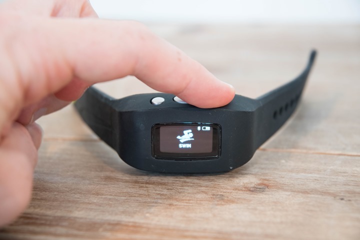
Now since I can’t easily take photos in this pool, I’m going to re-enact the photos on the bench afterwards. So just imagine instead of aged wood, it’s wet water. First, you’ll select swim:
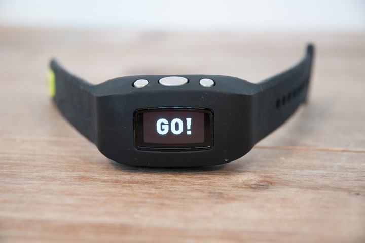
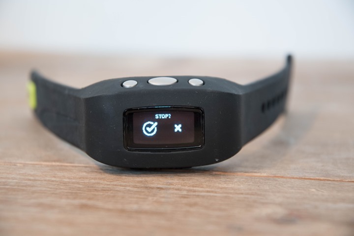
From there it’ll ask you for a quick confirmation that you do intend to swim, before giving you a 3-second count-down to start:
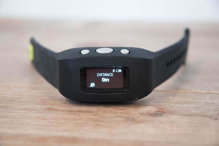
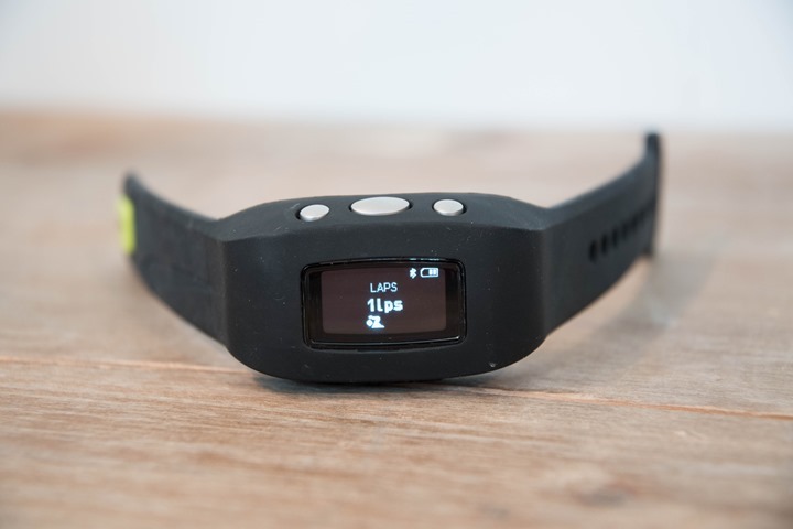
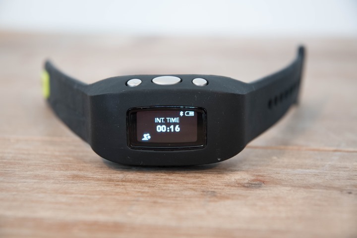
At which point it’ll show one of the five data fields you’ve selected. Prior to the swim I was under the impression I’d be getting some mix of these data fields at once (i.e. 3 fields at once). But in reality, you only get one field:
Well actually, you don’t get one field. You get no fields. See, the Swimsense Live will turn off the display while you’re swimming, so you can’t actually look at the watch unless you stop and press a button. Here’s what it looks like most of the time:
In talking to John about this, he noted the following:
“Having the display on while swimming. This was a choice we made because when you’re actually swimming you are not able to see the information but rather when you stop at the wall is your opportunity to look at information. With the press of a button you can see whichever data you have selected to review during your swim workout. Designing the feature as such has an impact on battery life so our decision to extend the battery life and have the swimmer be able to access their information at the wall was done by choice. The information cycles through each 3.5 seconds so if the swimmer intends to be at the wall less than 10 seconds they might choose to only display a few data points. The data points can be set up to cycle through for a period anywhere 1 – 99 seconds so if the intervals are short they might only see a few data points or if they are longer they can see all of their data points which they selected. This is also a feature that we discussed could be a firmware update depending on the customer feedback. Having literally millions of yards of data collected from the prior devices the data points we chose to make available are in fact about 95% of the page views from the prior device.”
Except, I believe many swimmers that go out of their way to buy a watch that tells them how far they’ve swam do look at it while swimming. It’s trivial for me to use virtually any swim watch on the market and glance at it as I push off the wall. I simply rotate my wrist and I’m good to go during the push off the wall. Heck, I can even glance at my watch while I’m stuck behind that slow upside-down backstroking lady with one boob randomly hanging out of her swim suit.
In talking with John about this during the call, he opened the door to the idea of leaving the display on with the understanding of a likely battery hit.
Once you do press a button though you’ll be shown the current state of your swim, for that singular data field:
I then figured I’d be able to press the button to change to another data field. Except, nothing happens. However, a few seconds later (3.5 to be precise), it’ll change for me. The data fields are only auto-scroll.
So circling back to John on this one:
“The auto scroll is set at each 3.5 seconds, and you can hold down the right button to pause if you wish to digest the data further before it moves on to the next data point. It is also possible for a future firmware update to allow the data to scroll a faster or slower rate but from our pool observations this seemed to be a reasonable setting. Additionally through our beta testing most users acknowledged they would put 2 or 3 data points to be displayed on the watch during the workout and having the other data available after the workout to view on their phone was the overwhelming response. This information was part of our rationale for choosing to cycle through the data each 3.5 seconds.”
I don’t really have much more to say on this topic. I see buttons, I want to push them. I expect something to happen when I push them. Anything really. Given I can’t see the data screens otherwise, I just…well…wanna push me some buttons.
Now, ignoring the fact that the watch can’t really tell me much while actively swimming, it worked fine in terms of capturing the data. It accurately captured my swim length/totals. I thought I had pressed the interval buttons once or twice (well, I know I had), but those don’t seem to show up in the app afterwards.
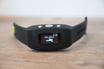
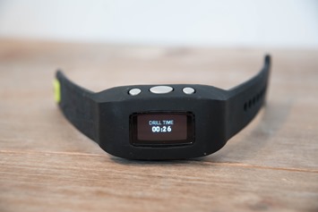
There is a drill mode, but it doesn’t appear to allow you to specify a distance afterwards (which is basically the entire point of drill mode).
I ended up swimming only 1,000m (or 990m by the FINIS unit), partially because I was annoyed at the people in my lane, but also partially because I was annoyed with how far from my hopes this watch was.
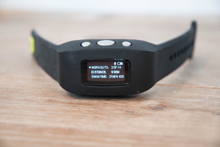
This watch also ignores the inability to have two or more metrics per page (i.e. show me interval time + interval distance). A 100% common feature in all swim watches for the last umpteen years. And then there’s minor annoyances like that it doesn’t show me a summary page after my swim. Sure, I can crack open the history menu later, but it just seems logical to show me the summary when I save the swim, no?
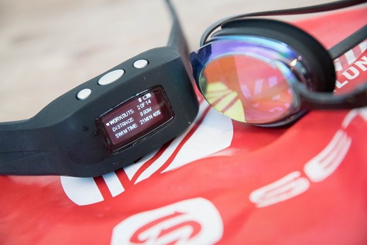
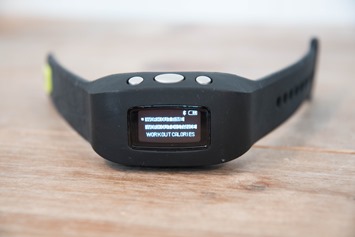
Here’s what that history page looks like upon completing the swim:
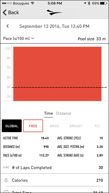
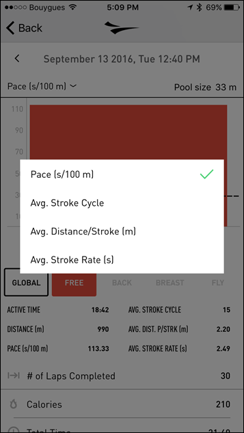
Once I’m done there – I simply open up the FINIS Live app on the phone and the watch sync’s right away.
It only takes a few seconds, and again – that part works right away.
Final Thoughts:
I’ve often said that sometimes the solution is just to “stick a Bluetooth Smart chipset in there and call it done”, when looking at older products like the FINIS Swimsense and Garmin Swim. These were both solid products that never really got true upgrades. All people would want on these units is the ability to just sync their swims. They were more or less great as-is (though, the original Swimsense display wasn’t quite as clear…but still…).
I simply can’t reconcile the user base for this device with how the device ended up versus the ever-growing competitive options today. But I am glad that aside from size concerns, the vast majority of my concerns should be quite fixable via software updates, and John seems to hint towards that in his e-mail closing paragraph:
“I am disappointed that your user experience was less than desirable but I do remain confident that the customers we work with across 80 countries were surveyed about their desired features and our new device is a result. While there are some very nice new sleek devices on the market which do not have a display, some of them are accurate and some of them are highly inaccurate but having some information while at the pool was an overwhelming necessity as opposed to no display. The information we decided to put on the app that the coach might view during a a test set or that the user might review after their work out as they walk back to their car is what I believe a great summary that will be useful and should the user decide to dig in deeper they have that opportunity at FINIS Connect.”
Hopefully FINIS will move quickly in that direction, allowing them to right what should have been a relatively easy slam-dunk of a product.
With that – thanks for reading!


