As with most things in the tech realm – announcements from companies at CES usually fall into one of two camps: software or hardware. This year we saw many software focused announcements in the fitness/sports technology space. I suspect in part because so many companies instead shifted hardware product announcements earlier, to the fall, thus enabling units to be sold for the holidays, as well as putting them in position for future spring hardware announcements (fall/spring releases).
For example, we saw TomTom and Fitbit both make software-only fitness announcements at CES. And both of those companies released new products within a few days of each other this past September. I’ll likely cover Fitbit’s software changes (which I’ve spent some hands-on time with) in a separate post.
But this post is all about TomTom’s announcement – which was focused on a much-needed app refresh.
The New TomTom Sports App:
One of the most important things new companies in the space seem to struggle to understand is just how important apps are to the success of devices today. If a person has a crappy app experience, they’re far more likely to get frustrated with the device and either stop using it – or simply return it.
TomTom has in many ways ‘gotten away’ with having a subpar app experience over the past few years because their prices in the budget category were significantly lower than others. For example, the almost always on-sale Runner is usually found for sub-$100. It’s a fantastic device at that price point, and offers far more than any other GPS on the market anywhere near that price.
But previous to now the app essentially rendered pages from the internet within the app. Basically, it was a glorified browser. Geeks like myself cringe at these types of apps, because they are rarely very smart and rarely very functional. They’re susceptible to connectivity issues, and tend to be exceedingly slow. In general though, they just usually suck.
But TomTom is changing things up with their new Sports app. This app is completely new from the ground up, and is available on Android and iOS. Specifically Android version 4.4 and higher, and iOS 8 or higher. They’ve got a gigantic list of specifically compatible Android phones, though it seems to cover most of them.
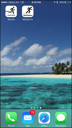
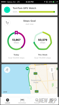
You can see below the old and new app icons side by side (‘Sports’ is new app, ‘MySports’ is old app), along with the new and old apps side by side (center is new app, right is old app):
This app though isn’t just simply rebranding, it’s actually offering new stuff. It’s got new metrics, and new trending pieces. I’ve been using it for almost two weeks now, and so I’ve got a bit of time to get the hang of it. Thus here’s a bit of a run-through of how they work,
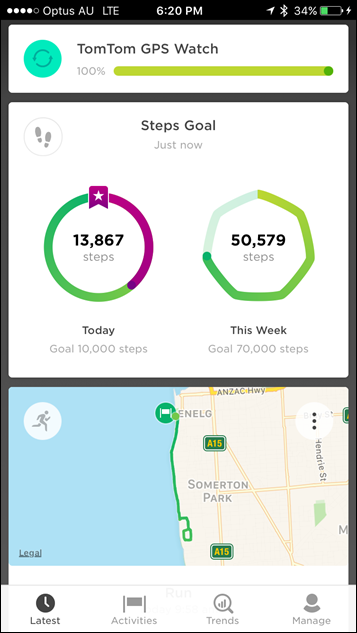
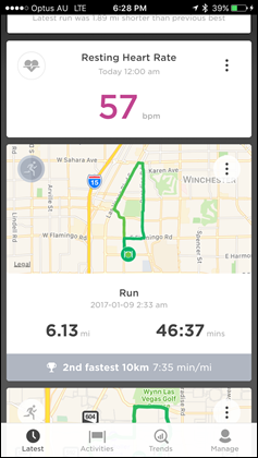
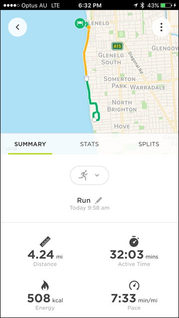
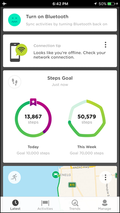
First up is the dashboard/timeline, which shows your current steps, as well as the most recent run. This is somewhat similar to the previous app, but only for that upper portion. Now your most recent run is shown very similar to how you’d see it in Strava, with a small map of it. You can tap on that workout to get more detail.
Note that the one downside of the TomTom units is that they don’t sync workouts in the background via BLE. Rather, you have to force it each time manually, which is sorta cumbersome and a bit behind how most other fitness wearables work these days.
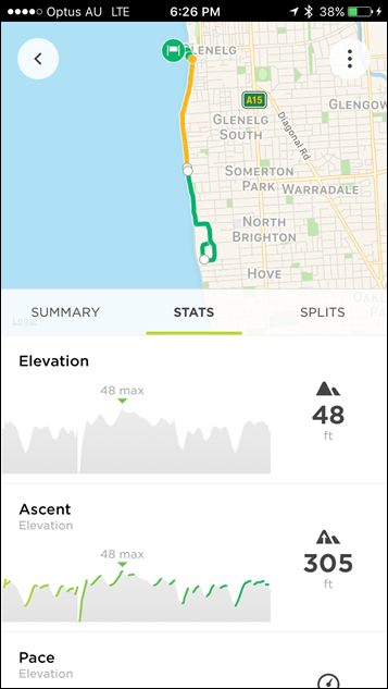
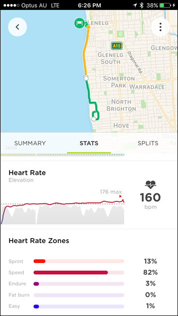
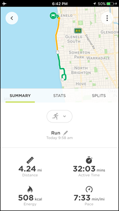
In any case, within a workout you’ll see the summary page, which gives summary information like distance and time. Followed by the stats page, which graphs each of the key metrics like elevation, pace, and heart rate. Plus it includes zone distribution at the bottom.
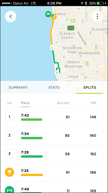
Meanwhile, the splits tab shows not just your splits and per-lap ascent and heart rate, but also your best lap. I can tap any given lap to see that segment displayed on the map, along with more detail down below for the pace and elevation of that lap.
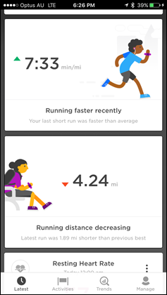
Heading back to the main dashboard timeline, you’ll see various stats about how your workout compared to the previous one. In today’s case it was both faster and shorter. Personally, I’d like to see these averaged over more workouts to be useful.
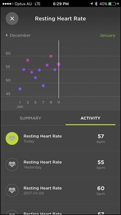
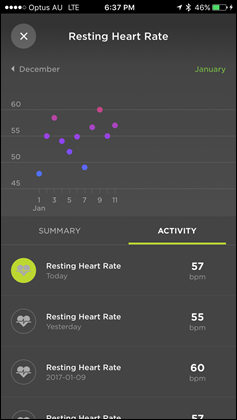
Following that we have resting heart rate data for the day, along with the next workout behind it. In this timeline you’ll keep scrolling down to find further workouts and further resting heart rate data points. You can both dismiss the resting heart item, or click on it for more information about it:
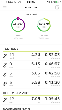
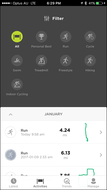
Next, if we shift gears to the ‘activities’ tab, you’ll see a list of all my activities, as well as the ability to filter these by activity type. Like before, clicking on a given activity takes me to detail about that workout. Speaking of which, I can then either share or delete that directly from the workout page.
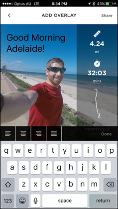
Sharing allows me to select a photo (or take a new one), and then add data overlays to it. It’s pretty cool, and reminds me a bit of what Nike and a few others have done. I’ve never understood why other companies haven’t followed them in this space, as it’s such an easy marketing thing for a given device/company. These pictures can then be shared out to social platforms or your camera roll (i.e. to then share to Instagram).
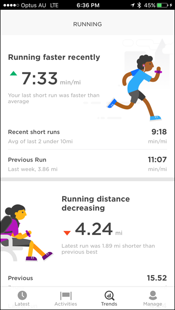
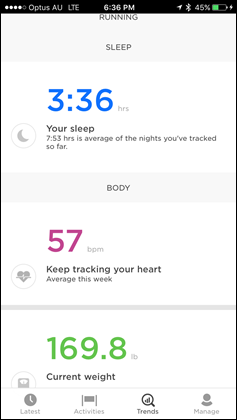
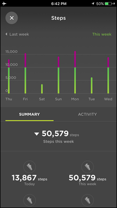
Next up is the Trends tab. It starts off showing various step trends, but then as you scroll down you get to other sports, for example running. Here’s where we see a bit more of that idea of averaging across multiple days.
And further down you’ll get stats about sleep, resting heart rate, and weight. I can tap these individual sections to get more detail as well as trending data.
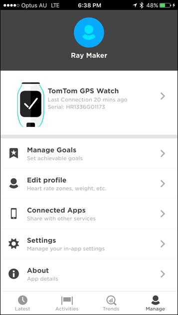
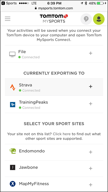
Finally, we’ve got the ‘Manage’ tab, which should basically be called the Settings tab. It’s where you’ll setup everything from the watch, to 3rd party apps like Strava and TrainingPeaks, as well as your profile information. The 3rd party apps page though is the only place where it pops you out to a web browser.
Within the profile section you can change things like age, heart rate zones, and display preferences:
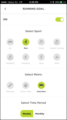
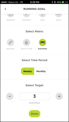
The one key new item to note here though is the ‘Goals’ section, which allows you to create goals based on the number of workouts in a given sport, as well as active time or distance. You can also set weight goals as well (though this is mostly targeted at the new body composition band).
Of course – if we go back to the very beginning you’ll remember how one of the key advantages of native apps over web-page rendered apps is around the connectivity pieces. In this case, I’m able to do the vast majority of tasks in the app with no connectivity at all, as seen below in airplane mode (top of the screenshots):
With that, overall I’m impressed with this effort from TomTom. They’ve done a good job over the past few months in not only getting firming updates out with bug fixes and new items (finally – including older watches), but now this much-needed app refresh. The beta version I tried isn’t perfect of course, and has a few minor bugs they’re cleaning up. But none of them are show-stoppers, and all just little user interface quirks. All should easily be solved by the end of the month when the app releases to the public.
Of course, one probably needs to calibrate app functionality expectations relative to the TomTom device lineup. By that I mean that TomTom’s devices are designed to be easier to use and less complex (or feature-deep) than a high-end Garmin, Suunto, or Polar device. As such, their app doesn’t need some of the additional details/functions that those apps provide. Yet at the same time, this app is a giant leap forward for the company.
I’m really hoping we’ll see this kind of development continue. For example, there’s no ability to create a route in the app to send to TomTom’s latest Spark 3/Adventurer units – which would set it apart from the competition. Heck, even Garmin, Suunto, and Polar all lack that seemingly basic functionality.
Still, this much-needed app refresh hits the spot. Well done.
—
Catch all the CES 2017 posts here in one handy to read page. And fear not – there’s still tons more to come from (the massive backlog of) CES!
