")


 – Scale (Geoffrey West)")
 – Jóga")


 – Vznik oceánů a hydrosféry – modrá Země")
 – Hadejská epocha – černá Země")
 – Kolize s Theií a vznik Měsíce")
 – Pozdní těžké bombardování a první pevná kůra")


Of the 19 men’s teams at the Tour Down Under this year, one stands apart from the rest. No, not because they’ve got super stars on the team. Nor because they’re riding the most expensive bikes in the field. In fact – they’ve got neither of those attributes. They’re effectively the lowest team on the totem pole this year, and the team with the least number of sponsors – let alone big time sponsors.
But UniSA-Australia do have one thing none of the other teams have at this race: Live tracking of all the riders, including power, heart rate, and speed data. They’ve got it not just in the team cars for coaching staff, but also live online for all the world to see.
I had a chance to sit down with the folks behind the system, as well as the team themselves to get a better understand of what they’re doing and how it all works. Keep in mind that Team UniSA is the local wild card team, effectively a slot given to a team within the country that’s not a full WorldTour team (ala Team Sky or similar). This is a great opportunity for local riders and local communities to be seen on the world stage.
The On-Bike Hardware:
Team Uni SA didn’t create their own system for the Tour Down Under, but rather is working in a partnership with Satalyst, an Australian company specializing in live tracking and streaming of data. The system allows them to stream GPS position data alongside performance data (such as heart rate, power, cadence, speed) from the rider to a backend cloud service. Once there, it’d distributed to numerous endpoints – including a web browser near you.
The Satalyst System isn’t new to cycling racing, though, their hopes are to make it more prevalent within not just cycling but also other events (of any tracking type). They were at the Tour Down Under last year, though this year they’re expanding the ways that people can access the data. Previously it was mostly limited to broadcast TV overlay data. Whereas this year the data is fed to multiple groups (more on that in a bit).
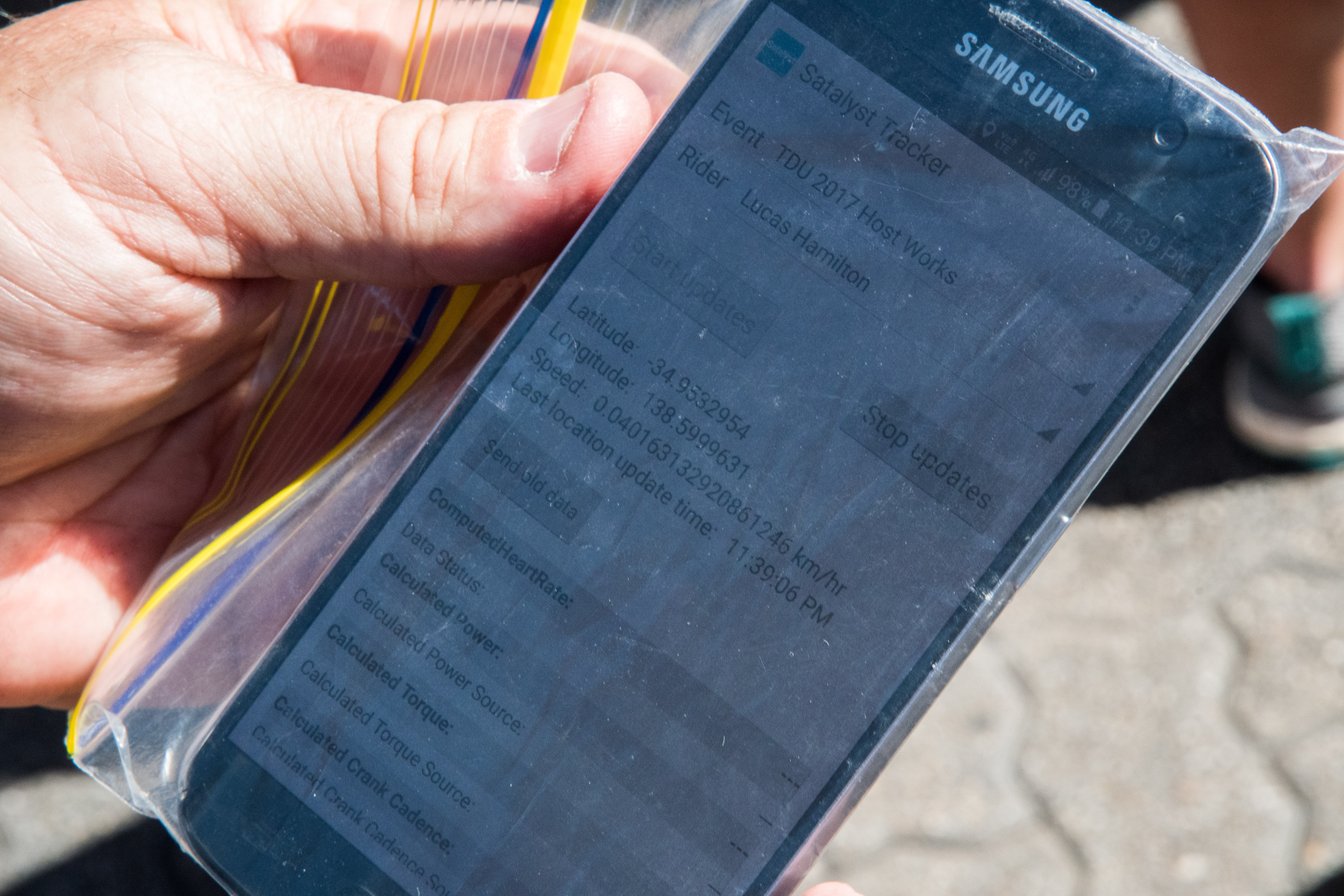
First up though, we’ll start at the rider. It’s here that each pro rider is given a cell phone to carry in their back pocket. In this case the riders are all using Samsung S4, S5, and S7 photos (of varying models). Each phone is assigned a given ride, and to keep things straight they’ve put the riders ANT+ ID information on the back of the phone on a sticker.

At the start of each stage, the rider verifies that their ANT+ device ID’s match what’s on their Garmin Edge units, as well as verify that it matches the bike devices. This triple-check ensures that in the event of any mechanical related swaps – everything is still good to go. And not just good for the tracking system, but for the rider themselves on their own head unit.

When it comes to app config – it’s pretty straight forward and basic. It’s simply an Android app that’s saving the sensor config and forwarding on the sensor and GPS data. As such, the company says they’re seeing about 6-8 hours of battery life with tracking on. Thus more than enough for any given tour stage.
This is a good time to mention the reason the company is using the Samsung Android phones is that they support ANT+. With cycling sensors overwhelmingly still ANT+ only (primarily power meters), support for ANT+ natively is a basic requirement. Certainly newer power meters are more commonly dual ANT+/Bluetooth Smart capable, but even in the men’s pro ranks, the vast majority of teams are still using ANT+ only units at this point still (Team Sky with Stages, 4iiii’s with Quick-Step Floors and BORA- hansgrohe, and Dimension Data with ROTOR 2INPower are the only exceptions).

After that phone is double-checked, it then goes into a plastic baggie and is tossed into the riders pocket. Of course many of the Samsung phones are pretty water resilient, but most would agree that for day in and out pounding in harsh conditions that a few cent plastic bag is a good safeguard.

Now interestingly – the cyclists aren’t the only ones equipped with this system. In fact, at the Tour Down Under they’ve equipped a number of the race motos and official vehicles as well. That’s because some of these motors and vehicles are assigned to static positions like staying with the lead rider. This allows broadcasters and others to get live information about the exact position of the lead rider (even if that rider isn’t part of UniSA). Smart thinking, ehh?

With the phones on the riders, and the app running the background, it’s time to start tracking.
The Cloud & Web Platform:

The phone is merely the starting point for the data. Once the phone collects the ANT+ data streams, it adds in the GPS location. From there it’s transmitted over regular cellular networks to Satalyst’s backend web platform at two-second intervals.. Now of course, since it’s transmitted over cellular it is limited to cellular service coverage. So if you’ve got a bad cell spot, there’s no data being transmitted. And the company doesn’t backfill data to the cloud either during this missing spots (though, it does record the data on the phone itself for later retrieval if need be).
The backend platform is using Microsoft Windows Azure services from a cloud computing standpoint. For those geeks in the house, they’re currently leveraging Azure Event Hubs for the data ingest, an Azure service which is typically used for large scale telemetry ingest applications (like, millions of events per second). A large-scale example of this could be utility providers that want to consolidate tens or hundreds of thousands of homes electricity data in real-time.
In this case, cycling data from about half-dozen riders is a wee bit overkill, but it shows how it could scale if they did a Gran Fondo type event with 10,000 riders using apps on their phones. They’ll soon be migrating from Azure Event Hubs to Azure IoT Hub. Once the data is within Azure, they’re using Azure HDInsight and Storm clusters, ultimately funneling the data over to SQL Server for storage. Again, using this combination of products are definitely overkill for this application of 7 riders – but it’s also a well architected system from a ‘by the book’ standpoint for a longer term solution. And it’s usually better to architect for scale than be fumbling or down due to lack of design thought.
All of that tech is in the name of getting it to a place where actual people can see the rider data. And for that there are four different audiences consuming the data this year:
A) Broadcast TV stations to overlay data during race
B) UCI/Race Officials in vehicles and elsewhere on course
C) The team itself (UniSA in this case)
D) Everyone else on earth via tracking website
In the case of broadcast TV, you can see what that looks like on TV (hopefully on a TV near you). Given I’ve been outside around town during the race itself, I haven’t watched it on TV. But here’s one stage you can likely sift through and find it (and if that disappears, simply search YouTube for ‘Tour Down Under 2017’, followed by Stage 1, 2, 3, etc…). For UCI/Race officials, the data is most useful for knowing where both riders and motos are on the course. Remember earlier that I said it showed various race officials as well. You can actually see those on the tracking site on the right-hand side:

The platform knows to ‘count-down’ versus ‘count-up’, when it comes to distance. This helps reduce/eliminate GPS accuracy issues, because it’s using a known course and auto-calculates distance from current position along that route to the finish. And that’s important to note – the stages for each day are pre-programmed into the backend web platform, so that it can lock riders onto a given course/route and determine distances to finishes as well as sprints/etc…

On the site (via either mobile or desktop), you can select a given rider and then toggle to display their stats. These stats include heart rate, speed, elevation, and power. As soon as you enable it for a given rider, the data will begin to populate for that rider, showing the last five minutes of data. Though disappointingly you can’t look back at various points within the race for a given rider (if you arrive an hour into it).

Also, I found that the site didn’t seem to want to render rider stats well on desktop for me (either Chrome or Internet Explorer), but I’m going to assume that’s a me thing. It worked just fine on iPad an iPhone for me, which is where these screenshots are from. Further, I didn’t seem to get some of the timing data to populate at the bottom of the site either.
Still, the overall platform is cool. The low barrier to entry from a rider cost standpoint is appealing, as is the relative simplicity of the data displayed. It was certainly easy enough to see the data in real-time, and in a broadcast scenario likely looked great as well.
The Future of Cycling Live Telemetry:

So where is this all heading? And aren’t there other companies already doing this?
It’s complicated.
Back a number of years ago I first covered a very similar solution that was used during the Tour de France. More or less, the core pieces of it are the same as this solution. Phones talking to a backend via cellular service, handing off data to broadcasters and users. The only problem? UCI rules got in the way.
For a few years UCI clamped down on progress, at least until about two years ago when they realized that was a stupid way to encourage fan involvement. Since then we’ve seen other efforts – like Dimension Data’s work last year, and a few other one-off’s here and there. More or less all of these operate in similar fashion. Some with cell-phone app devices, and others will smaller dedicated devices on the bikes.
And all of those solutions were targeted at the event provider, not so much an individual consumer. That’s where Quarq is somewhat straddling the line with their Quarq Race Intelligence (QRI), and Quarq Qollector system. I wrote about QRI before, but basically it’s what you see in Ironman events and such – tracking the pros. It’s a dedicated device with cellular capabilities suited to swim/bike/run. The company pre-creates courses and riders snap to it, but it’s all targeted at the event provider.
Which is different in spirit than Quarq’s Qollector devices that you can buy as an end consumer. Sure, it’s the exact same device. But with a consumer Qollector you own the device and can ‘participate’ in various races. Whereas with QRI, it’s a business to business transaction with a race organizer, and the athletes are provided units to borrow for the day (usually pros).
Finally – it’s really important to understand these are fundamentally different applications than things like Garmin Live Tracking, Strava Beacon, and various ‘Find My Friend’ apps. All of those are geared for one rider scenarios. They aren’t really designed to handle overseeing multiple riders in the same view, nor for race organizers to tap into them. And more importantly – they aren’t designed around an event/course/route in mind. Rather, it’s just a random snapshot of you going somewhere. Context is lost.
There are ultimately opportunities for all of these though in the tracking world. And the tracking world is still very young. With endurance sports, boredom is one of the biggest stumbling blocks for fan interaction. When athletes ‘disappear’ for hours at a time, people lose interest. By finding a way to bring live telemetry data to the masses, it increases the likelihood that you’ll stay engaged (be it in your living room watching a TV, or on the side of the road waiting for a racer).
Companies like Quarq will find their place in scenarios where dedicated devices make more sense (i.e. pro level), whereas Satalyst and others leveraging existing cell-phones will likely gravitate to events with large numbers of riders that want a lower cost solution.
With that – thanks for reading!
—
Side note: If you want to watch the team data live, you can do so at this link. That’ll work anywhere in the world. Any data you see on TV at the Tour Down Under is overlaid from this system (other races use varying systems). The racing continues through Sunday, and the teams are racing each day between roughly 11:00AM and 3:30PM Adelaide time, which falls in the US EST time zone from 6-10PM, roughly. You can hit up the exact schedule here.